Branding | Graphic Design | Logo Design
The Planet Depos Initiative:
Bringing trust and confidence to an underdeveloped brand.
When I was hired as the Senior Graphic Designer the company had already established the identity and logo. It was a brand new company and they needed help expanding their established brand. I was able to make the brand more recognizable by organizing a team and creating marketing materials of our own. That included hiring models, doing photo shoots and creating visually striking materials to enhance the company’s identity successfully. But as a graphic designer, I knew the Planet Depos logo was weak. The fact that the company had invested so much money in the logo and marketing materials kept me from suggesting a change from the start so I had to work with what I had.
MARKETING MATERIALS


THE PROBLEM/REDESIGNING THE LOGO
Objective:
Although I was able to elevate the brand to competitive levels within the industry, there were multiple issues with the logo that just didn’t work and the brand was suffering.
- It violates the cardinal rule of font use: The use of several fonts has the potential to result in a logo that isn’t cohesive.
- Hard to use against picture backgrounds: Prevents the application of the logo on colorful layouts and pictures in our marketing materials.
- Identical Uses of P and D in other markets: Abundance of logos with the same Planet Depos characteristics throughout the world.
ORIGINAL LOGO:
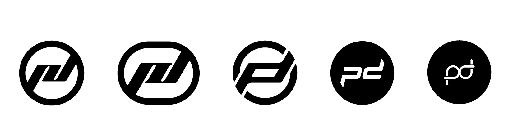
SIMILAR LOGOS:
The Challenge:
The word “planet” itself became a challenge to work with. How do I stay away from the usual iconography that has been used and reused a million times over the world? I couldn’t reinvent the wheel conceptually but I could use it to my advantage to create something straightforward that would allow the logo to depict growth and confidence within the industry.
The sketching started everywhere; napkins, post-its, notebooks, notepads, etc. It was a grueling process to stay away from the clichéd elements that were encapsulated in the PD name.
The Prototypes:
Once the sketching was done, it was time to develop some of the ideas in black and white. The first five were literal connotations to the word “Planet” and also the incorporation of iconography of the services offered by the company mainly Worldwide Court Reporting. The steno machine keyboards were represented in the orbits of the planet icons.
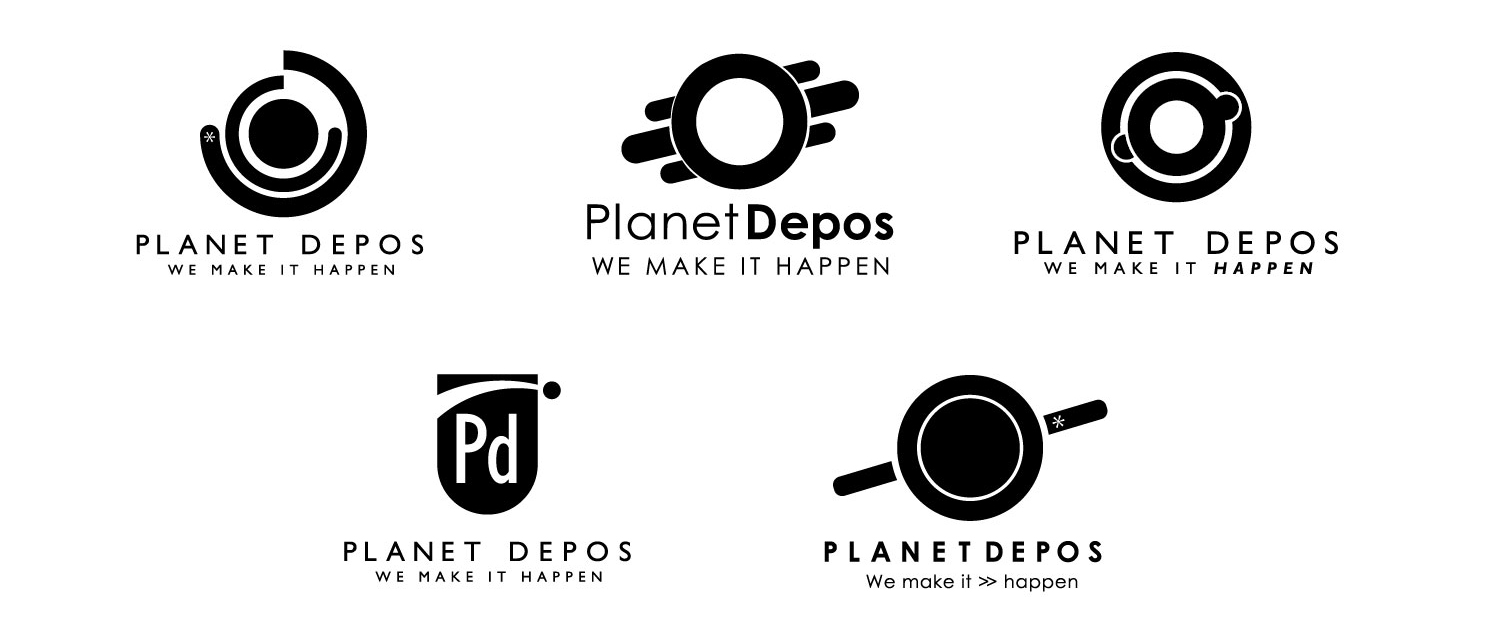
The second approach was to keep the “PD” in the identity to show the evolution of the brand using more simplified elements and to eliminate the clutter of the original logo. With this second wave of prototypes I was ready to make a presentation to the team and start the elimination process.
Post-Meeting:
The team was happy with the direction of the second prototypes, but there were concerns with how the abstraction of some of the prototypes would be a challenge for brand recognition. My solution then was to keep the original blue color and make the green secondary, that way the clients would recognize the brand new logo. But it was decided that the colors were too weak and a new hue of blue was necessary to revitalize the brand. It was further discussed that the name Planet Depos was no longer used by our customers; instead the “PD” acronym was commonly used in the client lexicon within the industry.
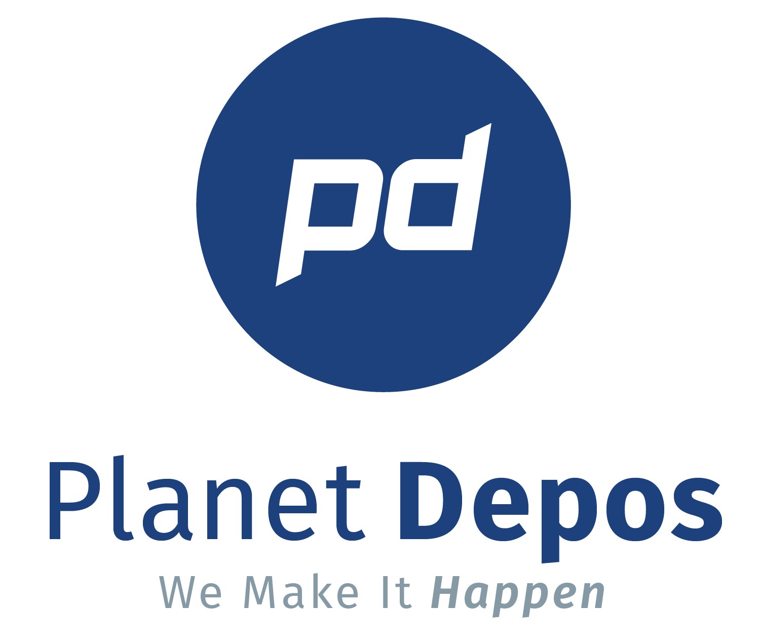
THE SOLUTION
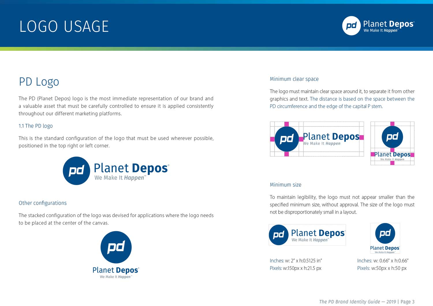
After feedback the best solution for the logo was to keep it simple and direct. This approach to the new design promotes confidence without the gimmicks and trends. It represents the maturity of a company that has evolved from the mom and pop business to a renowned international company that has been around for some time now.
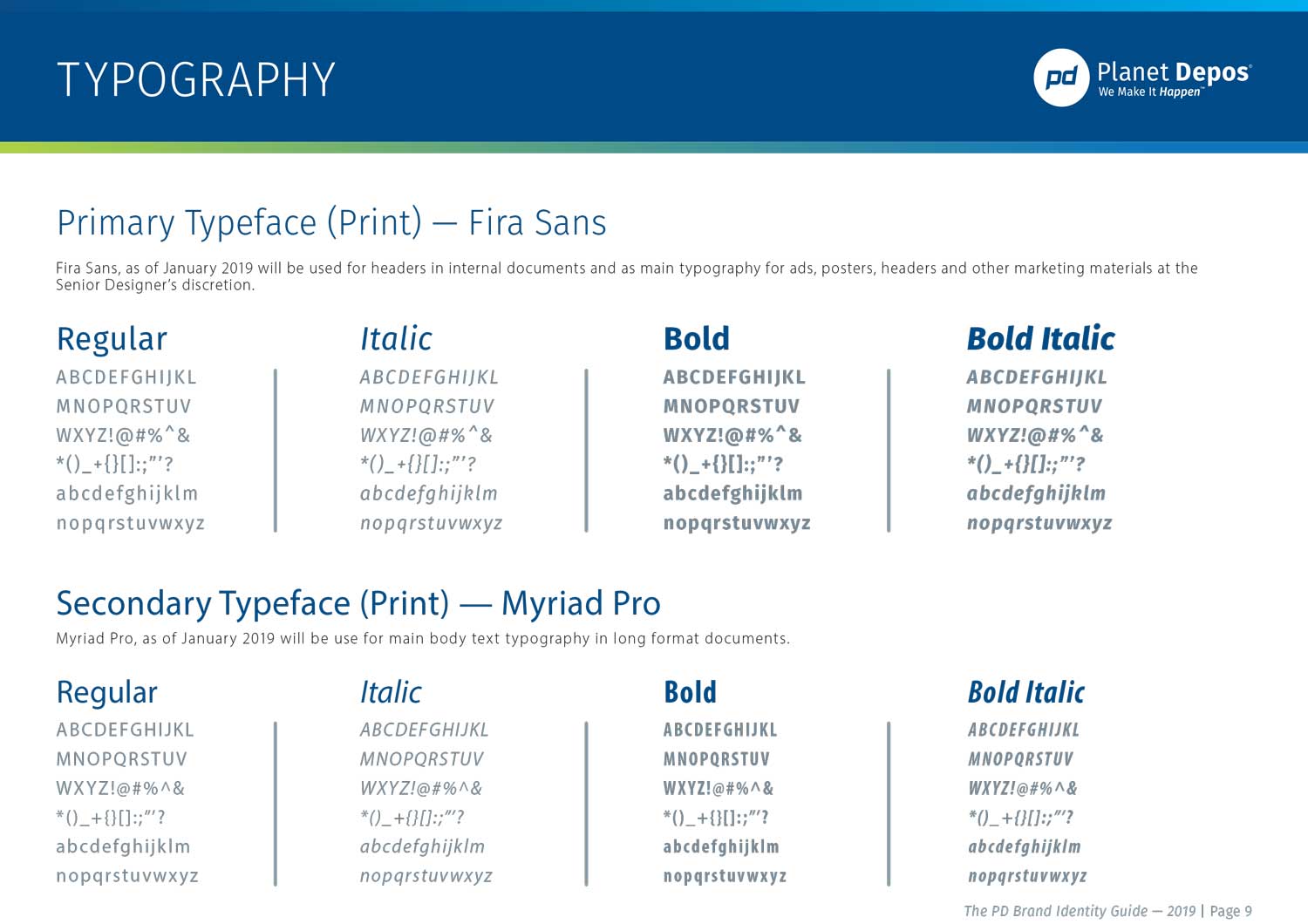
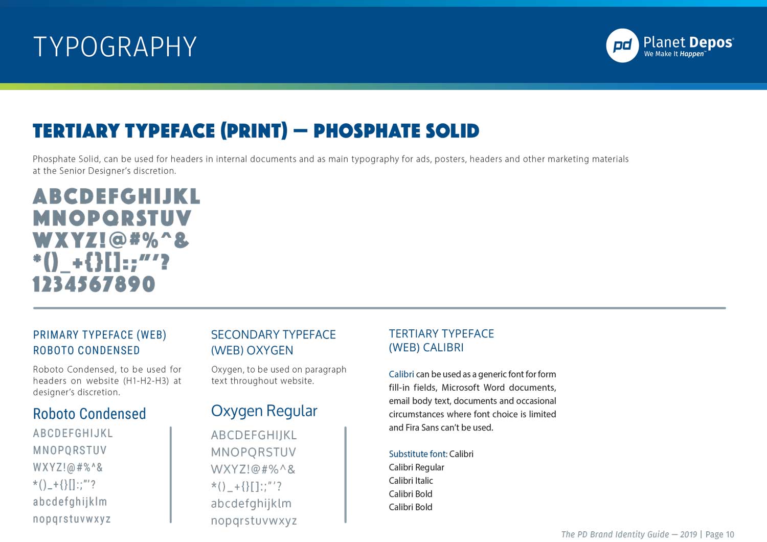
Typography:
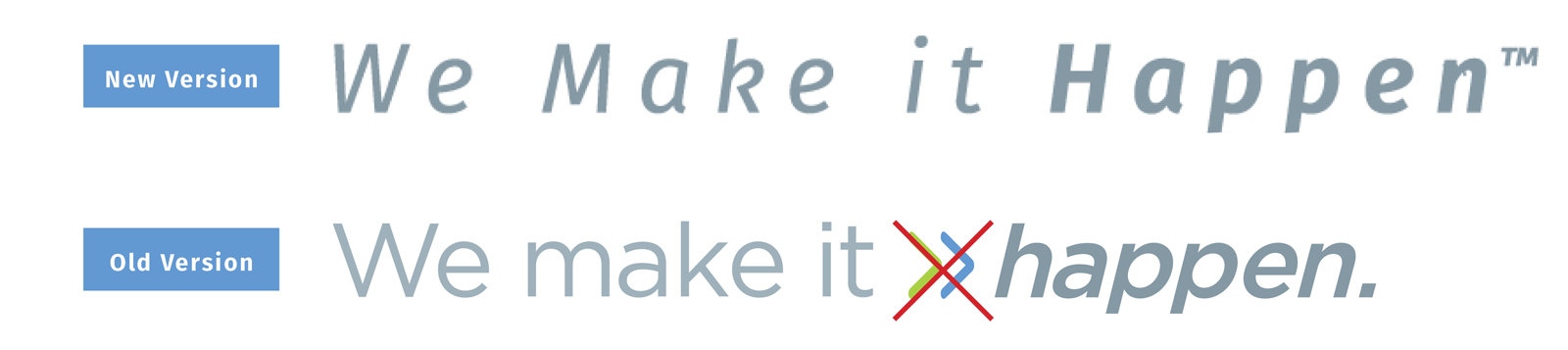
In order to simplify and rid the new logo of extra clutter, the arrows needed to be removed. These elements did not add anything important to the tag-line; rather they added unnecessary noise and visual litter. Instead, the word “Happen” was bolded to add the importance and punctuation needed.
After feedback the best solution for the logo was to keep it simple and direct. This approach to the new design promotes confidence without the gimmicks and trends. It represents the maturity of a company that has evolved from the mom and pop business to a renowned international company that has been around for some time now.
BRAND IDENTITY GUIDE