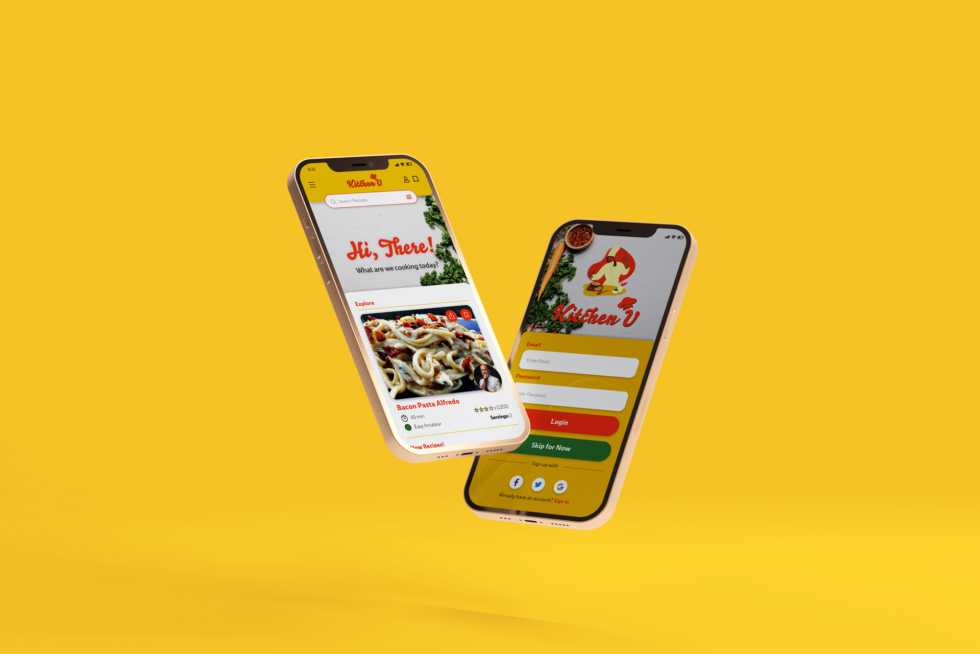
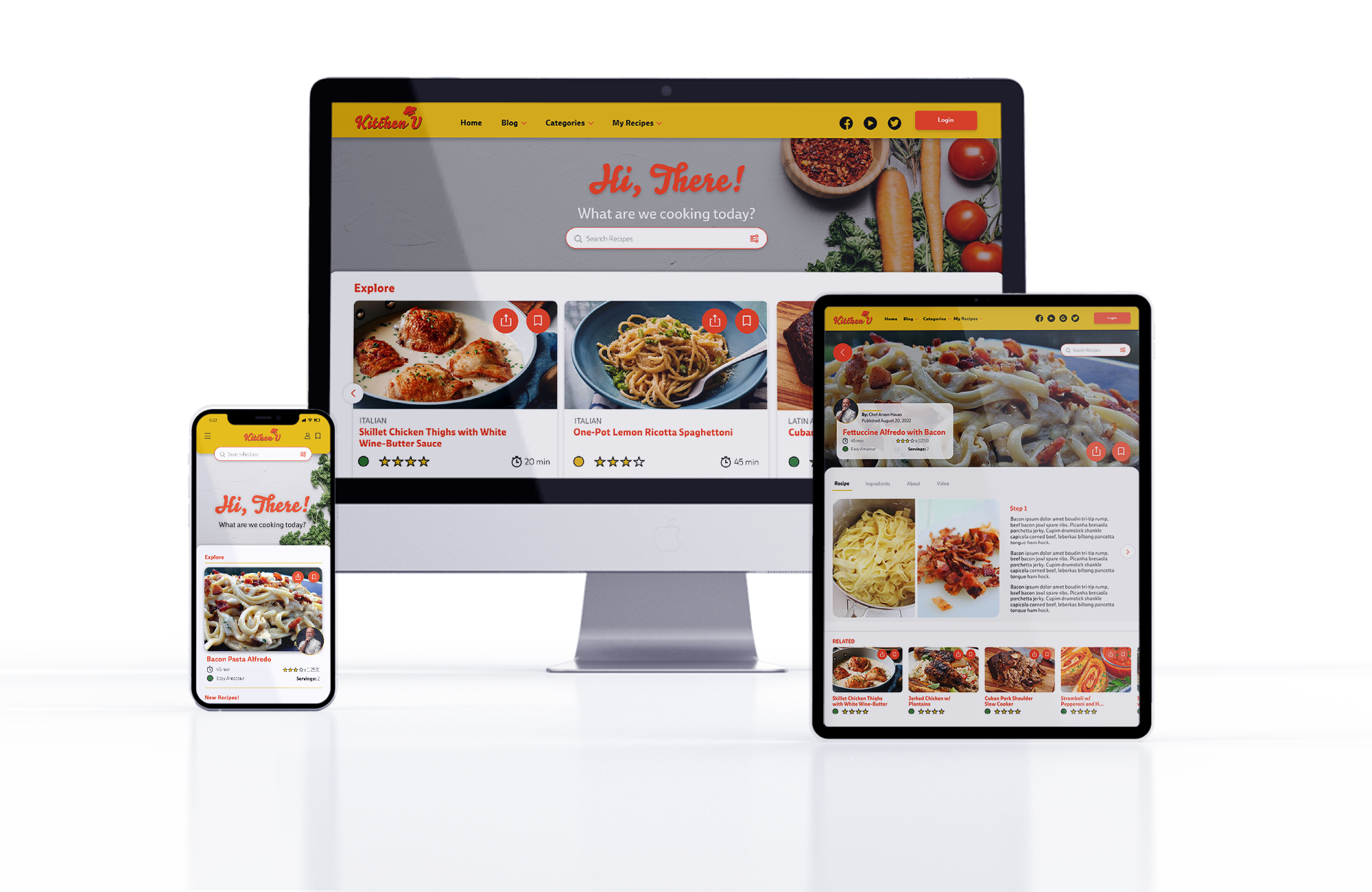
Web Responsive App | UX Design | User Research |UI Design
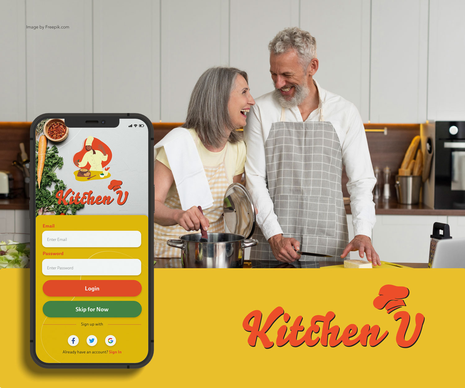
Kitchen U
The best deals in a b-link of an eye!
Technology and evolving times have changed how people view meal prepping as a part of a daily or weekly routine. Research shows when people think of an idea for a recipe, the majority rely on the web or mobile applications to find the right one. Through research and polling, I concluded that users tend to find a variety of pain points when using any recipe-responsive web app; mainly, there are a lot of unnecessary features that get in the way of the objective, thus making the experience problematic. Kitchen-U app will resolve all these issues for users by applying UX/UI design principles and solutions to bring back the joy of cooking to people’s daily routines.
>>OVERVIEW
Who is the User
Kitchen U will be targeted to users who are professionals, between the ages 25-45 with busy work schedules who need to prioritize their meal prepping throughout the week.
The Opportunity
One of the most common pain points when using recipe apps is the storytelling and blog posting before arriving at the recipe itself. The strategy behind these blog-type posts is to write stories of the recipes to rank high on search browsers (SEO). Most recipe websites follow this strategy without considering the users, thus giving them a bad experience.
Solution?
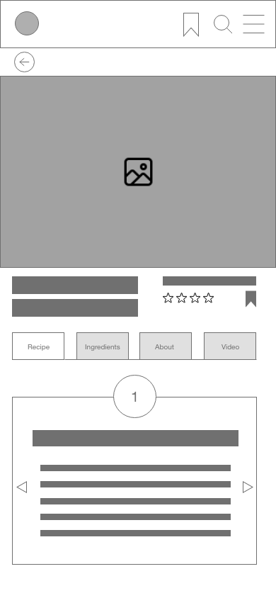
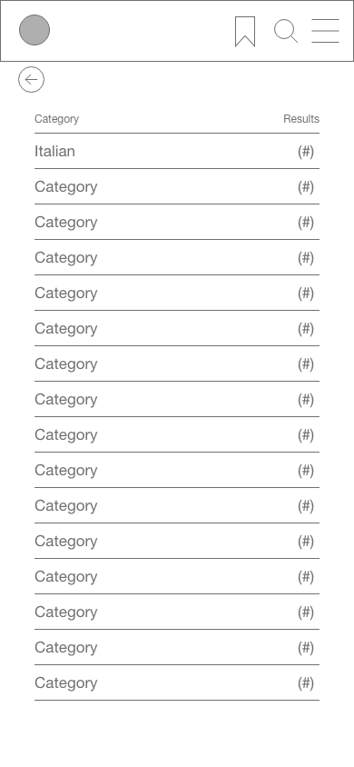
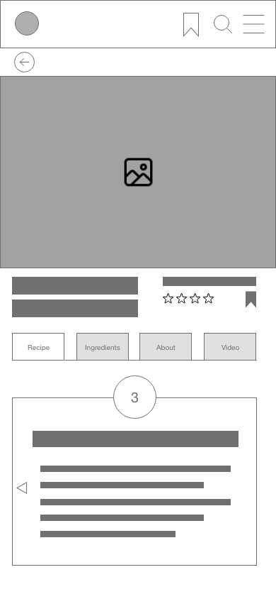
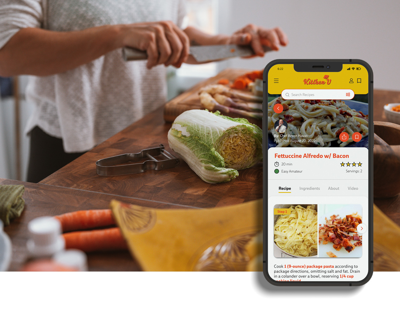
The product should be able to de-clutter the instructions of the recipes by having compartmentalized sections.
- Search for recipes by name/ ingredients already at home
- Be able to follow cooking instructions easily either by written instructions or video
- Search recipes by categories and ingredients or keywords
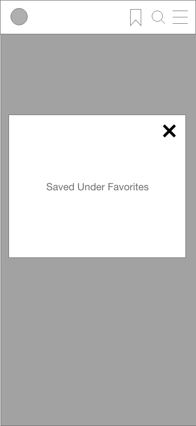
- Save recipes in a favorites folder
>>DESIGN PROCESS
Discovery
For the discovery process, the research is based on the original project brief, followed by user interviews and testing, and finally competitive analysis research of other similar apps.
Understanding
Understanding the pain points of the user experience was the process to follow. By selecting a potential group of users, a series of interviews were done to find how each one felt about the overall experience with recipe apps.
Prototyping User Testing
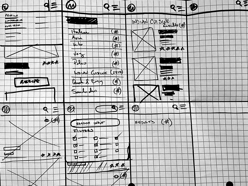
Rapid sketching was developed and tested with some users to establish usability, preference testing, and final design.
APPLIED SKILLS:
UX Design:
User flows, rapid sketching paper wire-framing, digital low-fidelity wireframes.
UI DESIGN:
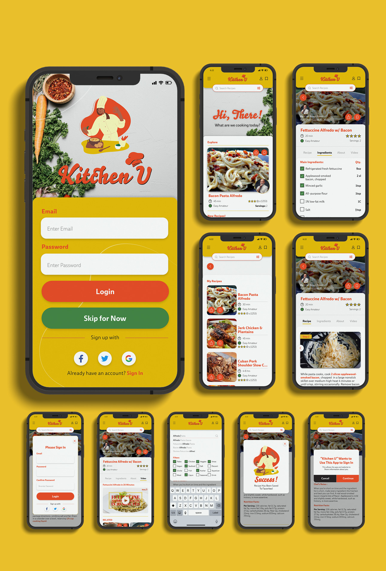
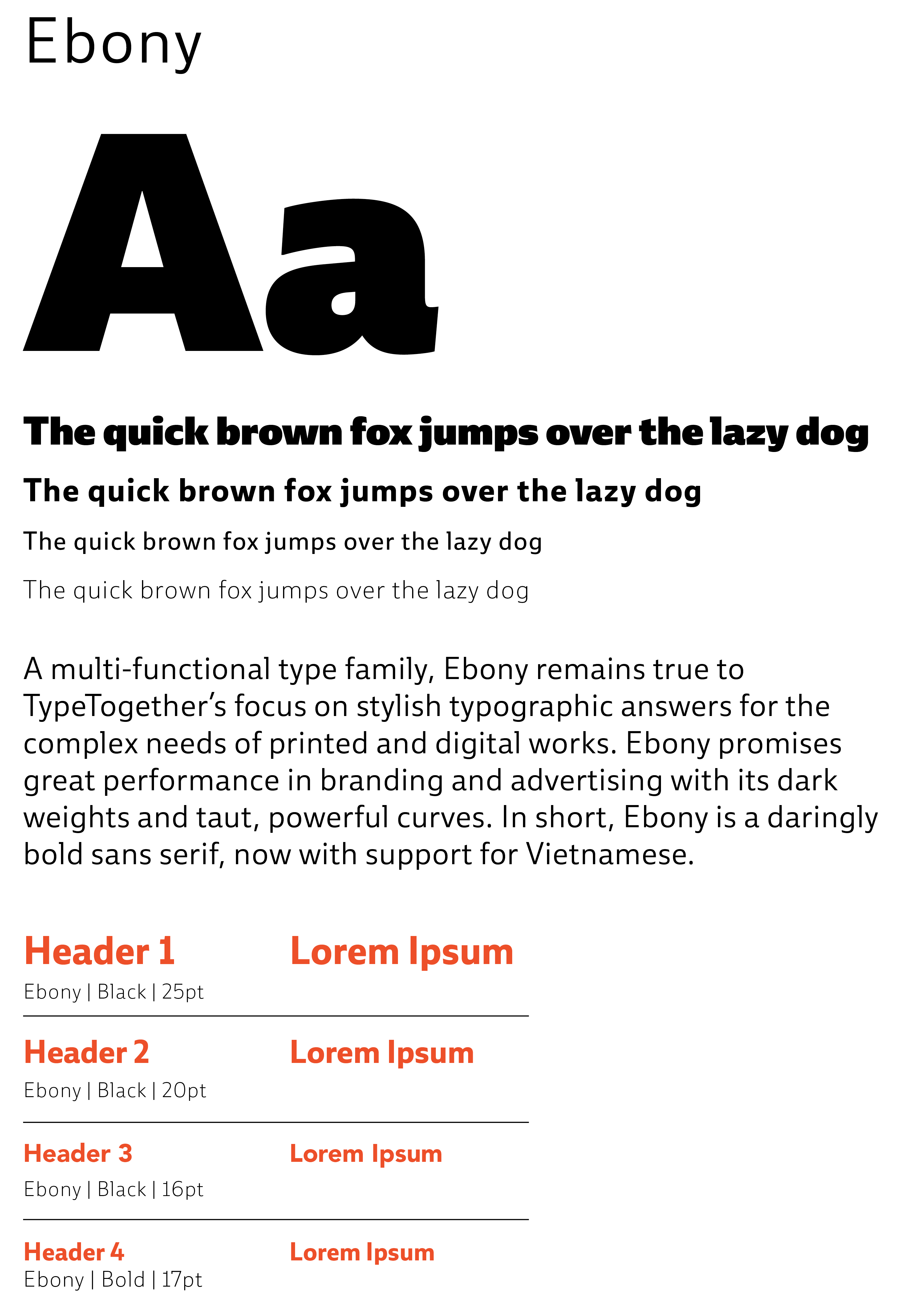
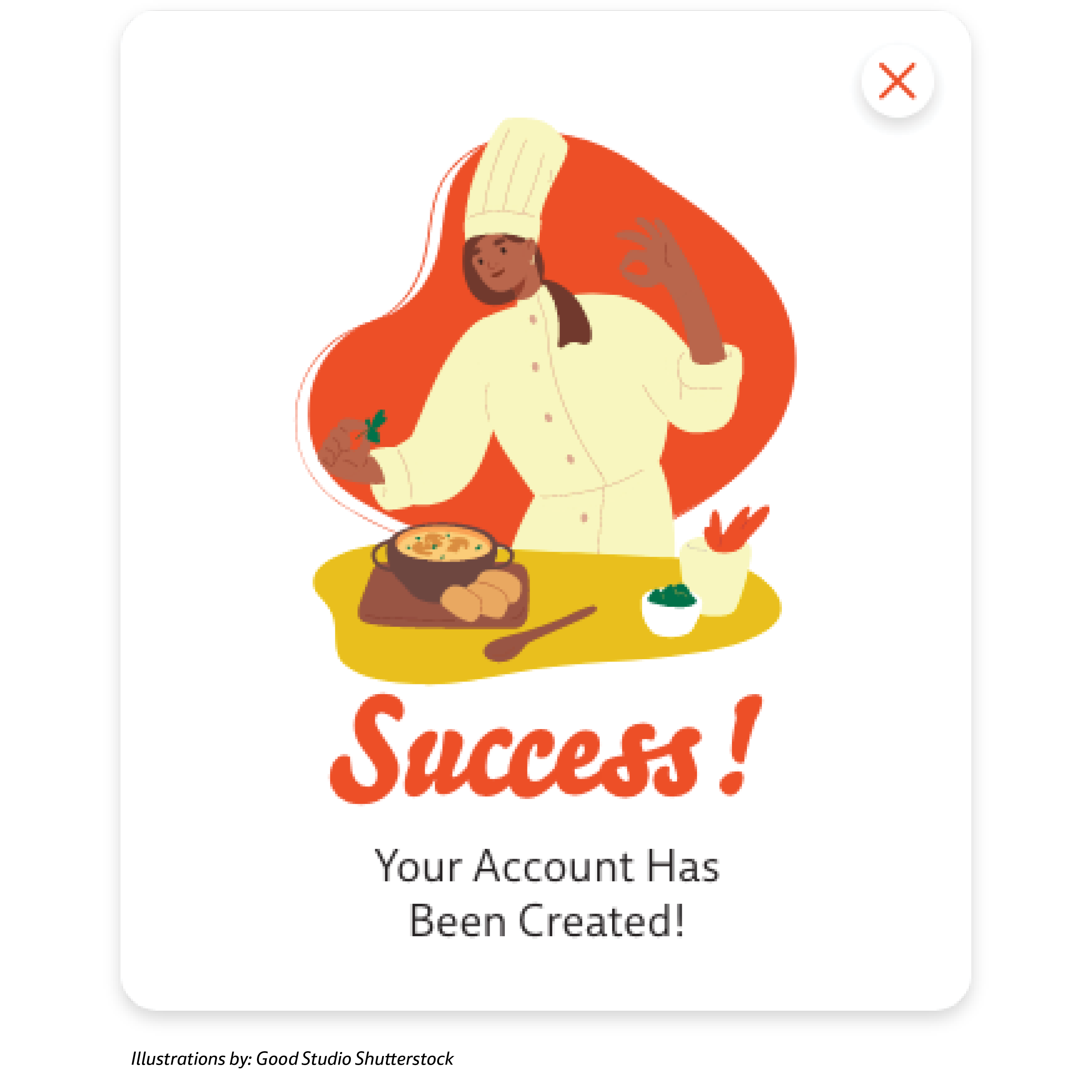
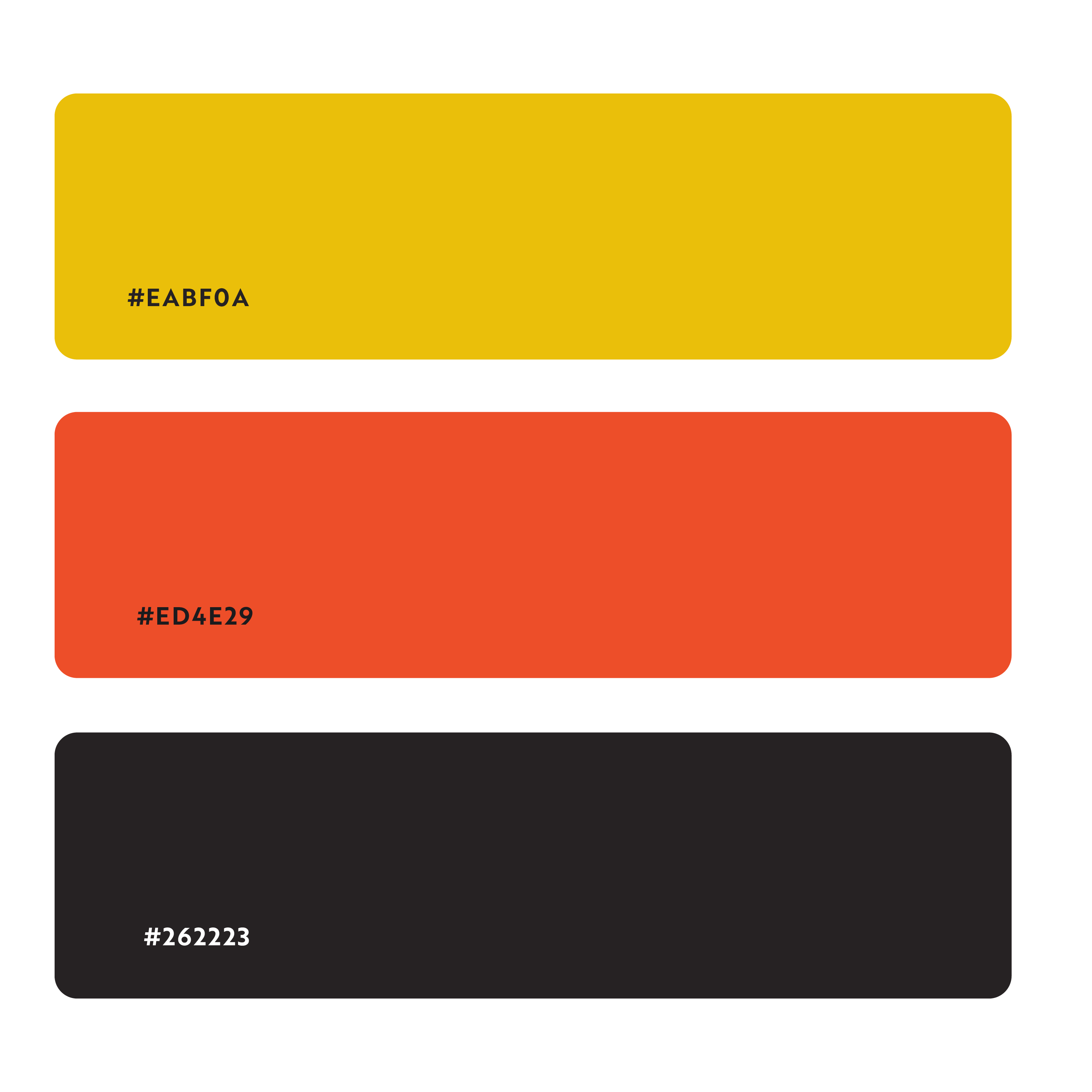
Brand identity design applied consistently on both native guidelines (iOS elements and Material Design) including iconography, typography and color palette.
User Testing:
Testing through interactive mobile prototypes created through Adobe XD, analyze user feedback and apply changes accordingly.
Project Duration:
5 Weeks – 16 Screens
ROLE:
My role during this project was split between UX/UI designer and Brand designer. I focused on developing the brand identity, creating wireframes, conducting usability tests and creating user flows.
>>RESEARCH: COMPETITIVE ANALYSIS
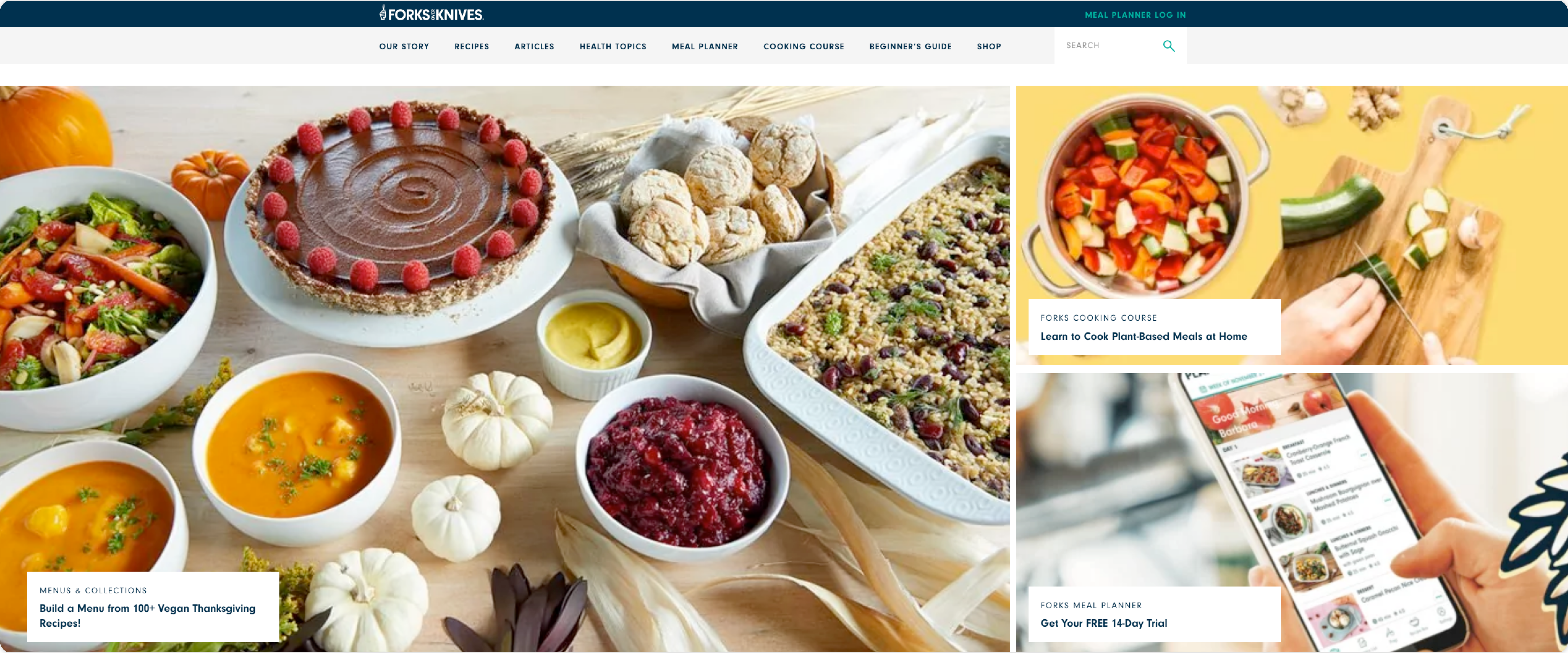
I conducted a competitive analysis on two recipe apps, Forks Over Knives and My New Roots, both popular in the field. I conducted the analysis to collect and evaluate information regarding the UX of both apps to find points of improvement. Users don’t have the time or ability to visit physical stores and would rather buy their goods on the go or from home. It’s also more convenient to try out the items and easily return those that aren’t desired or appropriate without having to return to a physical store.
SWOT ANALYSIS #1: FORKS OVER KNIVES
Strengths
- Color palette consistent with the theme.
- High quality pictures for recipes
- Iconography is consistent and clear.
- Search bar for easy look up
- Beginner’s guide
WEAKNESSES
- Requires upgrading for full access.
- Perhaps a bit too busy with extras. Too many blogs and information. Might overwhelm the user thats just looking for a new recipe.
OPPORTUNITIES
- Doing away with on-boarding for meal planner.
THREATS
- A wide variety of recipe apps as competition.
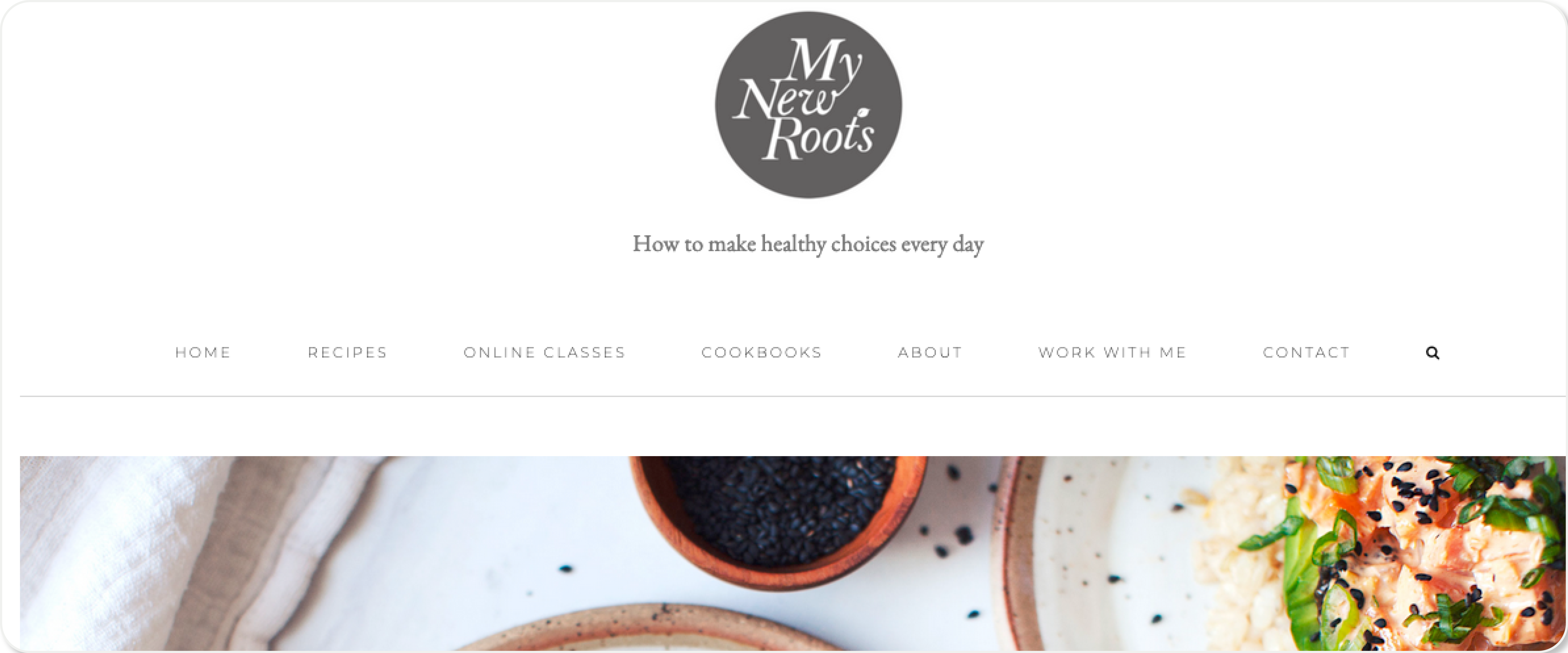
SWOT ANALYSIS #2: MY NEW ROOTS
Strengths
- Clean design.
- High quality pictures for recipes.
- Search bar for easy look up.
- Cooking classes and lectures.
WEAKNESSES
- Recipe page has a long bulleted list of recipes which makes it very hard to read and to search.
- No SEO.
OPPORTUNITIES
- Partnerships with other websites as guest bloggers and sharing recipes.
- Strong Instagram subscription
THREATS
- Recipe page should be the most important page on the website. Long list scroll is messy and difficult for searches.
>>USER PERSONAS
By gathering a selective group of people and conducting interviews regarding their familiarity with cooking recipes, I was able to determine the most important “wants’ that most of users expect of a recipe and cooking app.
MARIA FRANCO
JEWELER
Age: 45
Status: Married 2 Kids
Location: Montreal QB
Interested in: Movies, her children, Jewels, music, TV series
“I am truly extremely busy! But I have to manage everything effectively”
BIOGRAPHY
Maria is a mother of two young boys; she has two degrees, one in Engineering and one in Jewelry design. After having and tending to her two boys, she decided to find another profession that would conform to her motherly duties since her children are her most important job.
NEEDS AND GOALS
- Maria needs quick reference guides for when she uses cooking recipe applications or websites.
- She only cooks on special occasions.
PAIN POINTS
- Maria dislikes cooking
- Maria struggles with a sedentary life.
ENRIQUE MANJAR
ART DIRECTOR
Age: 43
Status: Single
Location: Washington, D.C.
Interested in: Video Games, Volleyball, Comic Books and Movies
“I am a very “What’s the problem so we can fix it” kinda guy”
BIOGRAPHY
Enrique is an Art Director for an international organization located in Washington D.C. He is laid-back, very well-liked, and he can make friends easily. Enrique is the go-to guy for everything, from making a big plan with lots of people or the go-to guy at work that will help you no matter what. He enjoys a single life but will want to have a family eventually.
NEEDS AND GOALS
- Enrique needs easy-to-follow recipes.
- Enrique needs to balance his single lifestyle, going out and ordering take out to achieve better health
- Enrique needs to learn how to cook more efficiently because he doesn’t consider himself a good cook.
PAIN POINTS
- Enrique dislikes pop-up ads.
- Enrique dislikes recipes that focus on products of a specific brand
- He doesn’t like to read anything, ever.
- He doesn’t like to diet but does it in order to stay health.
>>MVP OBJECTIVE
HYPOTHESIS
After collecting all the data, I was able to establish a hypothesis. Users usually get easily frustrated with recipe apps that contain too much clutter and are not organized. Most of these SEO strategies become invasive on websites such as ads, blogs, pop-ups, and CTAs.
By strategically organizing all the information focused on the user, the company will keep the advantage of SEO and other monetary possibilities without frustrating the user.
>>USER STORIES/FLOWS
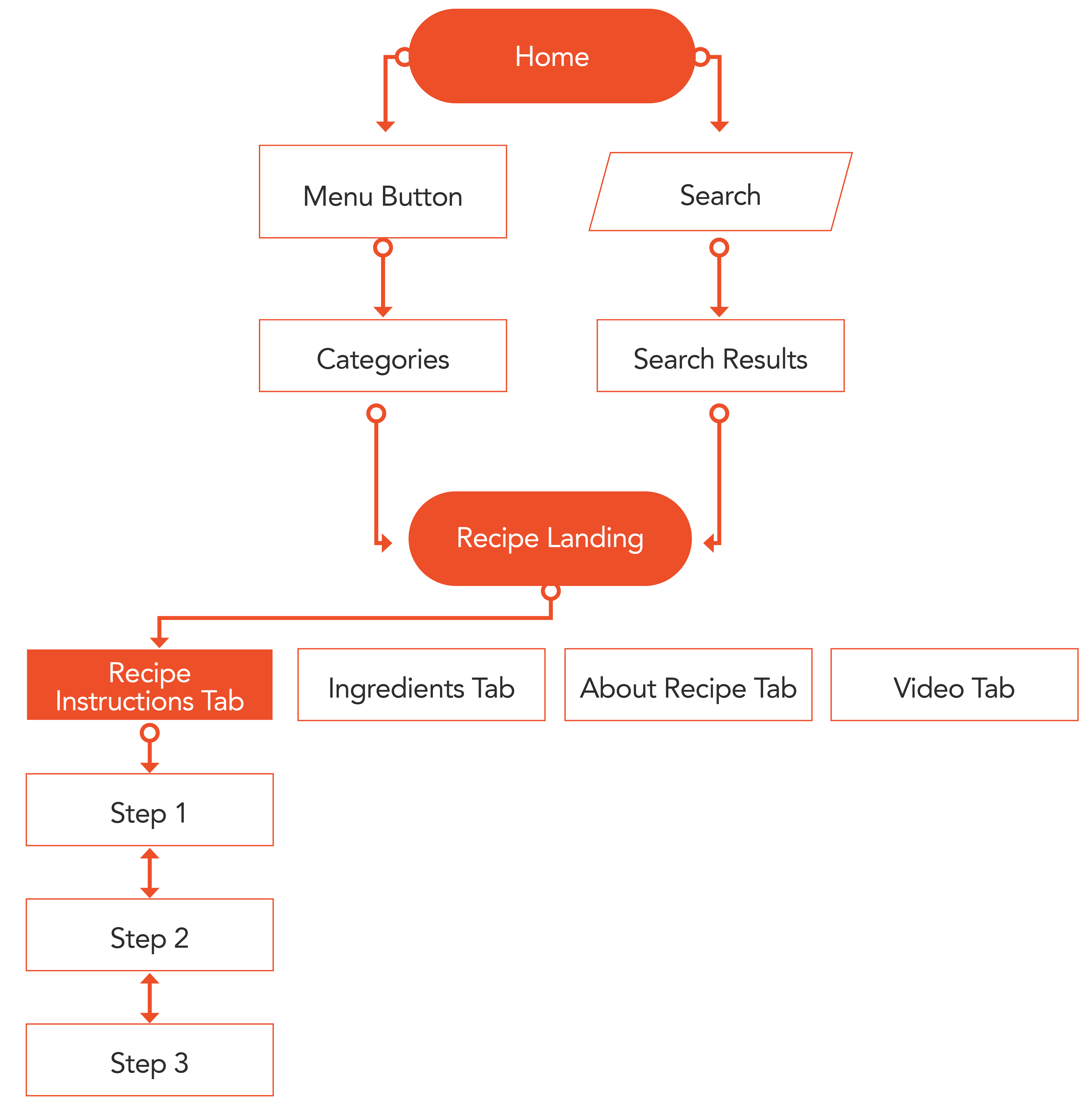
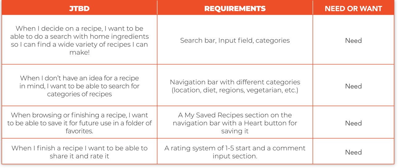
Once the objectives were established, using the Lean UX model, a list of Jobs To Be Done was created to establish the MVP, Minimal Viable Product. These are the User Flows of the 3 Jobs To Be Done.
JTBD #1
When I decide to cook and have certain ingredients already accessible in my home, I want to be able to search with those ingredients so I can find a wide variety of recipes I can make!
Entry Point: Homepage
Success Criteria: Use search bar for recipe results by ingredients
JTBD #2
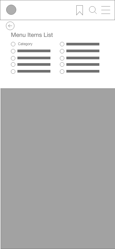
When I don’t have an idea for a recipe in mind, I want to be able to search for categories of recipes to find a good fit for my cravings. I also want to be able to know if the recipe needs a long preparation or if it can be done on the spot.
Entry Point: Homepage
Success Criteria: Navigate through categories
JTBD #3
When I find a recipe I like, I want to be able to see the recipe right away without any distractions, so I don’t have to waste time scrolling up and down while managing the steps and trying to find certain parts of the recipe in a long list and wordy instructions.
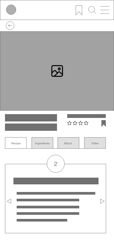
When following a recipe I want to be able to focus on each step at a time, and I want the instructions to be accurate and that includes the amount of each ingredient inside the instructions, so I don’t have to revisit the ingredients list and its quantities.
Entry Point: Homepage
Success Criteria: Be able to navigate through each steps easily
>>MVP PROTOTYPE (Rapid Sketching)
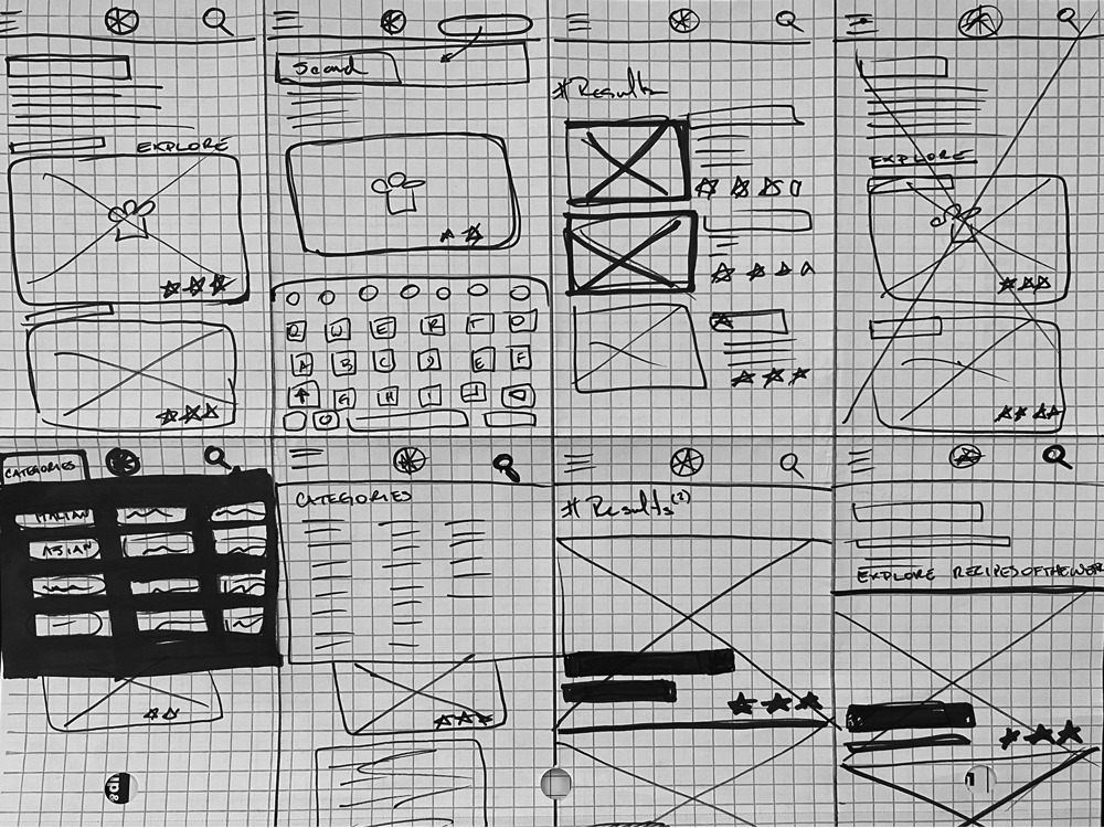
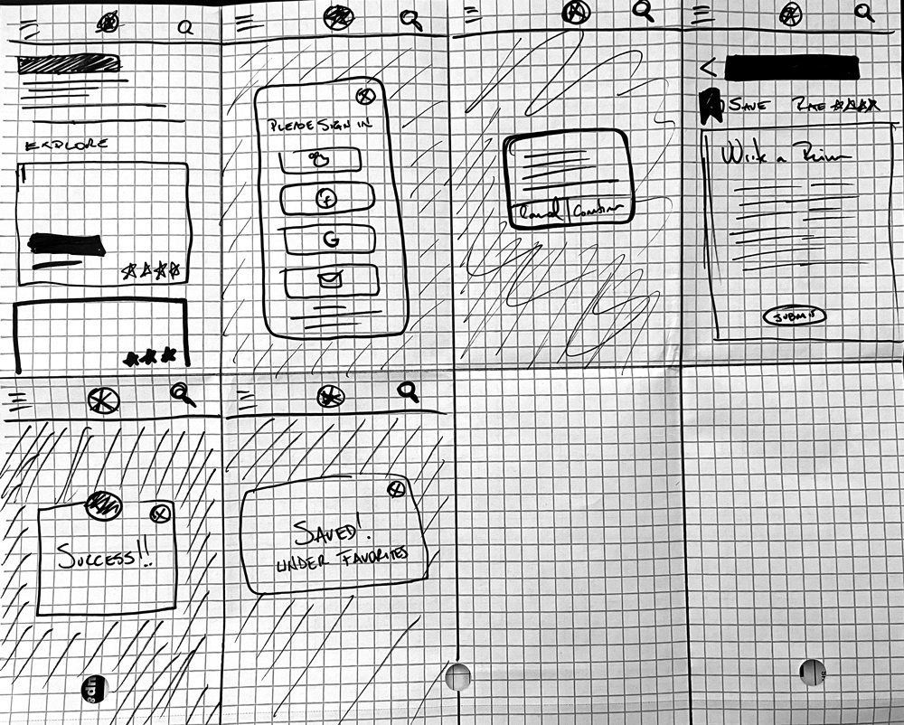
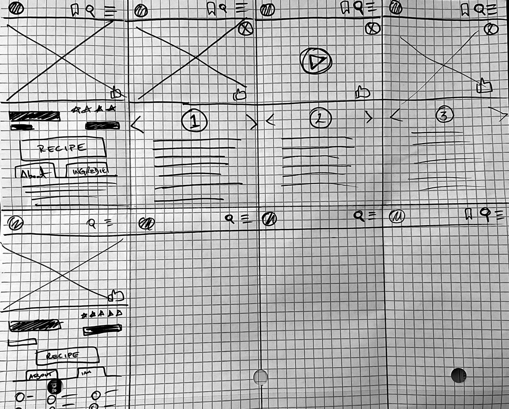
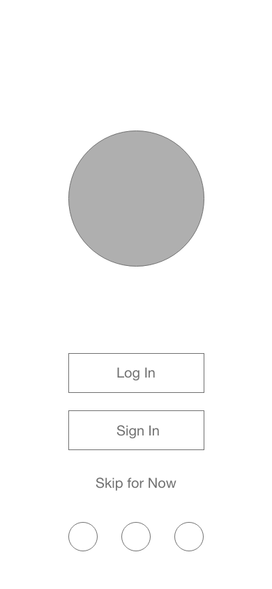
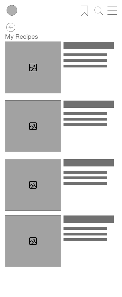
Once the MVPs where establish I was able to do some rapid-sketch prototyping utilizing the Crazy 8 method. Then, those sketches were moved into low-fidelity wireframes to create a usability test.
>>WIRE FRAMES
USER FLOW 1 / MID FIDELITY
>>USABILITY TESTING
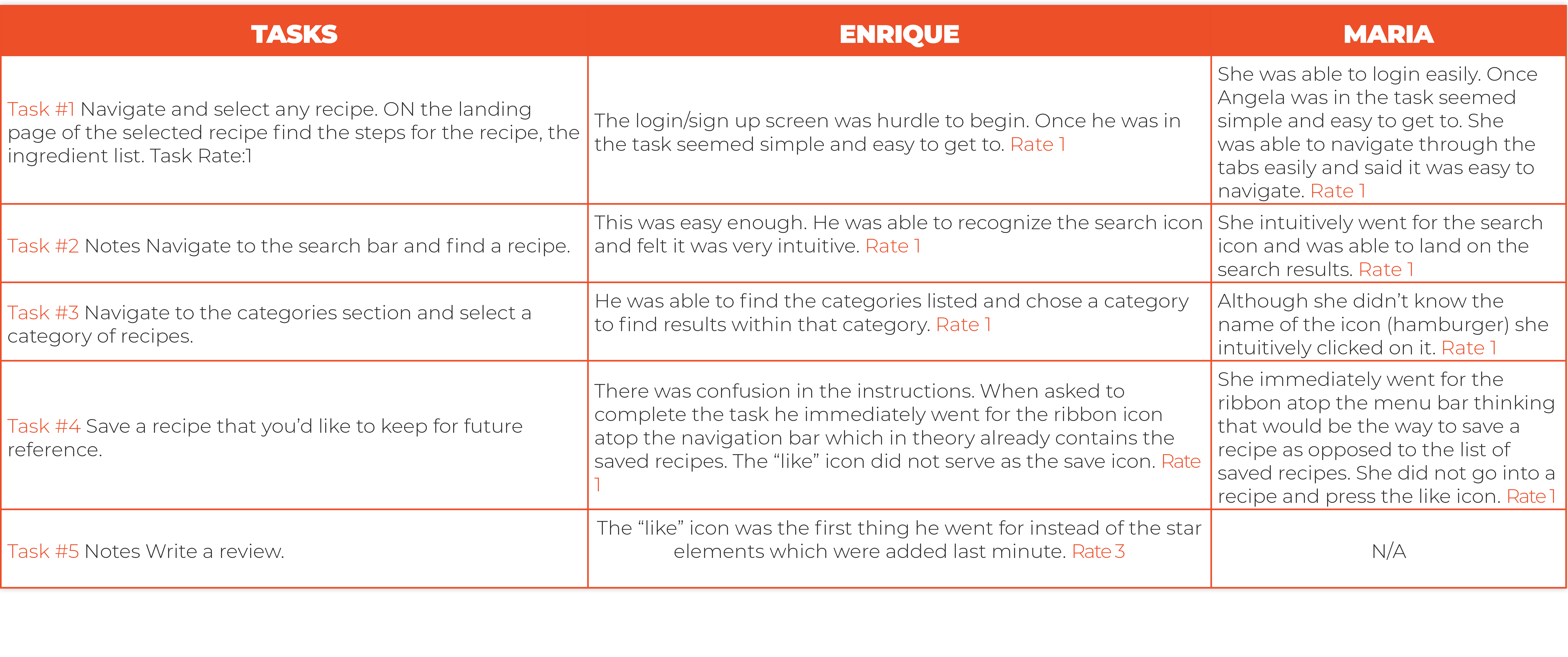
>>RESULTS SYNTHESIS

0 = I don’t agree that this is a usability problem at all
1 = Cosmetic problem only: need not be fixed unless extra time is available on project
2 = Minor usability problem: fixing this should be given low priority
3 = Major usability problem: important to fix and should be given high priority
4 = Usability catastrophe: imperative to fix before product can be released
>>RETROSPECTIVE
What did go well?
The common tasks during the user testing went very well. It feels like the solutions applied to the UX were very intuitive and easy to manage for the testers. I got a majority of tasks rated 1 on a 1–5 difficulty scale.
My solution to de-clutter scrolling and SEO keywording was well received. The tab system seems to work by compartmentalizing the recipe itself from the storytelling and everything else.
Competitive analysis was also a great tool to apply. By comparing and contrasting Forks Over Knives and My New Roots I was able to identify several good and bad strategies to support the objective.
I have a new set of skills concerning the journey of a UX project. Those include competitive analysis, interviewing and creating questionnaires for user persona development, and most importantly, receiving feedback from peers.
What didn’t go well?
One of the biggest obstacles to me is rapid sketching. It is a skill that I have lost through time due to the nature of my high volume of work in real life. In my daily life, I mostly rely on brand guides and rapid deliverables. In that context, rapid sketching and low-fi wire-framing were issues to the point that I did not feel comfortable presenting those sketches to the testers I had gathered.
The remote setting and lack of communication with other students might have been an issue to find a varied group of testers. I didn’t want to use Career Foundry students because they are doing the same projects and they might contaminate the thinking pool of everyday users.
User flows need work. This is another skill I need to continue to shape for better usage. I had a hard time putting those together in a way that made sense. Or so I believe.
I have realized that UX research might be too big a task for one person to begin with. I felt overwhelmed and preoccupied with my decisions.
WHAT CAN BE IMPROVED?
As mentioned above, rapid sketching needs to improve on my part as well as planning better user-flow graphics.
Time management was an issue as well because of the scope of the project.
>>UI DESIGN
DESIGN SYSTEM/STYLE GUIDE
TYPOGRAPHY
ILLUSTRATIONS
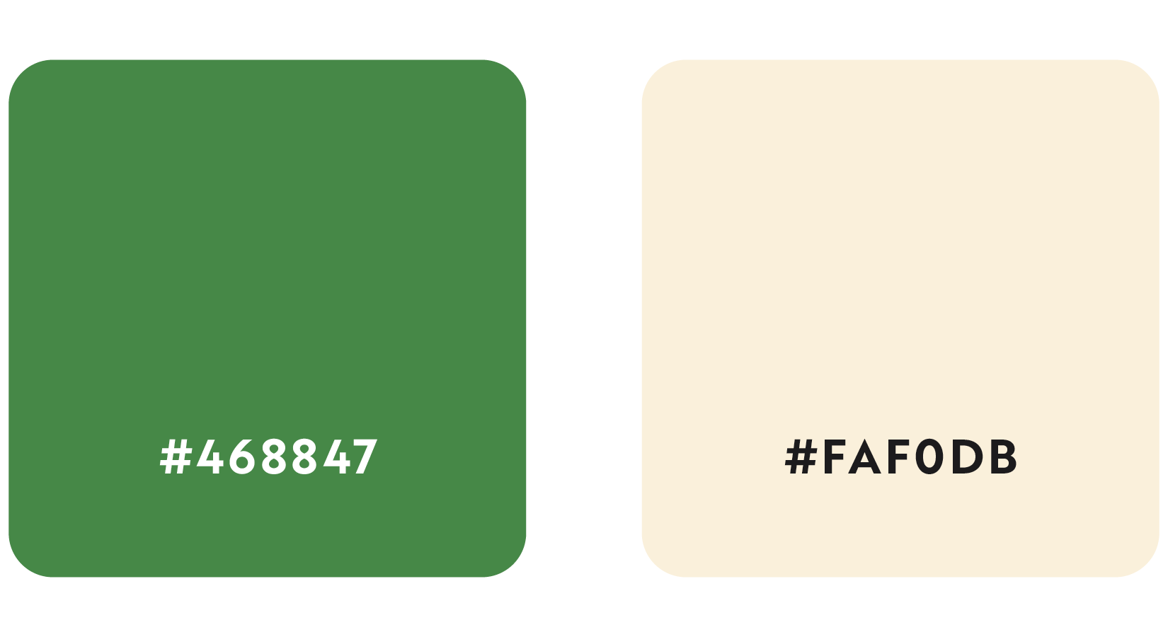
Color Palette
PRIMARY PALETTE
SECONDARY PALETTE
