Web Responsive App | UX Design | UI Design
B-Link
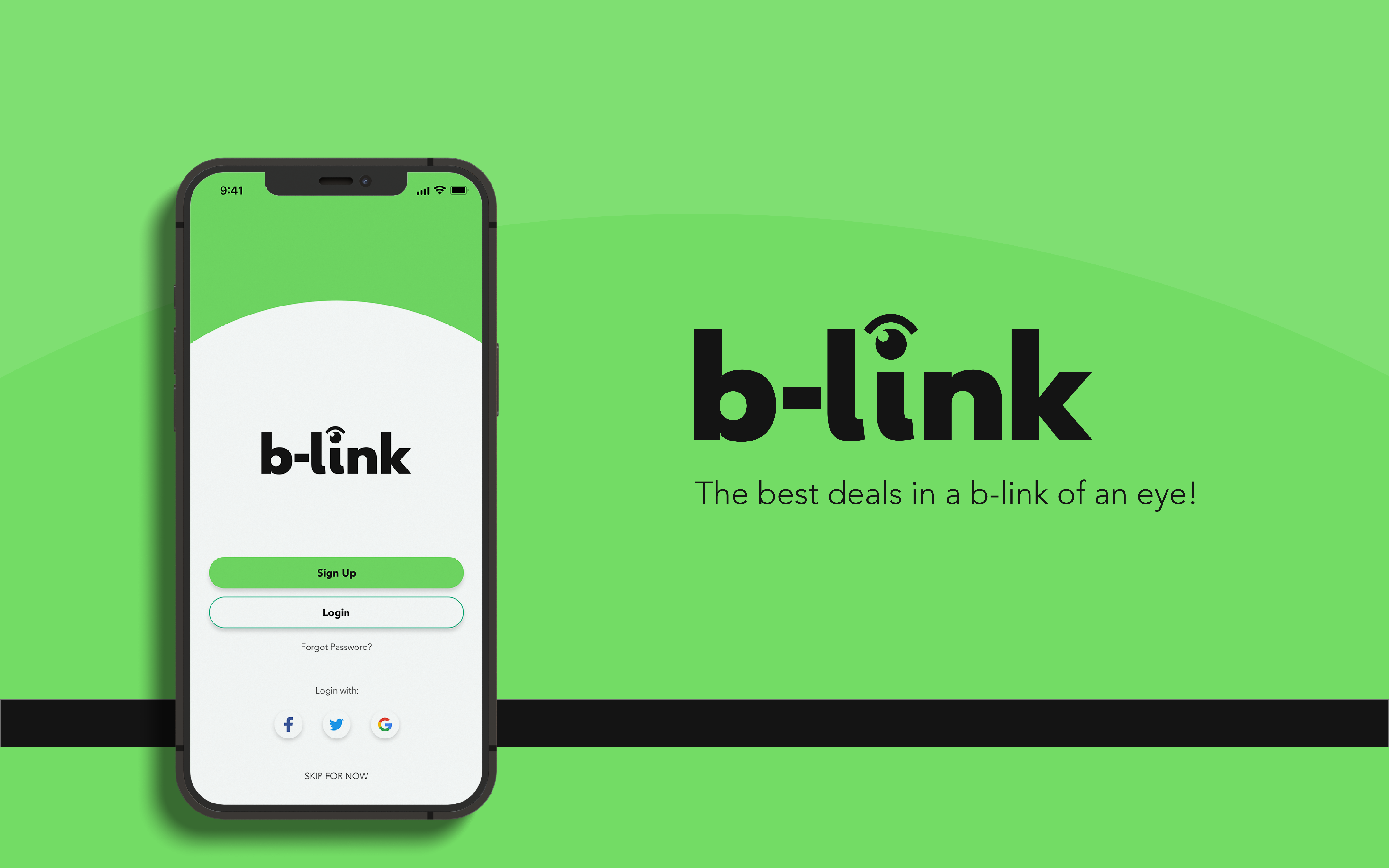
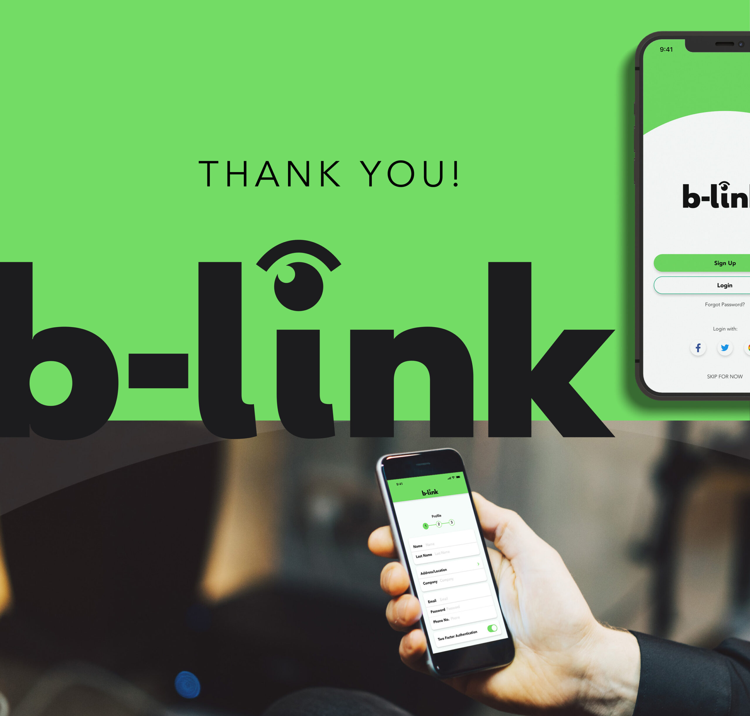
The best deals in a b-link of an eye!
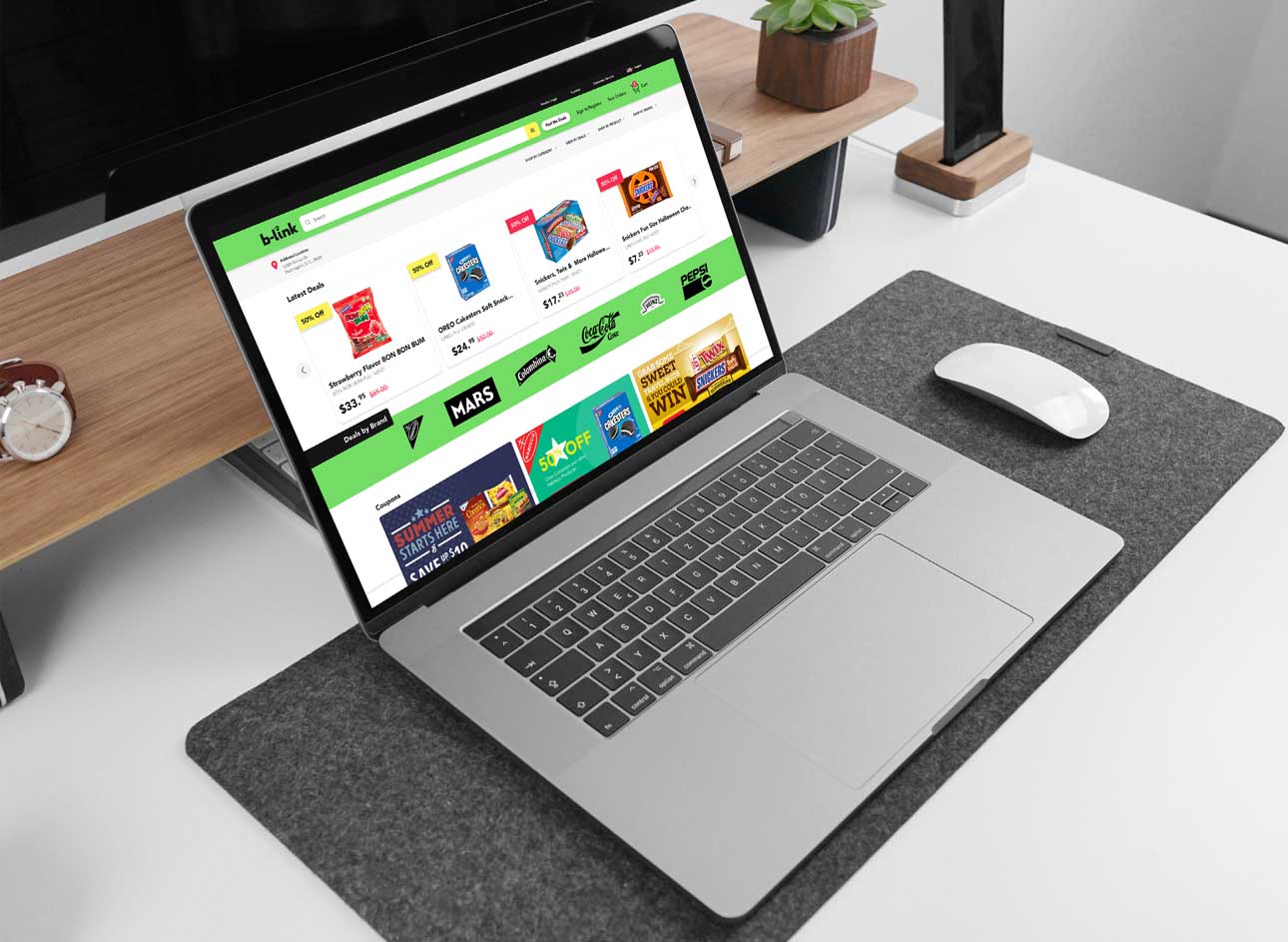
B-link specializes in allowing small businesses to find products of all worldwide brands at discounted prices to provide distributors with the best deals on one site.
>>THE OPPORTUNITY
This app was developed as a conceptual e-commerce store for an established distributing business based in Bogota, Colombia.
APPLIED SKILLS:
UX Design:
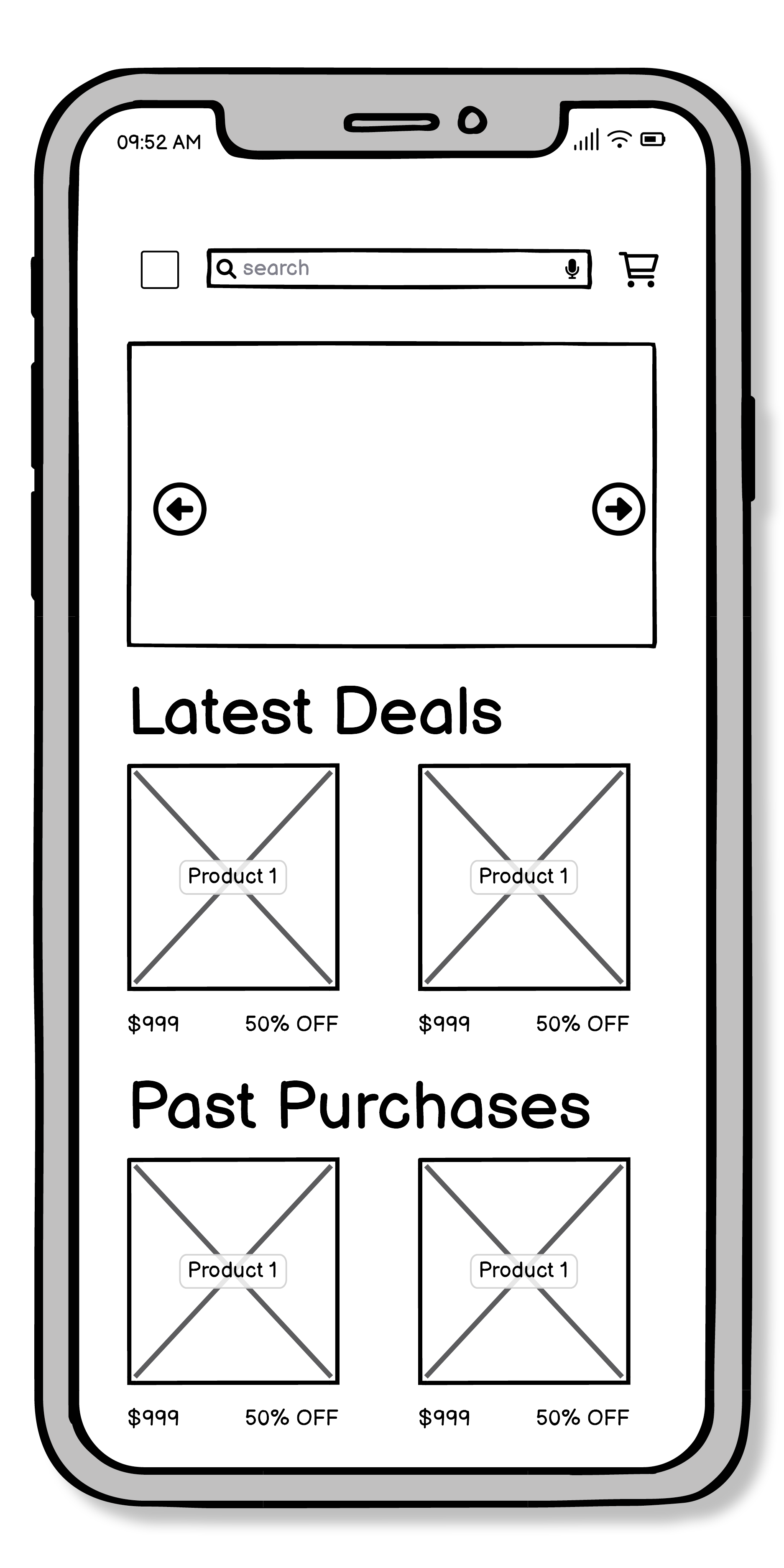
User flows, rapid sketching paper wire-framing, digital low-fidelity wireframes.
UI DESIGN:
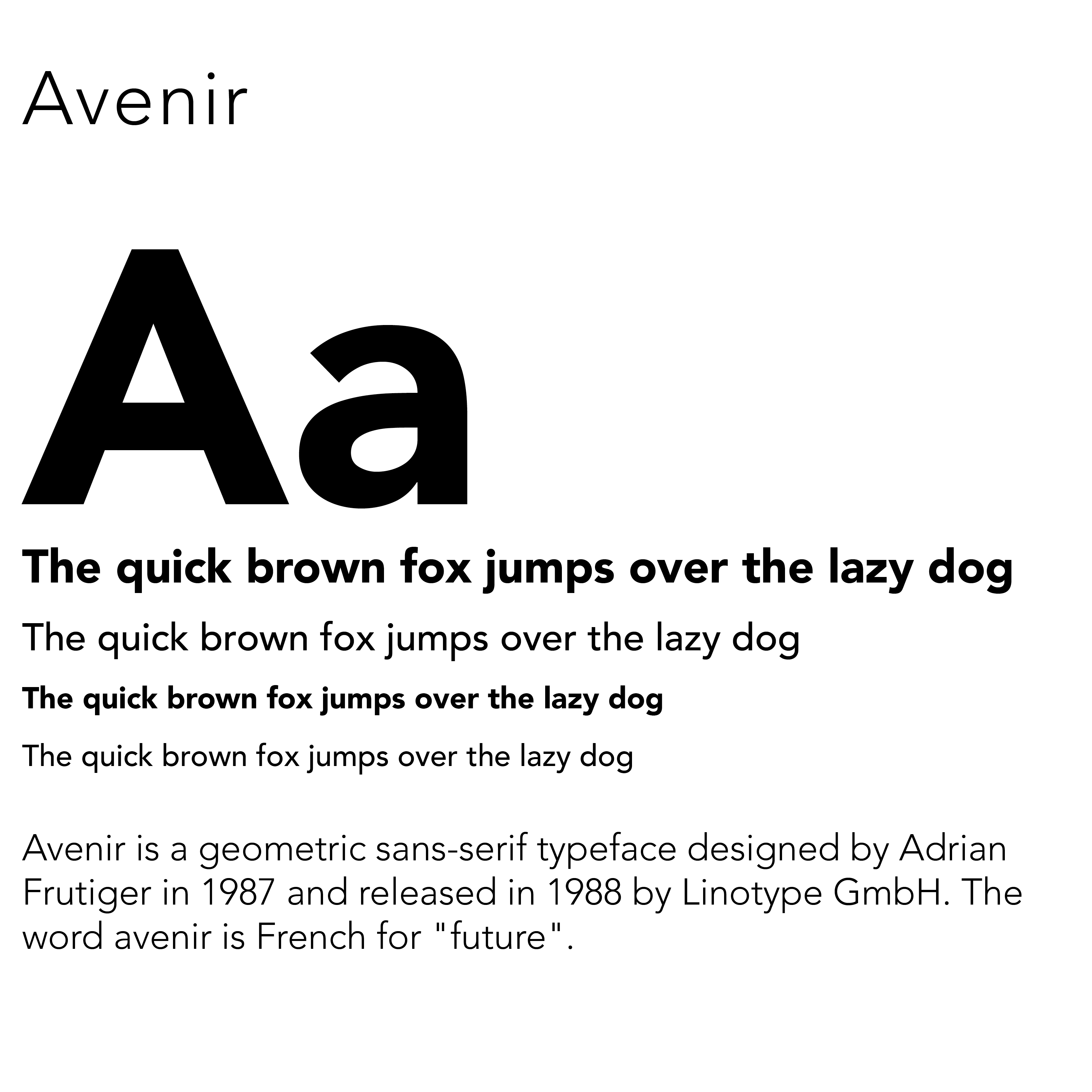
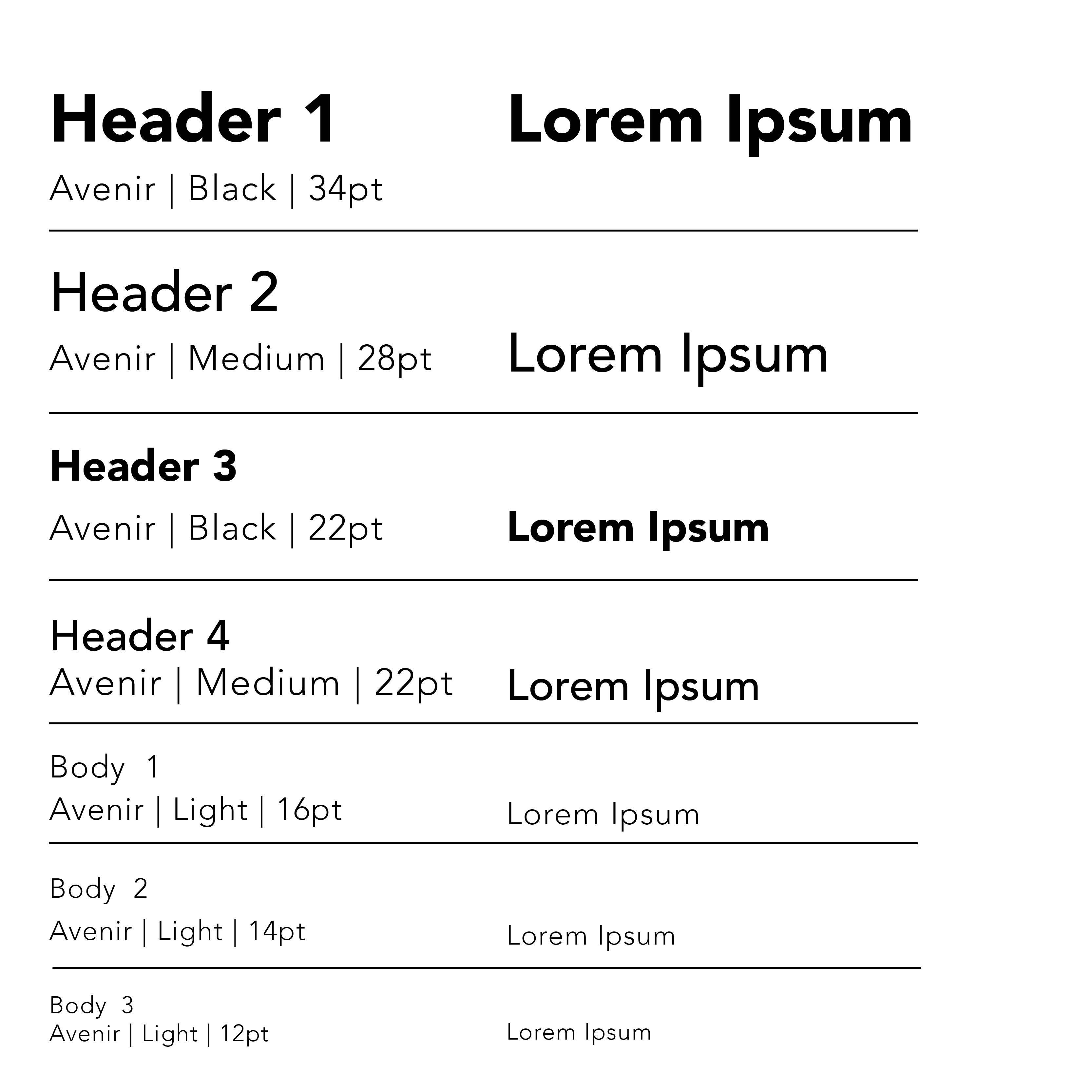
Brand identity design applied consistently on both native guidelines (iOS elements and Material Design) including iconography, typography and color palette.
User Testing:
Testing through interactive mobile prototypes created through Adobe XD, analyze user feedback and apply changes accordingly..
Project Duration:
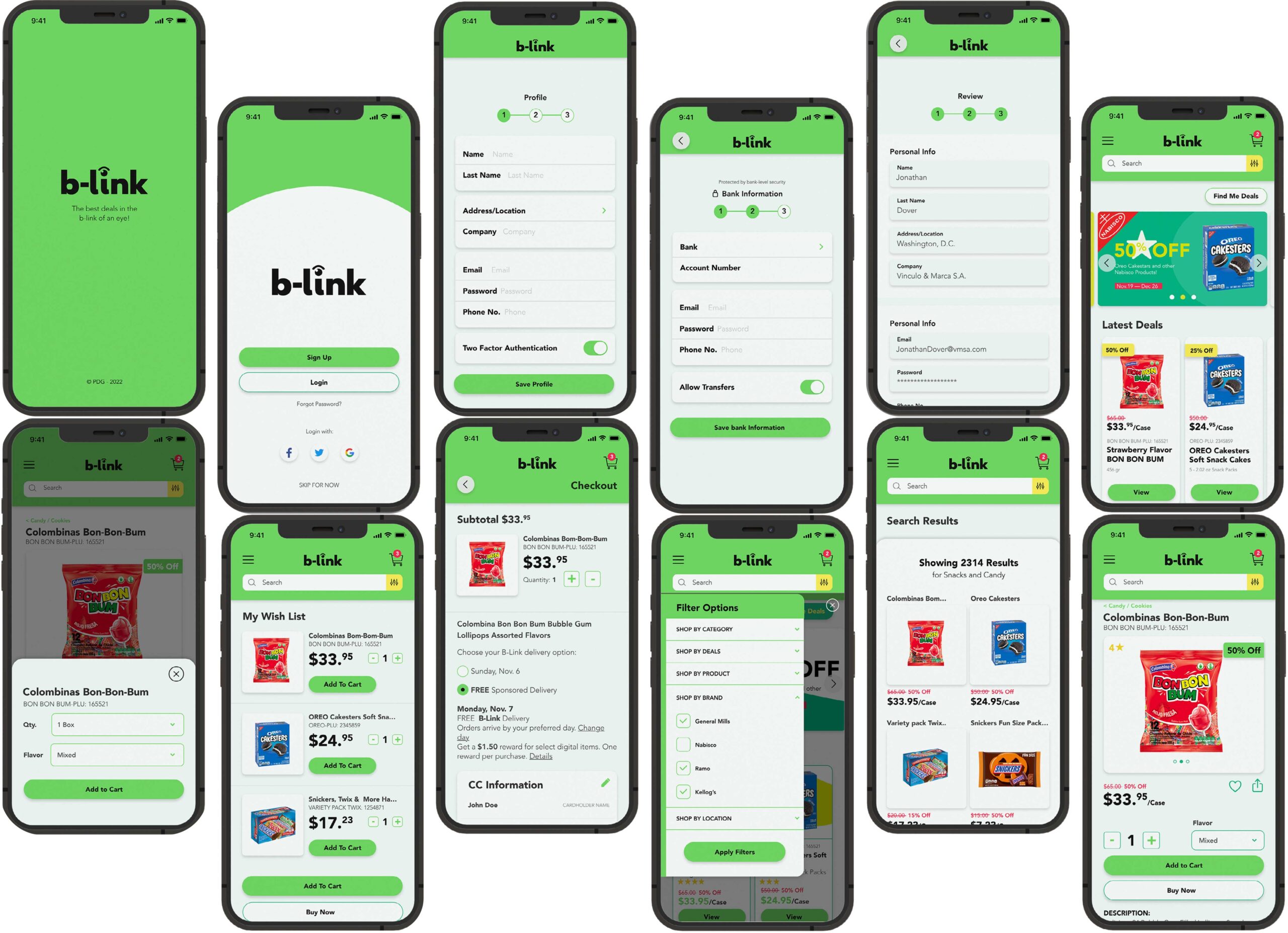
4 Weeks – 18 Screens
ROLE:
My role during this project was split between UX/UI designer and Brand designer. I focused on developing the brand identity, creating wireframes, conducting usability tests and creating user flows.
>>THE BRIEF
Objective:
Create a web online store and help distribution businesses find products quickly and easily match their particular needs when ordering wholesale products from worldwide brands.
WHO
This tool is for people who want to shop for key items without going into a physical store. Your online store is particularly valuable for people who struggle to find the items they want in traditional stores. Most of the users will be proficient with technology but will greatly benefit from basic navigation and clean design.
WHAT
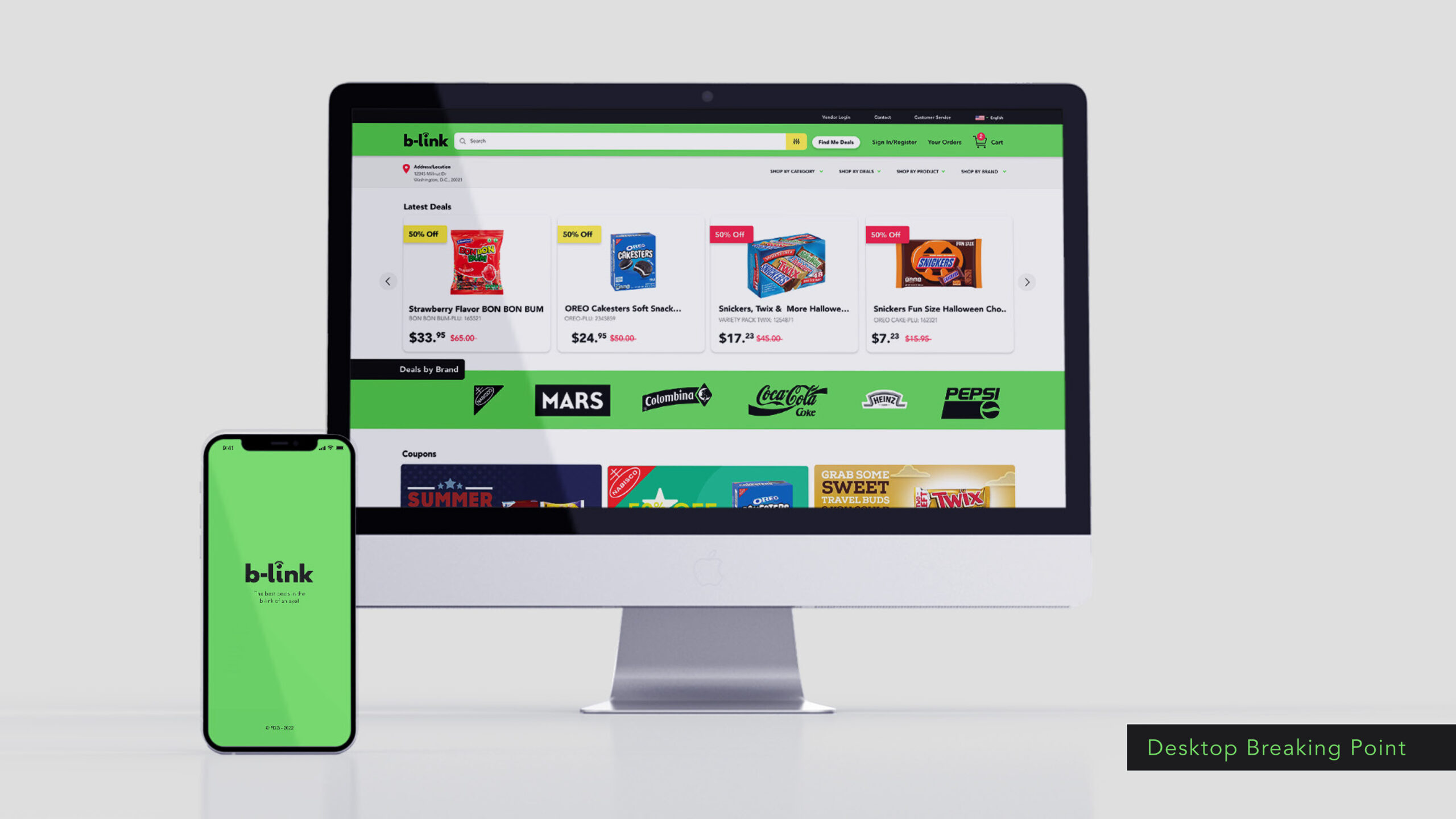
A responsive website, web app, and/or mobile app that shows users the inventory and can be filtered in particular ways depending on their needs. The tool allows users to purchase their desired goods and have them delivered to any address. Free return of the goods is possible.
WHEN
This product will be used most often on commutes to and from work, in the evenings, during lunch breaks, and on weekends.
WHERE
Users can easily shop from anywhere they can connect to the INTERNET, whether on a mobile device or on a desktop.
WHY
Users don’t have the time or ability to visit physical stores and would rather buy their goods on the go or from home. It’s also more convenient to try out the items and easily return those that aren’t desired or appropriate without having to return to a physical store.
>>USER STORIES/FLOWS
USER FLOW 1: CREATE A P R O F I L E
The first task would be to complete a profile to make yourself available as a legal professional. Second, the user should be able to schedule a professional by connecting with them and verifying their availability. Third, the user should be able to see how many professionals are within the map, where the user can click and open up the professional’s profile, see its schedule and send a scheduling request.
USER FLOW 2: WISHLIST
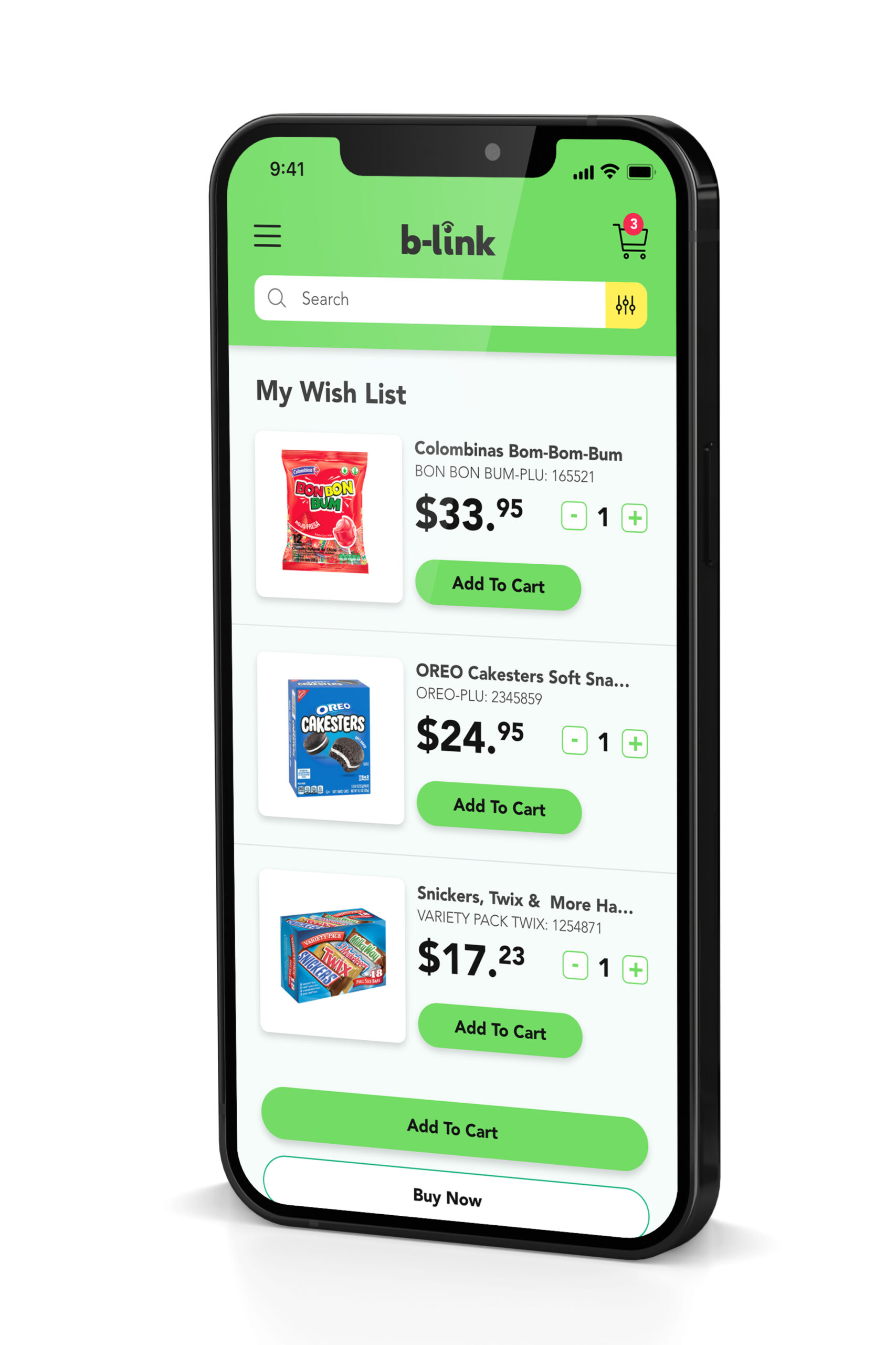
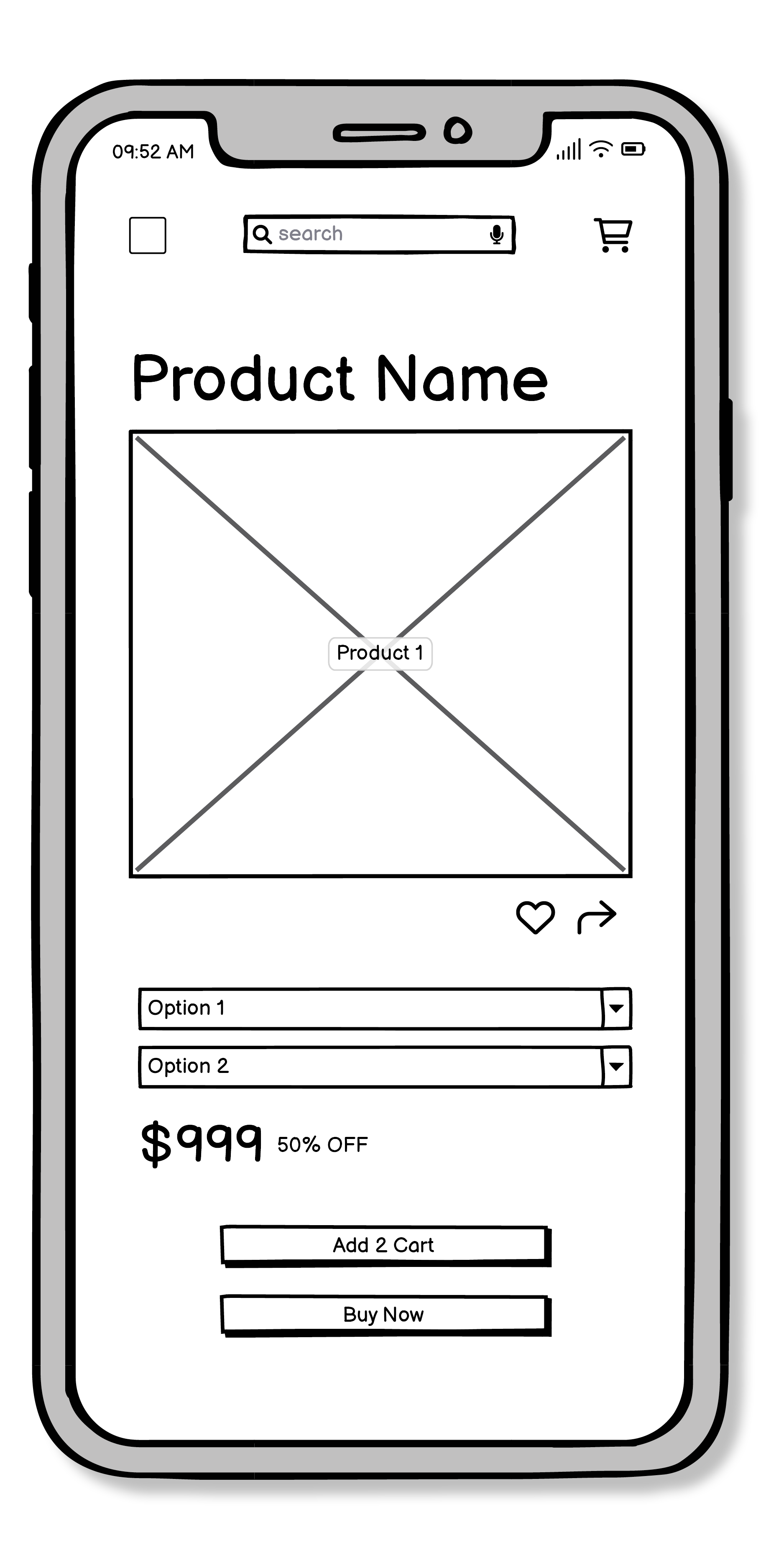
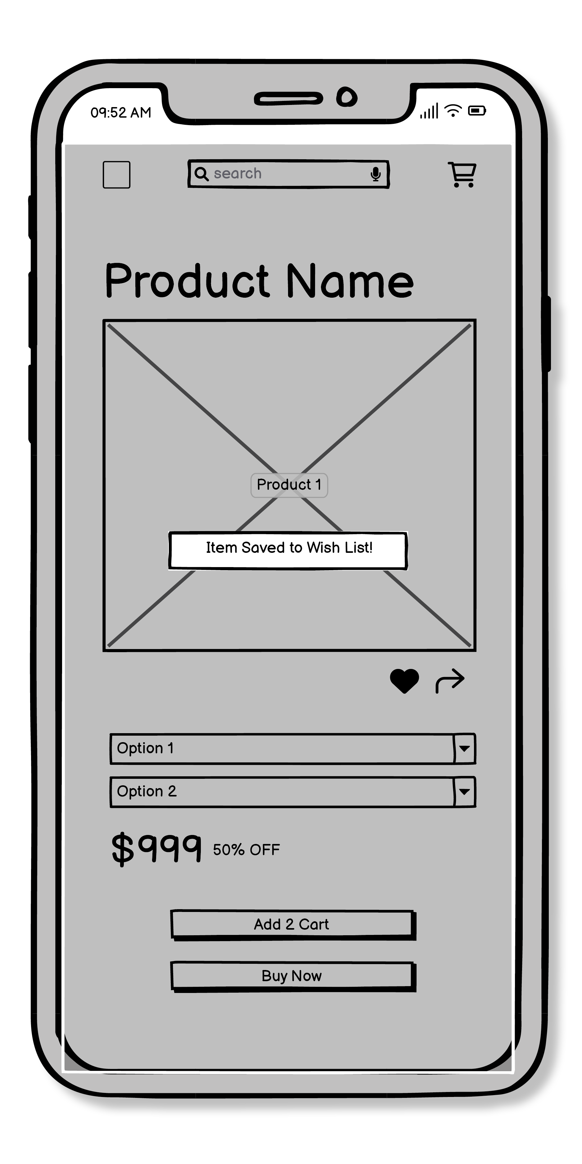
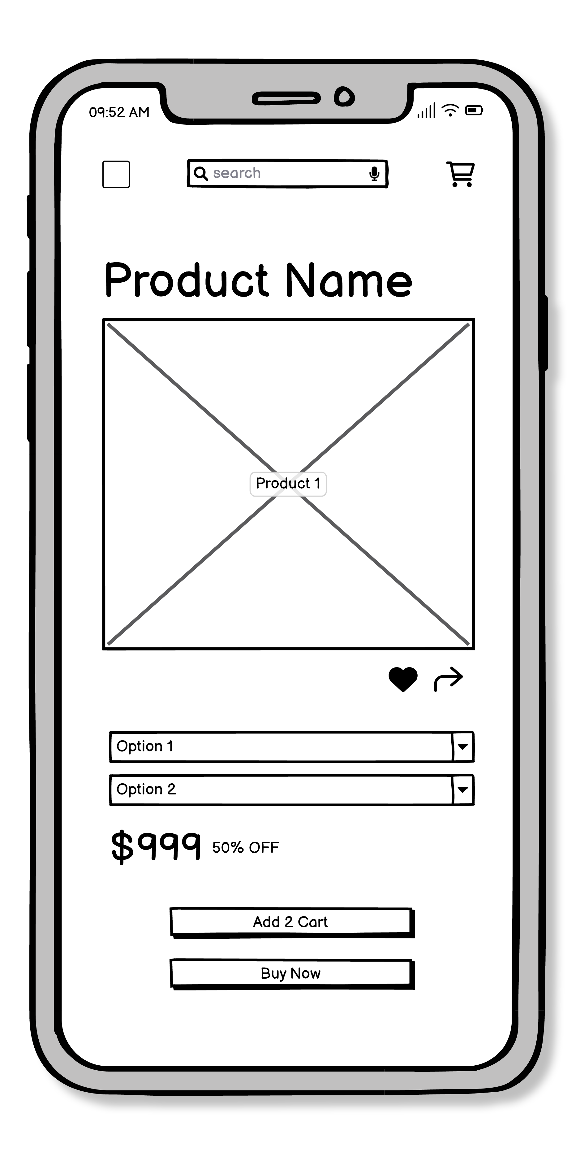
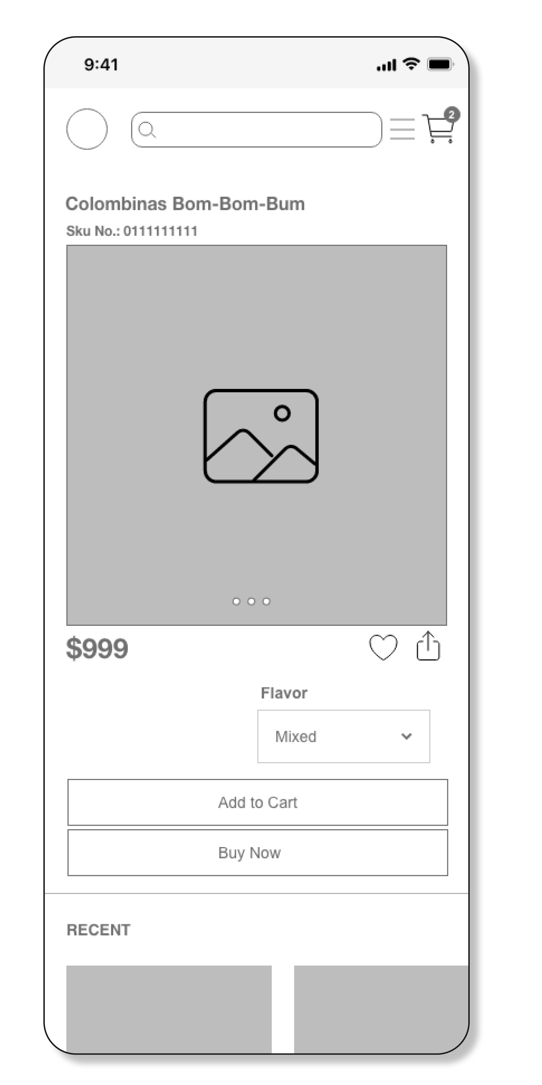
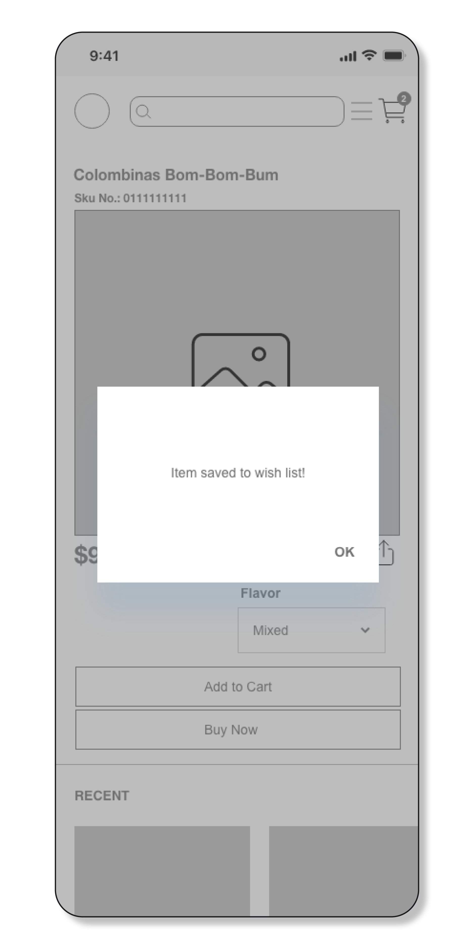
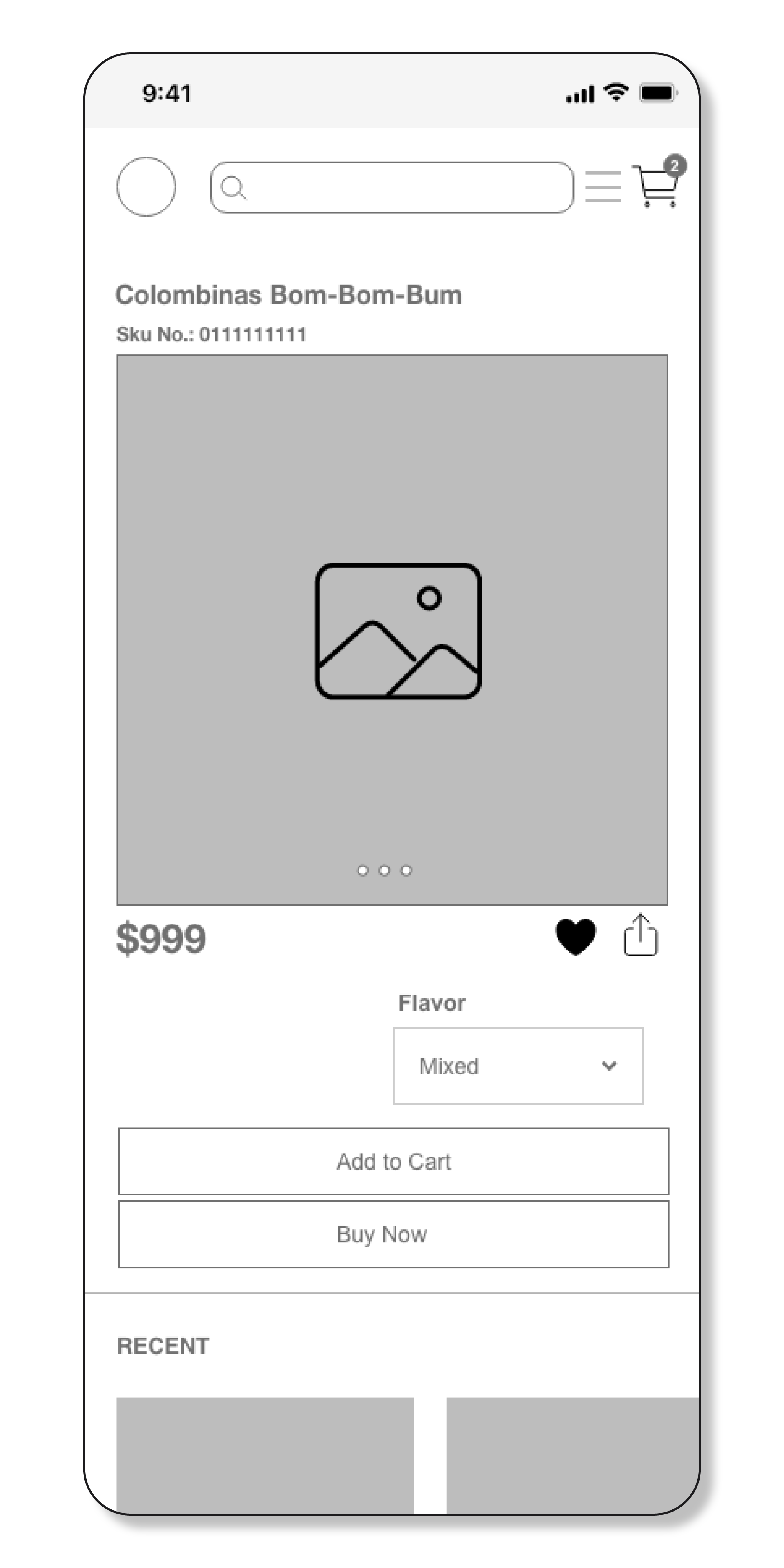
As a returning customer I want to be able to save items that I cannot buy to a wish list, so that I can purchase them at a later date. .
USER FLOW 3: FILTER SEARCH
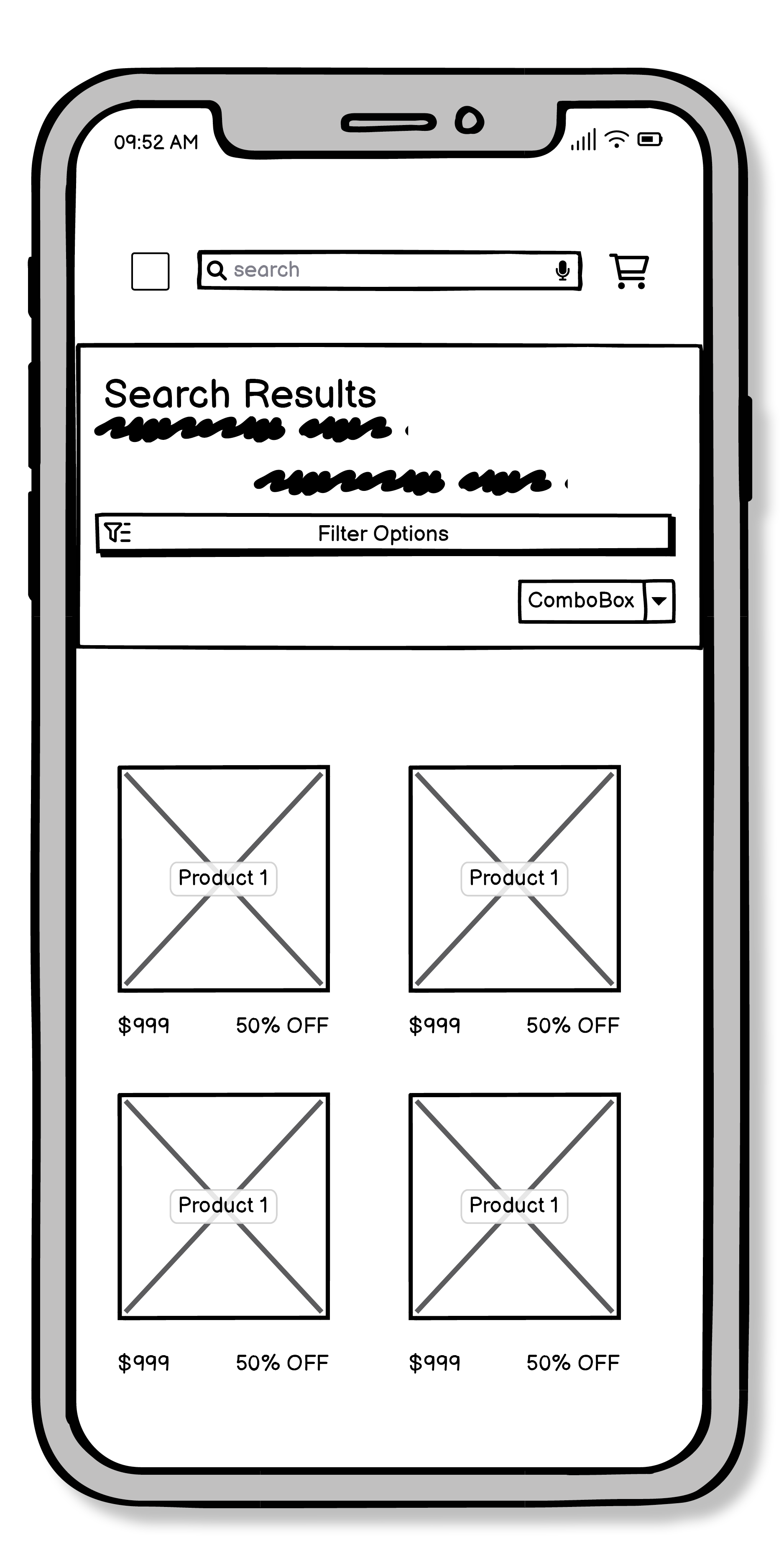
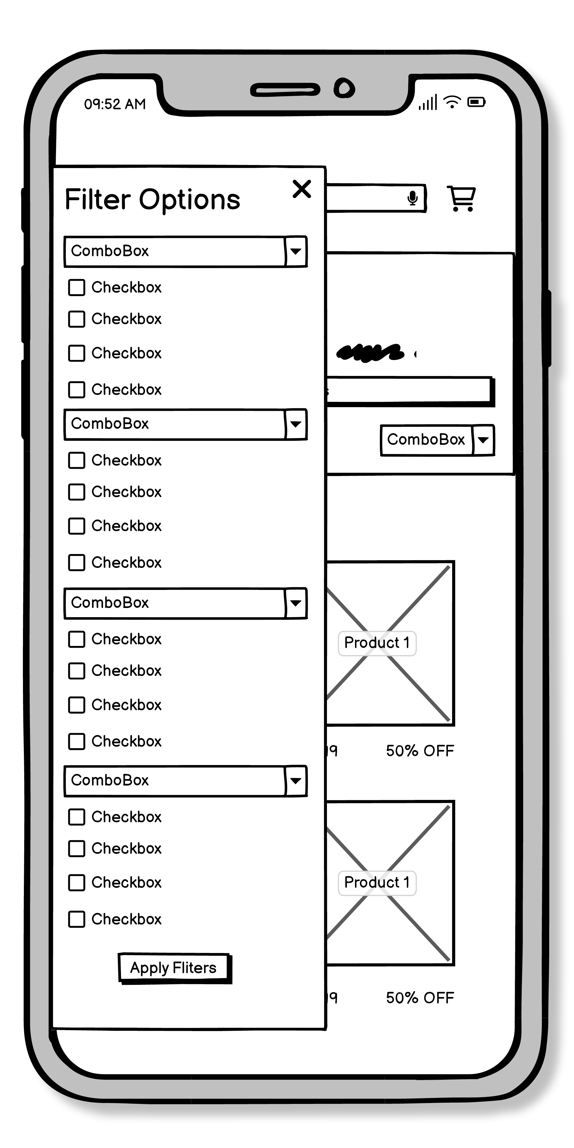
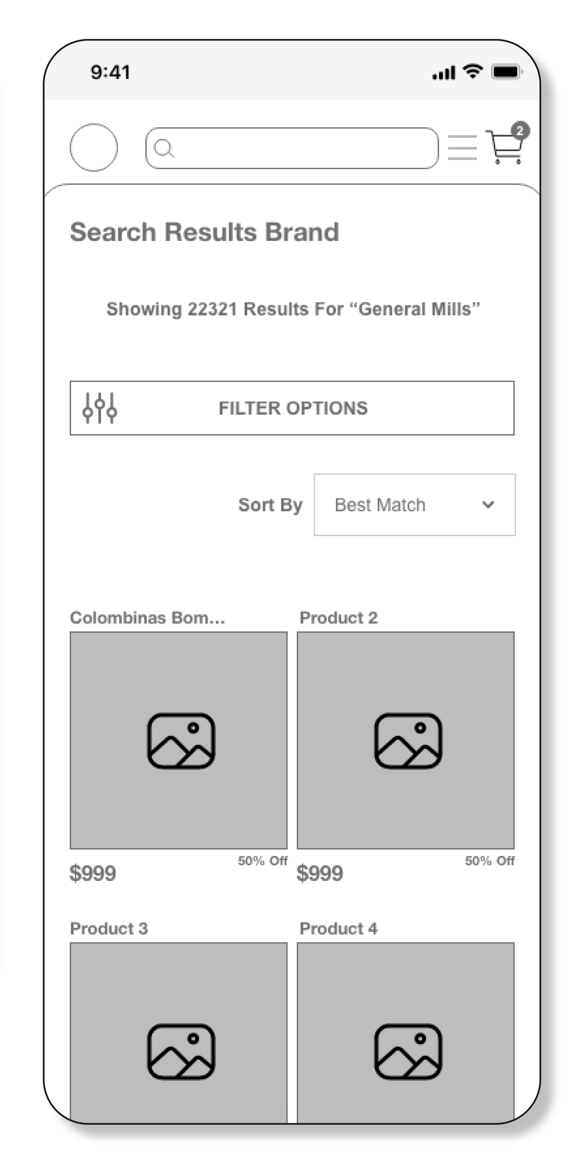
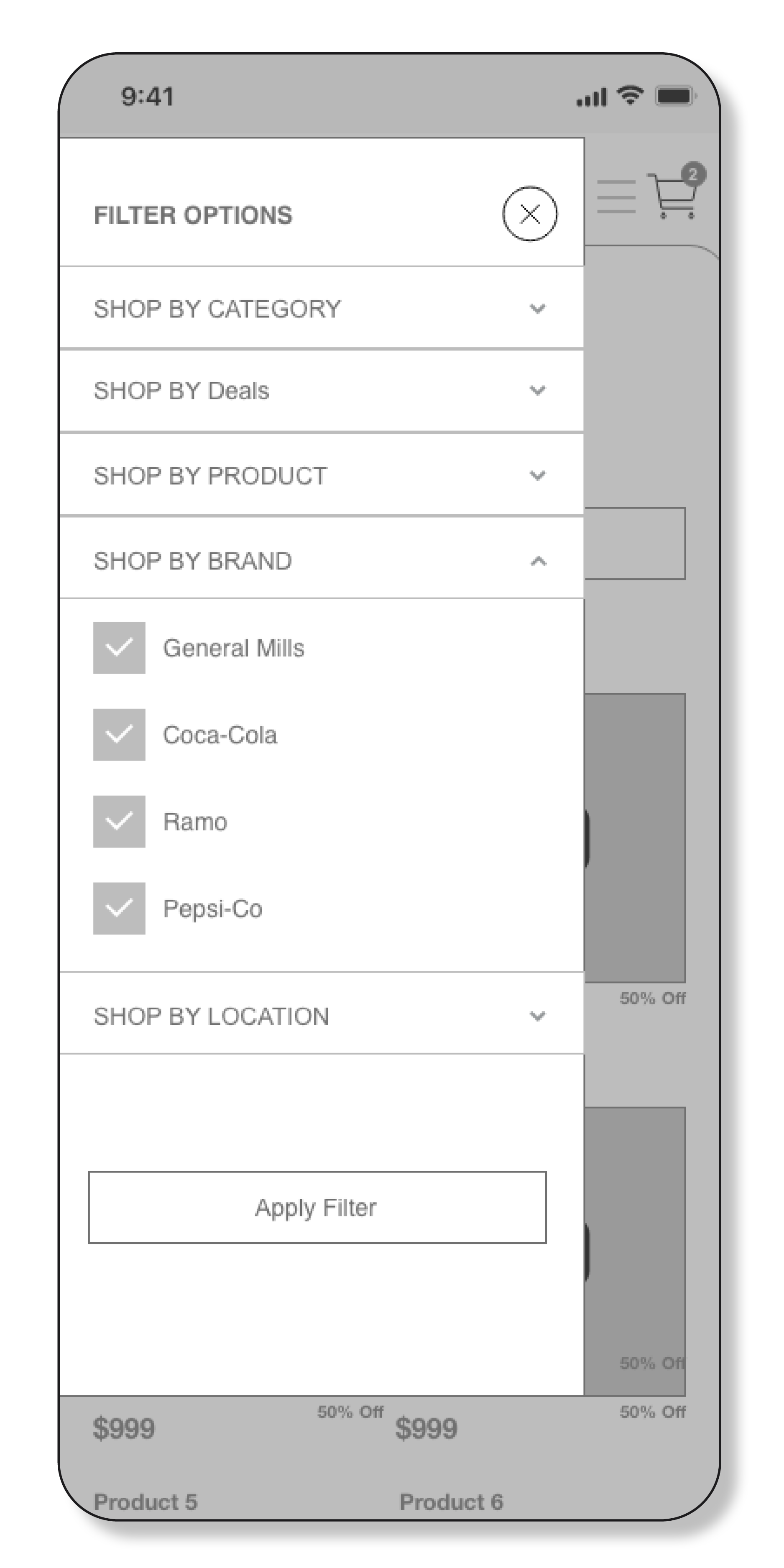
As a customer, I want to be have access to filtering options, so that I don’t have to browse through a lot of products to find what I’m looking for.
>>WIRE FRAMES
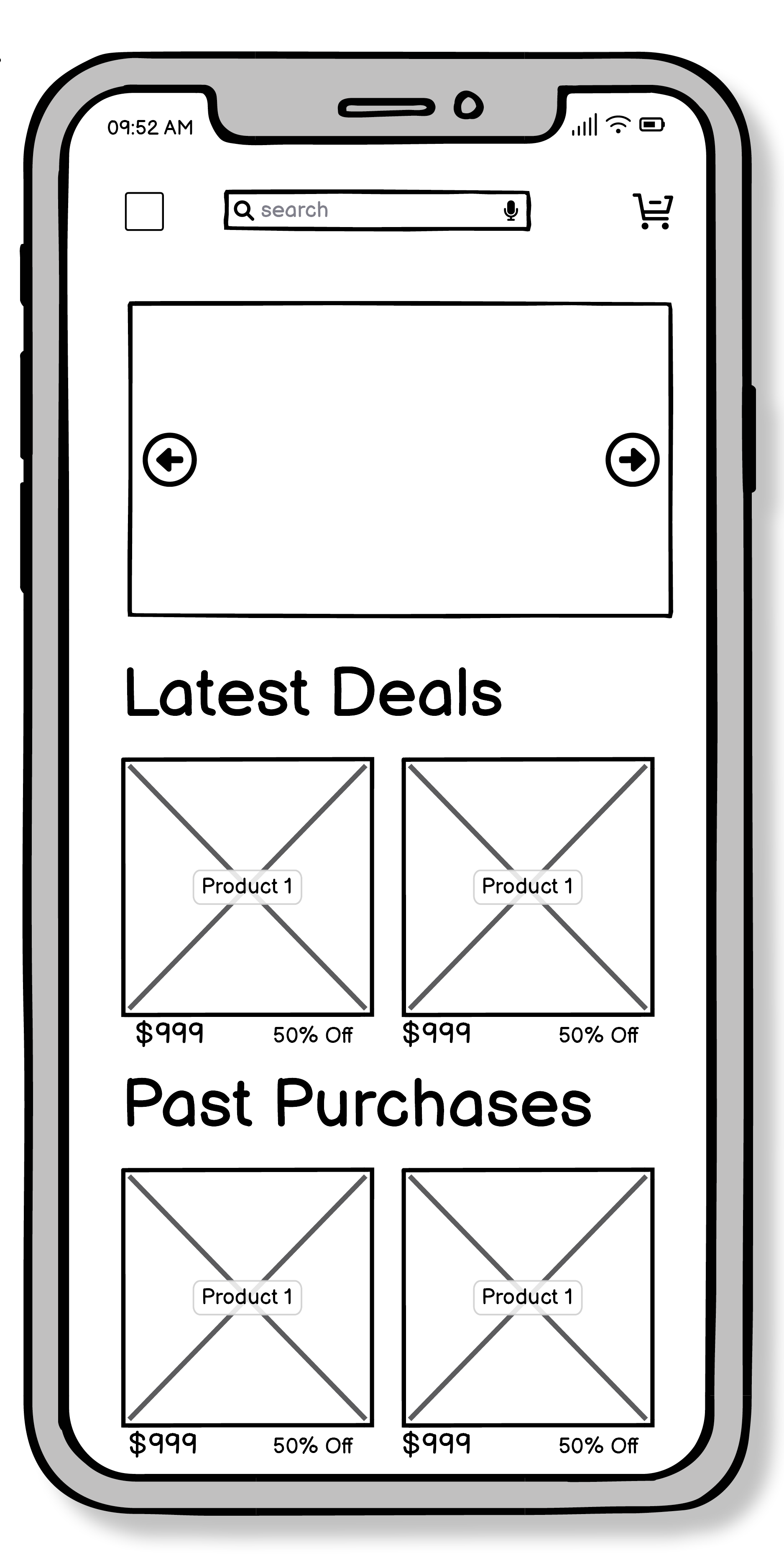
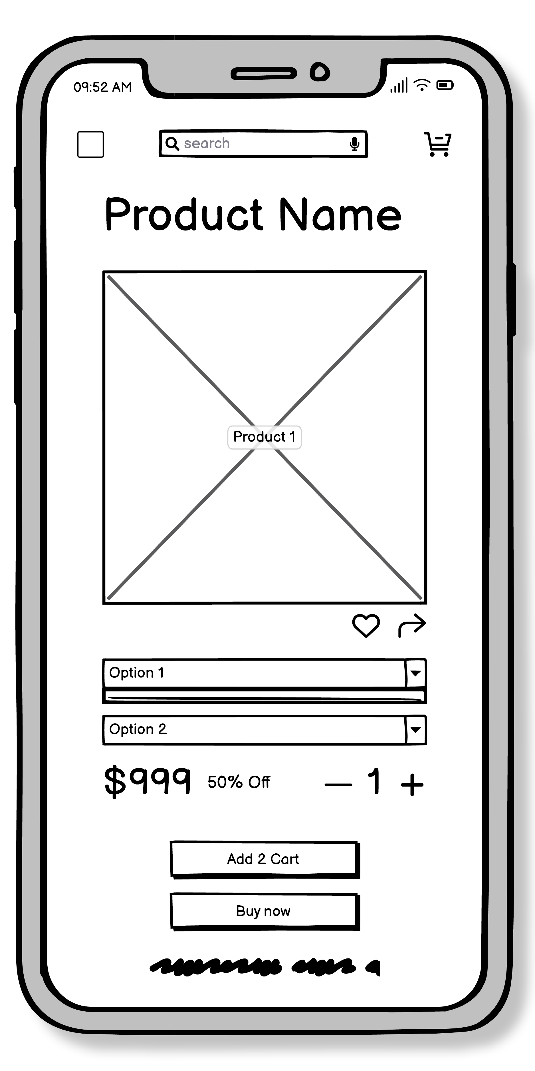
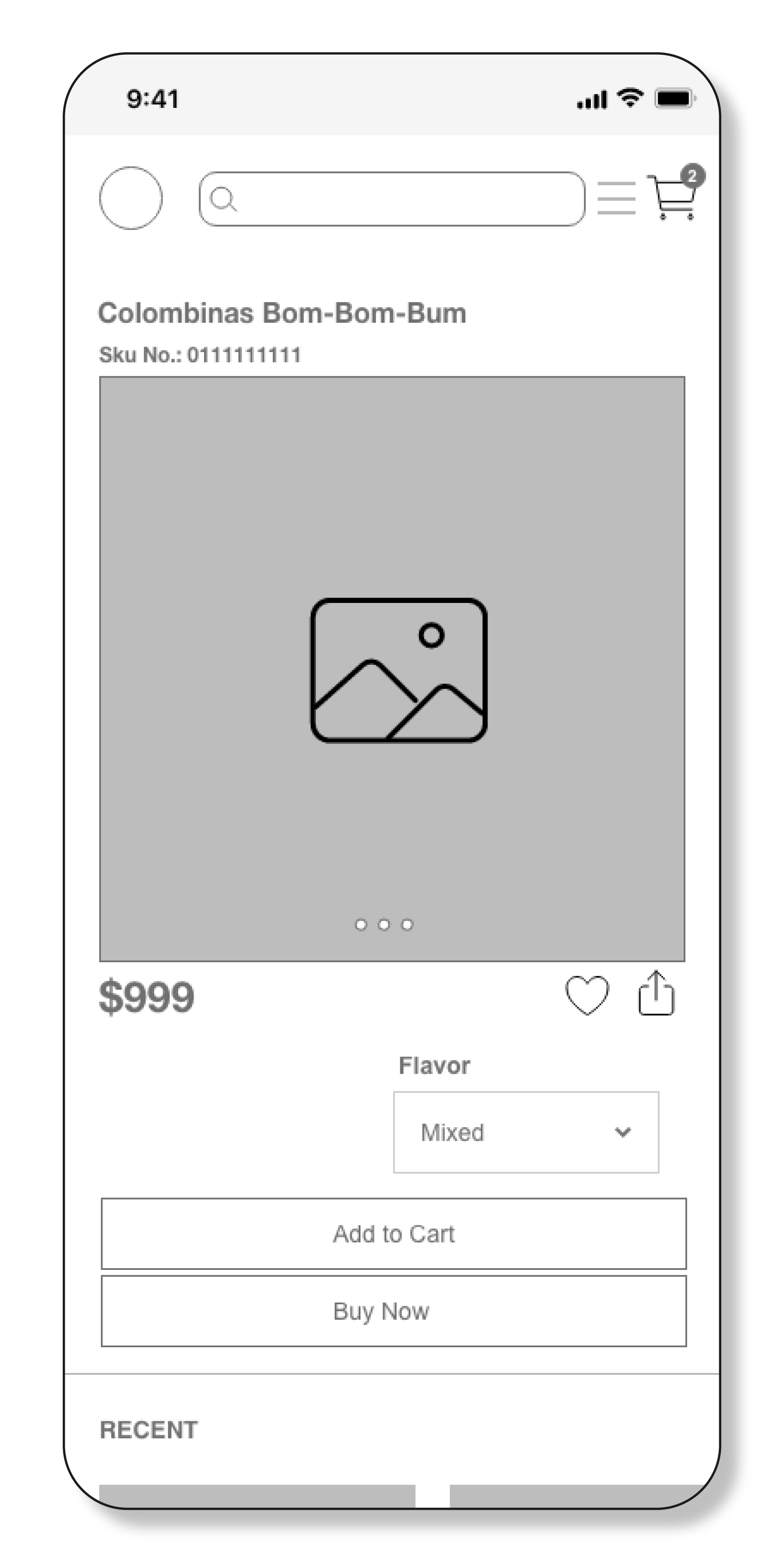
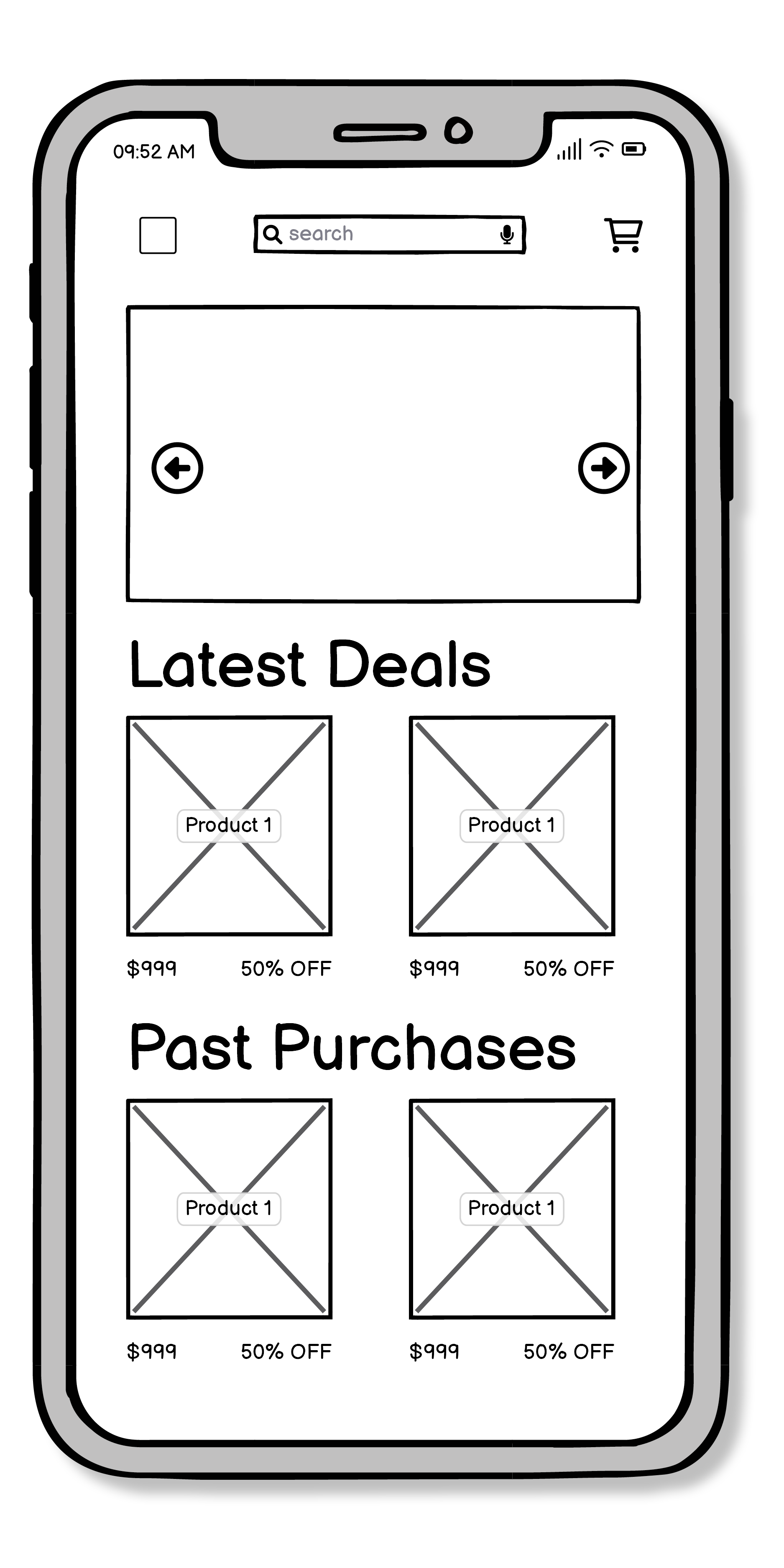
USER FLOW 1 / LOW FIDELITY
USER FLOW 1 / MID FIDELITY
USER FLOW 2 / MID FIDELITY
USER FLOW 2 / LOW FIDELITY
USER FLOW 3 / LOW FIDELITY
USER FLOW 3 / MID FIDELITY
>>USER TESTING
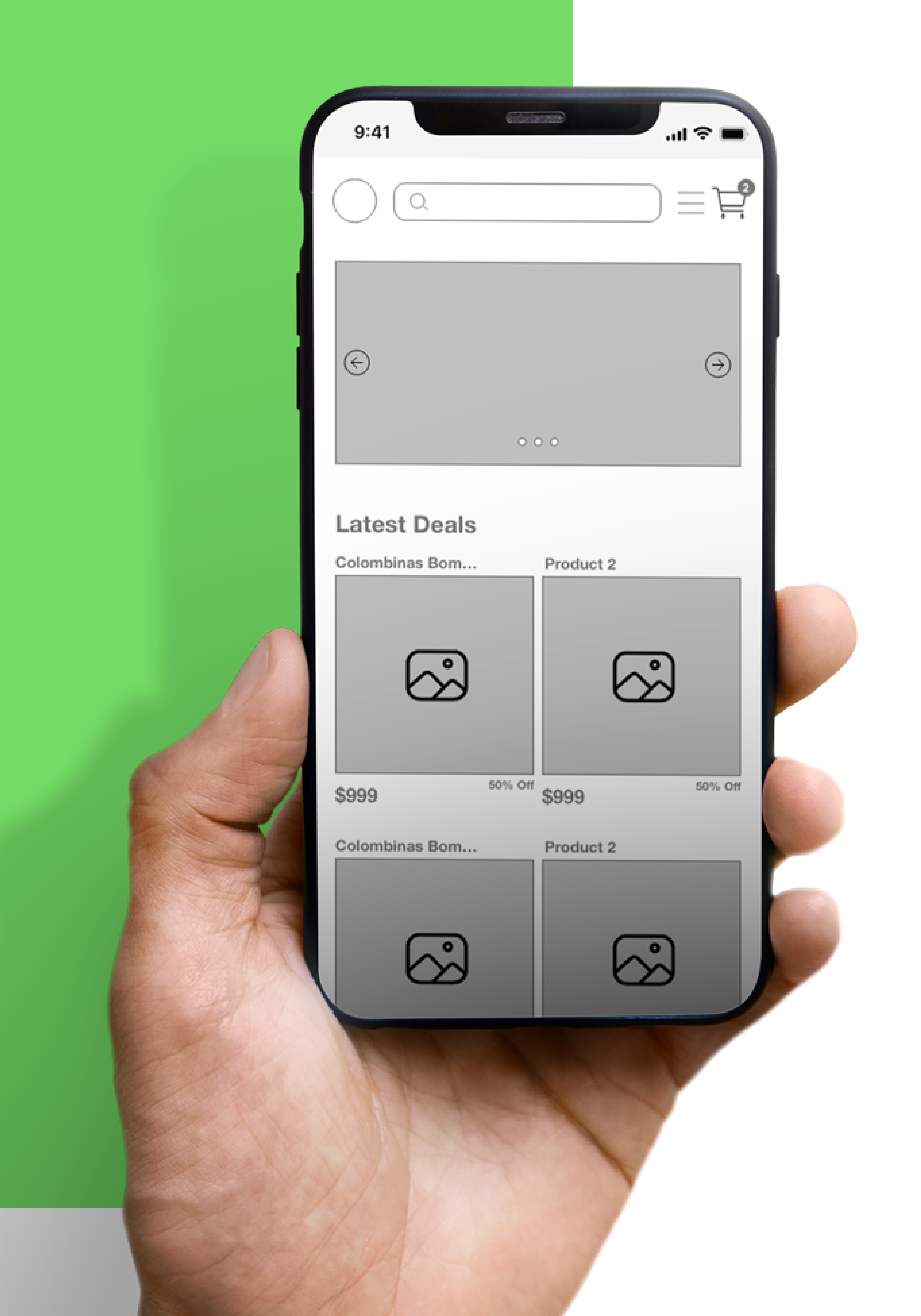
User testing was conducted once the wireframes were completed to find pain points in all three user flows. Issues were identified and feedback from testers was provided early in this process thanks to early testing and rapid sketching.
First flow:
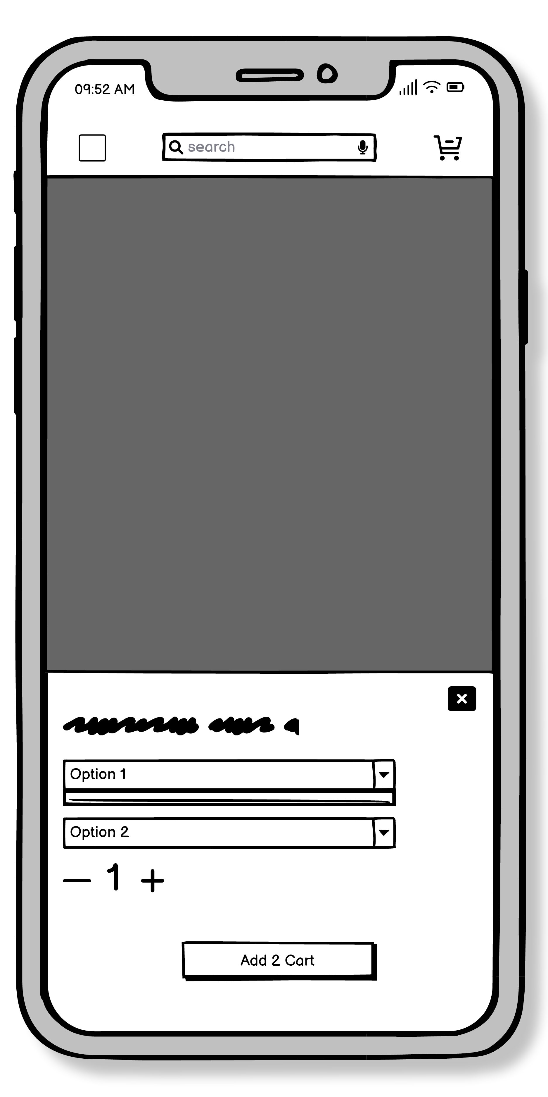
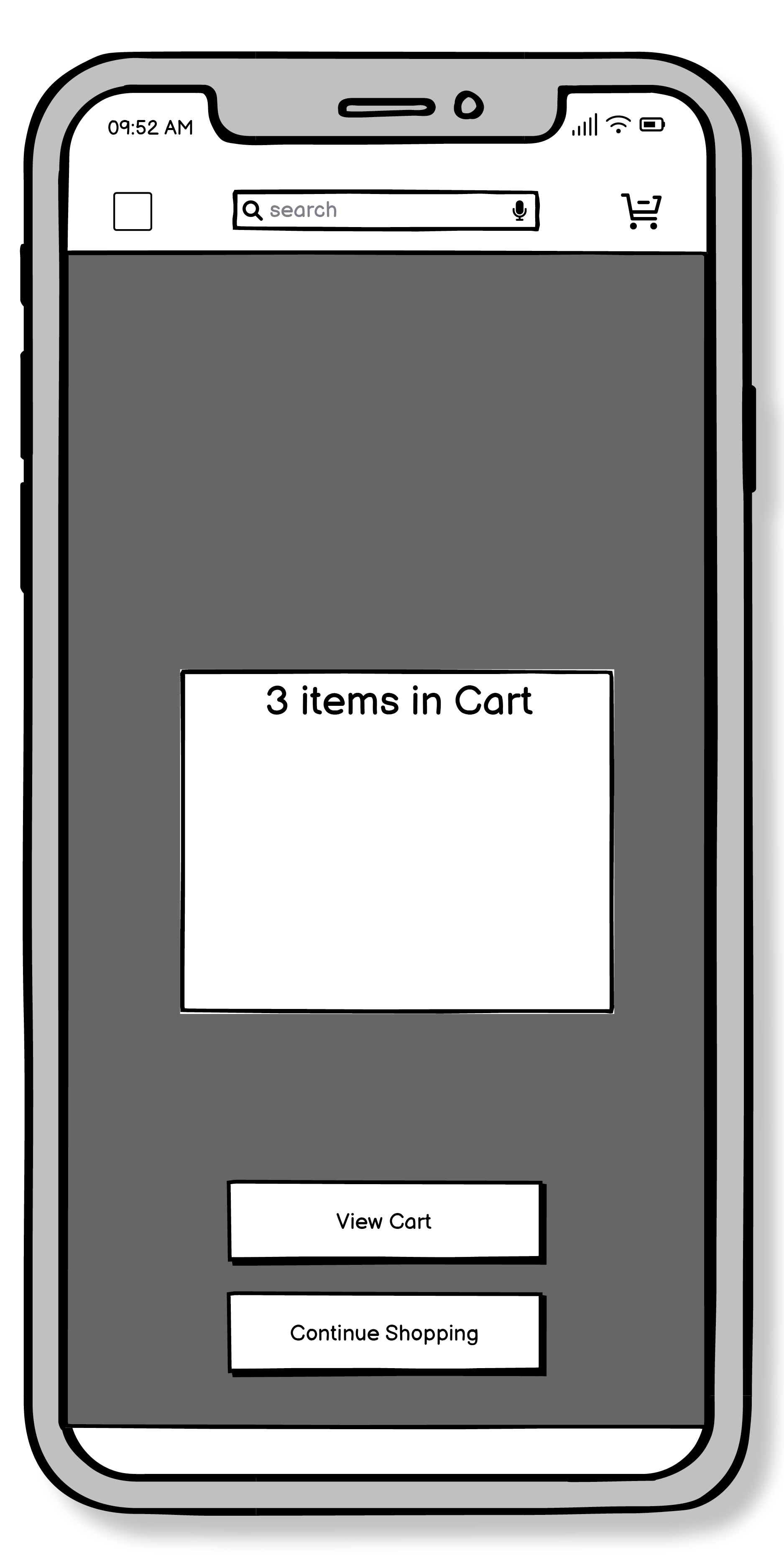
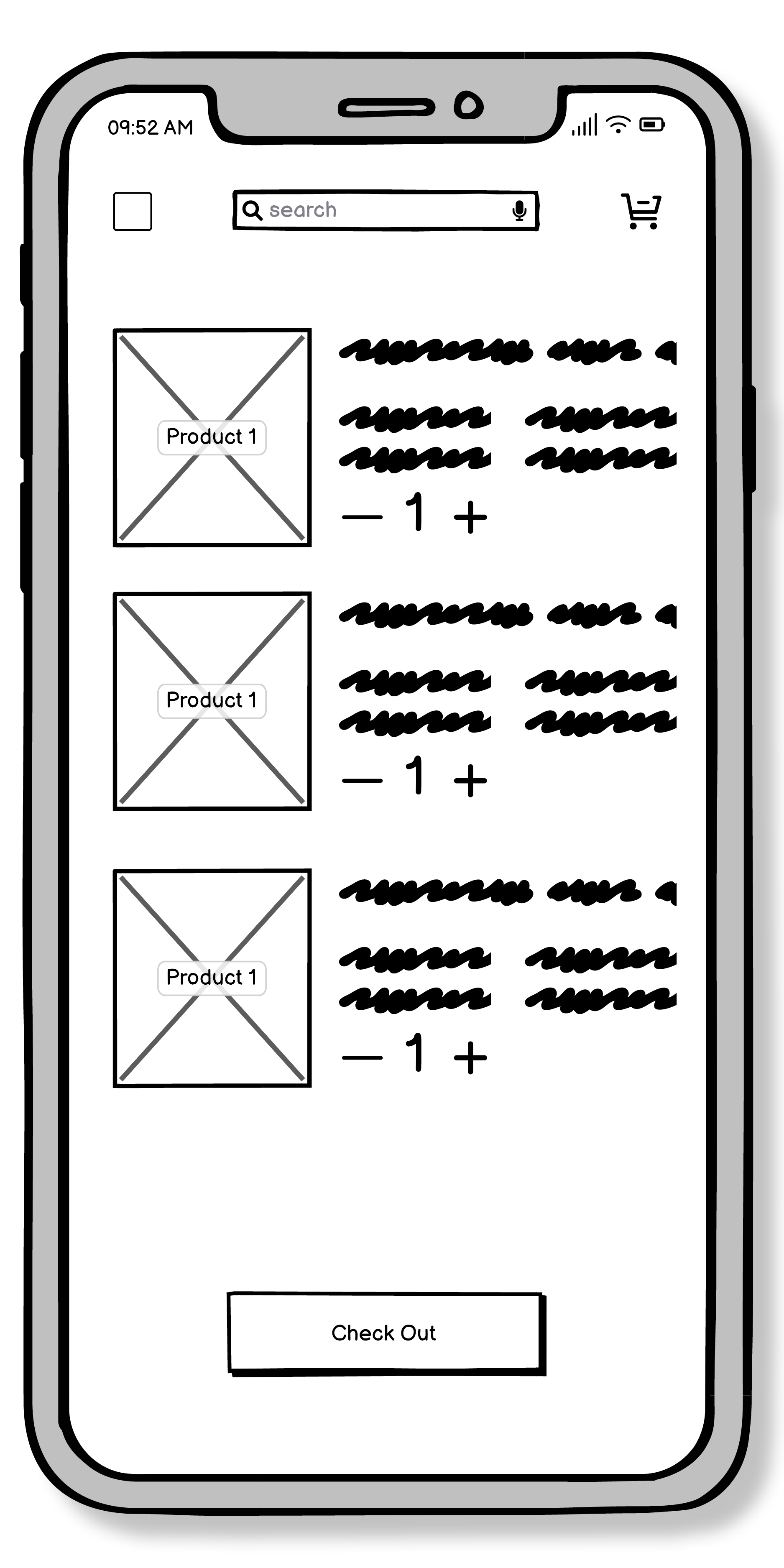
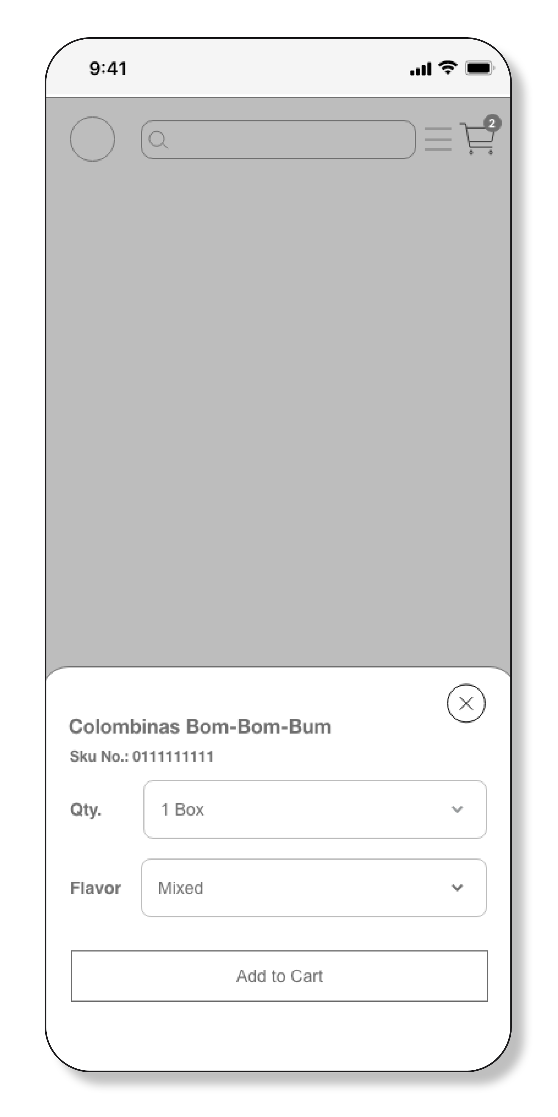
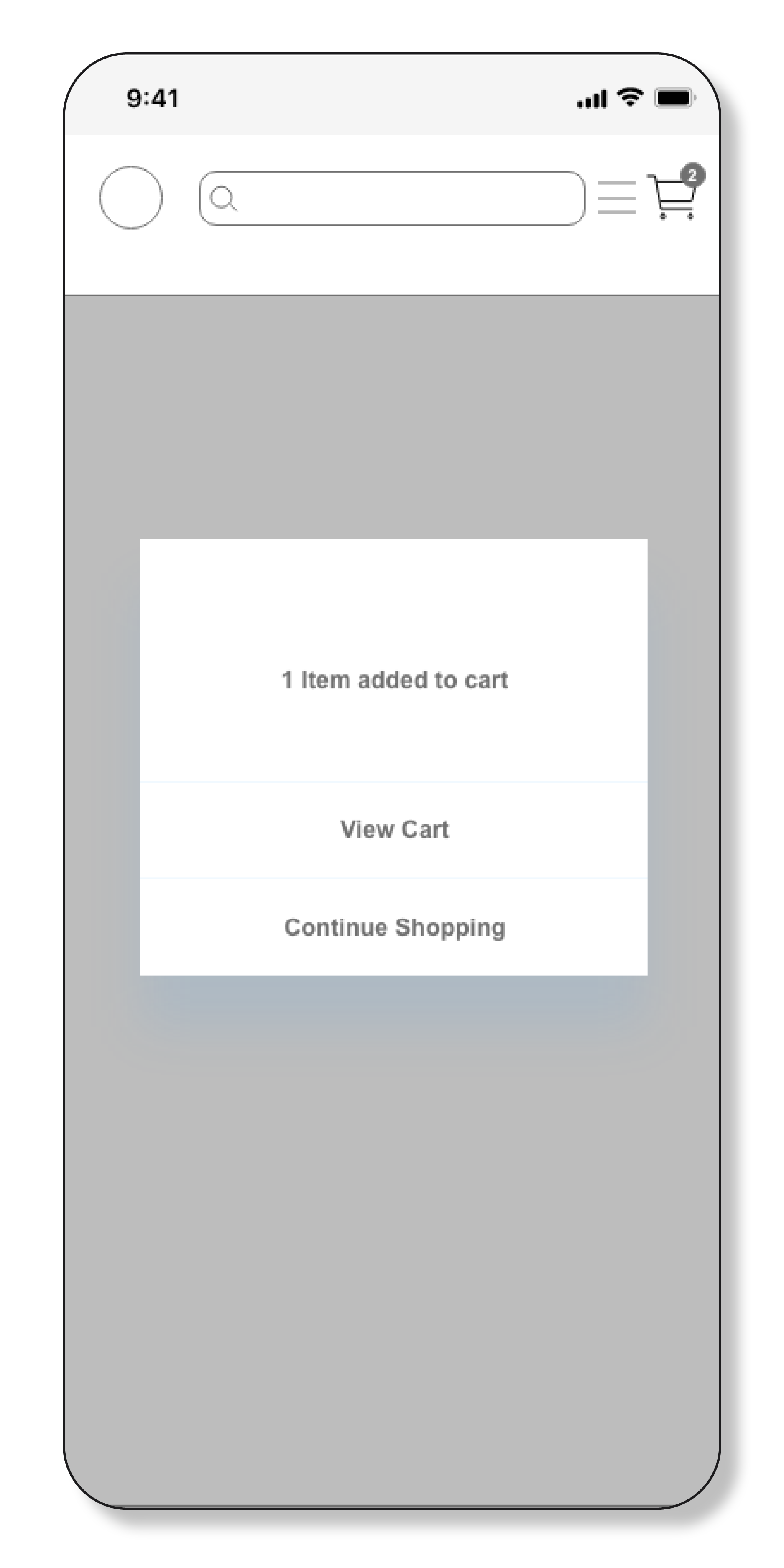
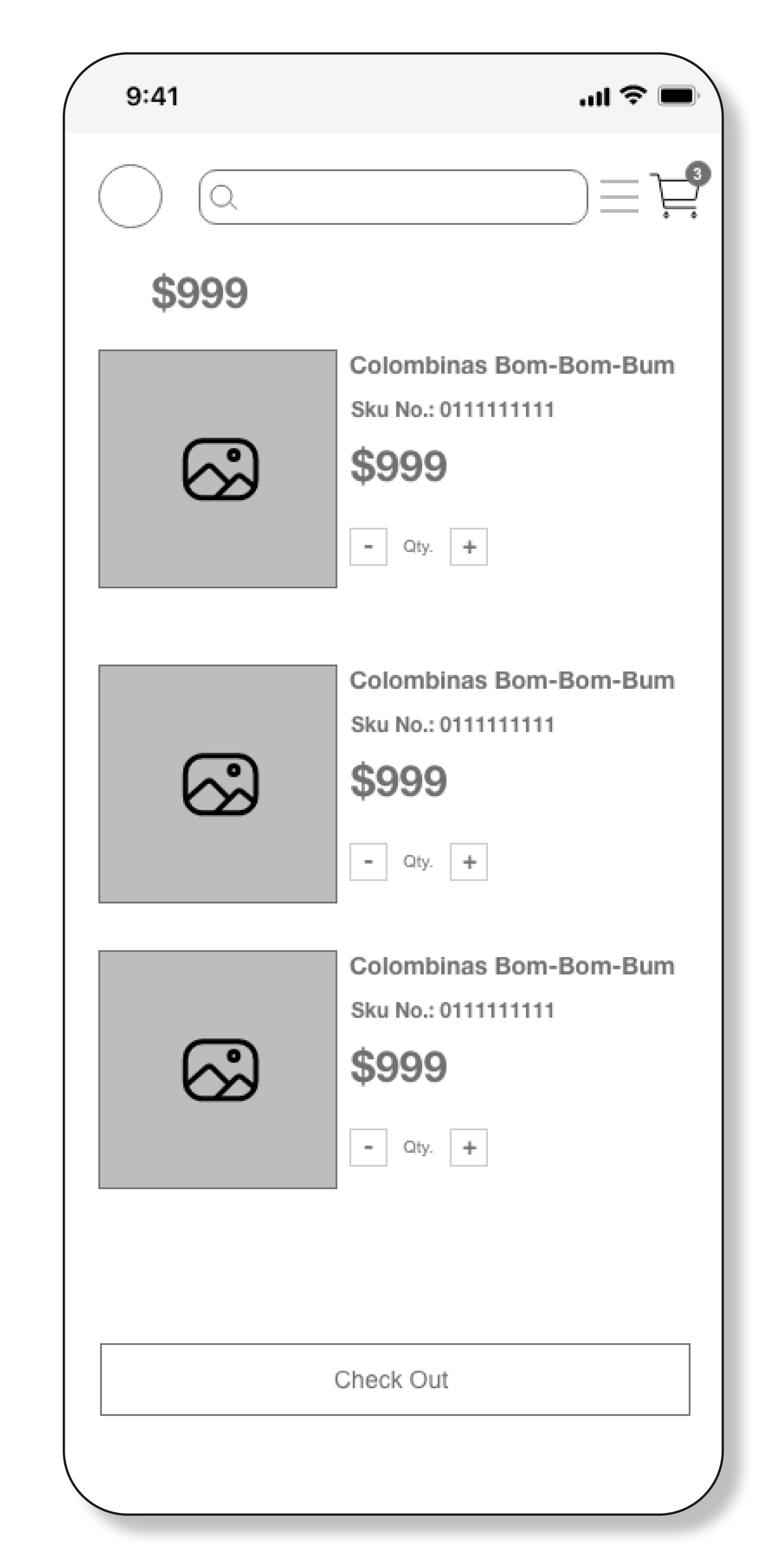
I was able easily to add the item to my shopping cart, however on the second screen, after pressing add to cart I was expecting the item to be added to the cart, but was taken to another adding screen. Maybe you would suggest combining the second and third screens ( I might be wrong but just do not get why you need a third screen).
— Uliana Bilenkiy / CF Student
Second flow:
I had no problem adding the item to my wish list. Also was nice to get a feedback.
— Ling Ren / CF Student
THIRD flow:
Also didn’t have any problems with that flow, only one thing – maybe add an indicator that some filters were applied or even how many, if necessary. Consider putting the filter option on the Home page instead of through Search!
— Juan Juarez / CF Student
>>CHALLENGES
What did go well?
The main MVP tasks during the user testing went very well. I was able to create user flows that were intuitive and received no negative feedback from the testers; they were able to complete the tasks without any major hurdles
What didn’t go well?
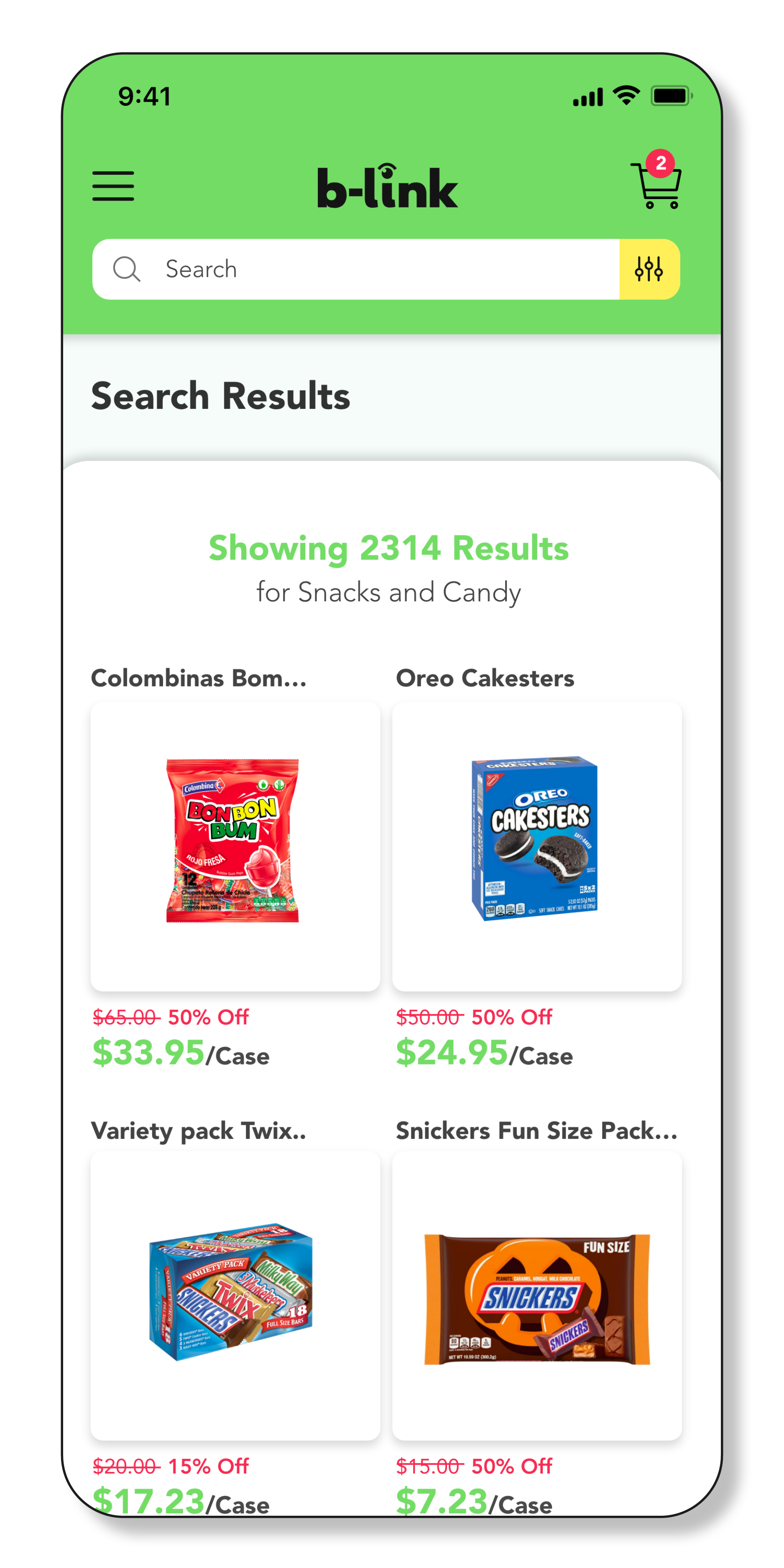
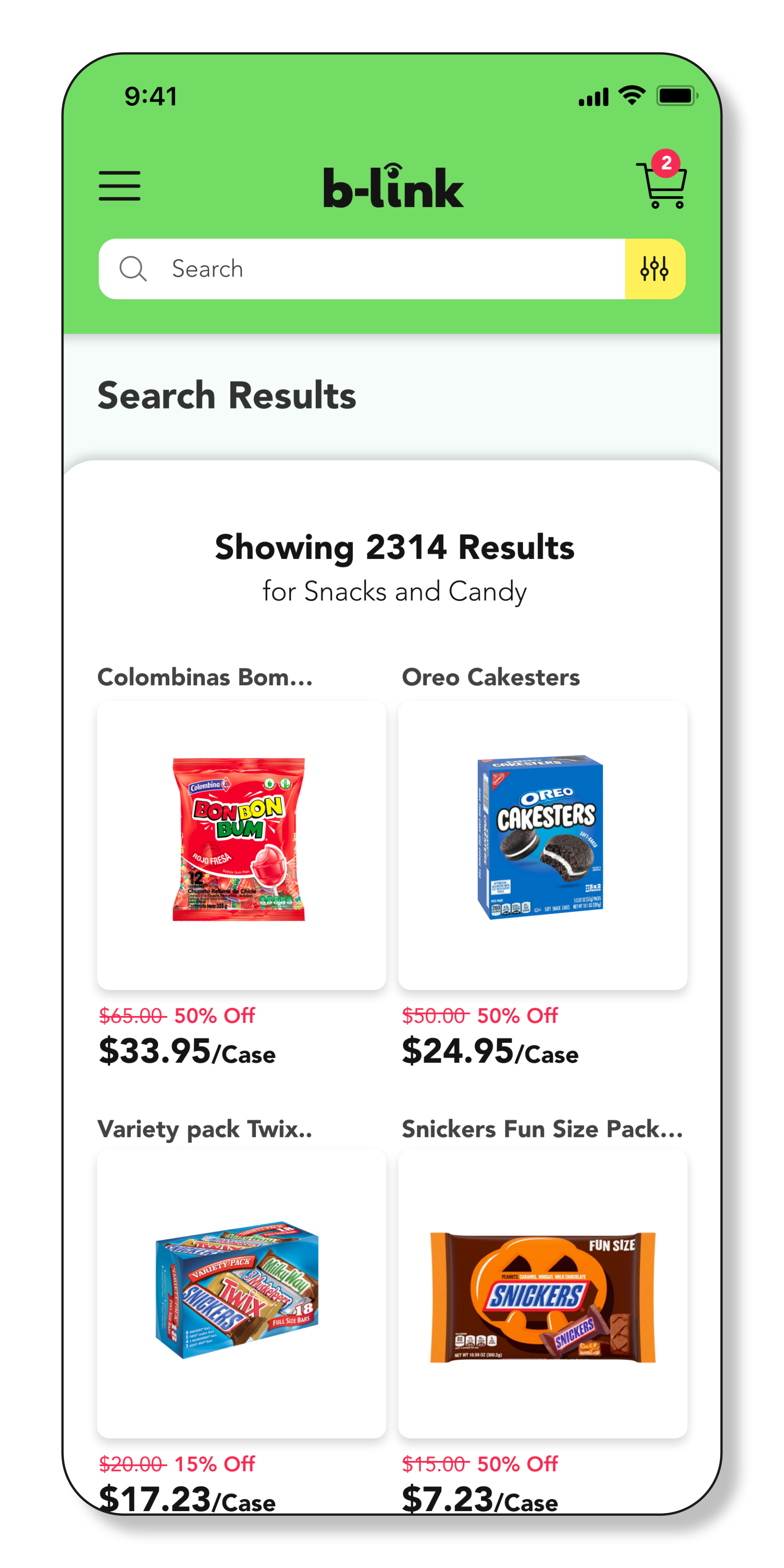
Although my user flow tests went well, one of the biggest challenges was recruiting more users to have a bigger testing pool to refine the user experience. There were some issues concerning design accessibility, mainly color contrast, in some elements of my final Hi-Definition wireframes. After consulting with peers, I revised them on a couple of contrast-checking websites to help me correct those issues throughout the app. See Fig. 1
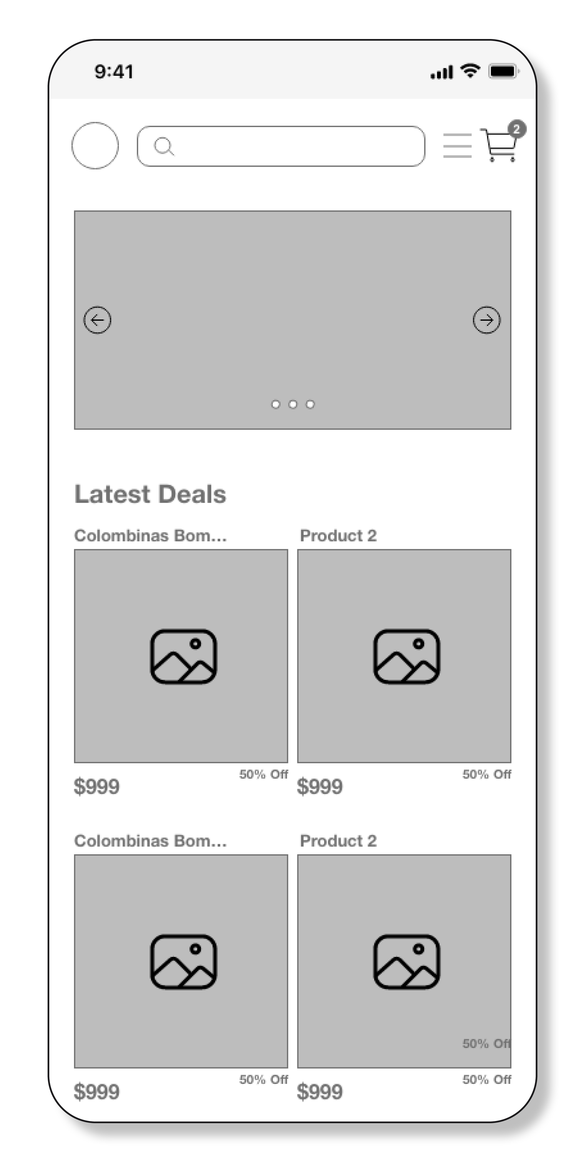
Other issues I encountered had to do with hierarchical organization of the layout. Juan Juarez commented on the Filter Search Results Screen: “Try to align both texts, the price and the discount to the same line, maybe the upper line?”
Ling Ren also made some suggestions concerning the Item Saved to Wish List Message Screen: “the font size could be increased to make the message clearer.”
I was able to revise and implement all these changes as suggested by my fellow Career Foundry peers.
>>UI DESIGN
DESIGN SYSTEM/STYLE GUIDE
TYPOGRAPHY
Color Palette
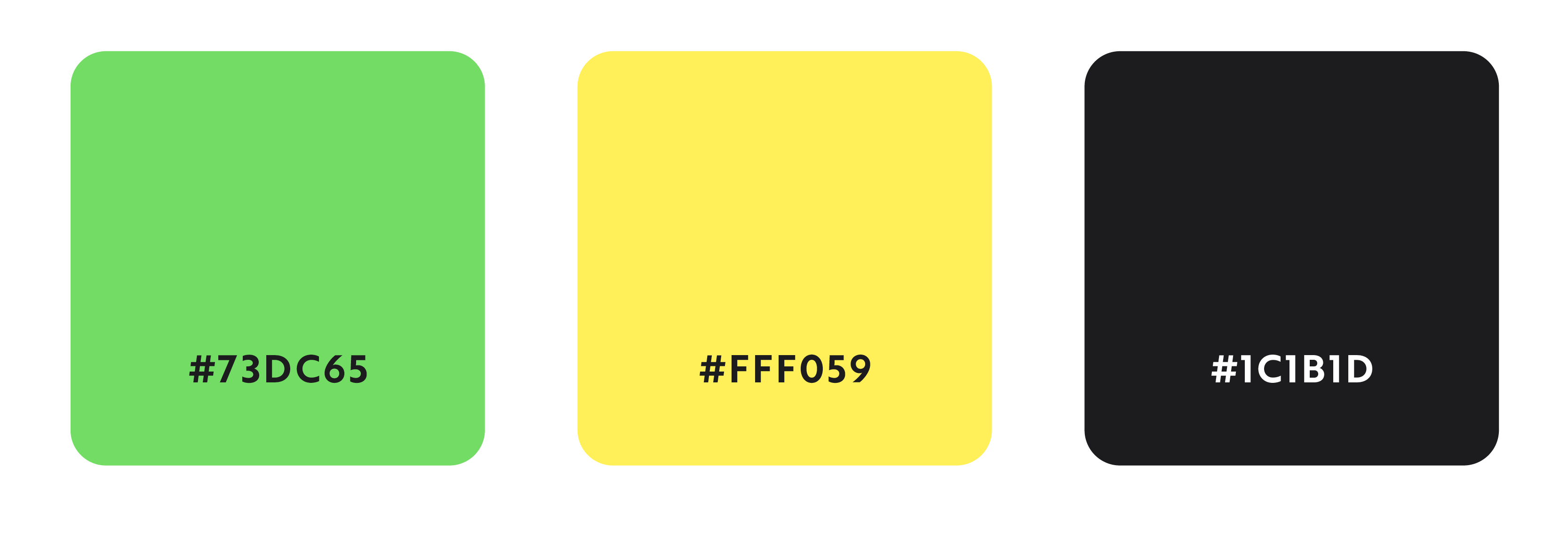
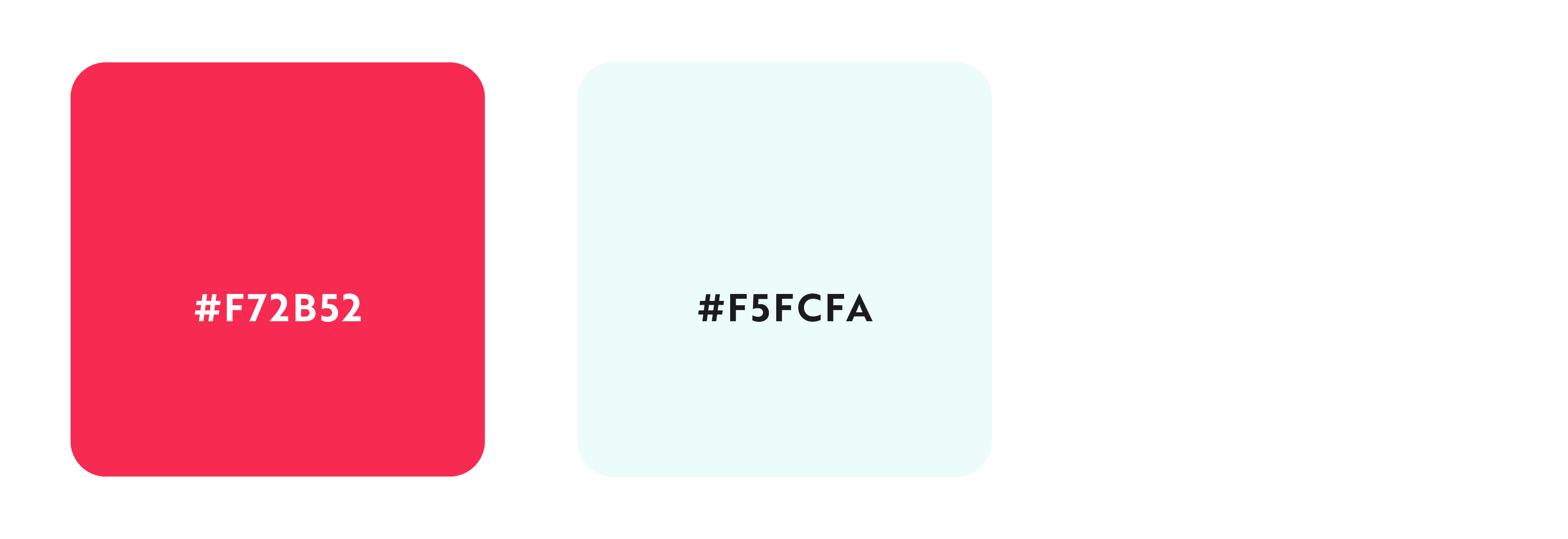
B-Link as brand will be represented by two primary colors. Green representing growth and prosperity and lemon yellow as happiness and optimism. However, since B-Link will be dealing with world-wide brands it will also be able to accommodate itself to a wide variety of palettes as needed.
PRIMARY PALETTE
SECONDARY PALETTE
Copy/Language Guidelines
Tone of Voice:
The voice of B-link throughout the site is positive, conversational, friendly, and approachable. When it comes to the product descriptions, for SEO purposes the tone of voice will be direct and focused on keywords.

