Branding | Graphic Design | Logo Design
KINGFISHER SYSTEMS, Inc.
Logo Redesign — Bringing a Securities Tehnology
Company to the 21st Century
A quick turnaround redesign of the Kingfisher Systems, Inc. logo. I did not know how, who or why the original logo was designed, but I was asked to keep as many of the original features in a modernized version of the logo.
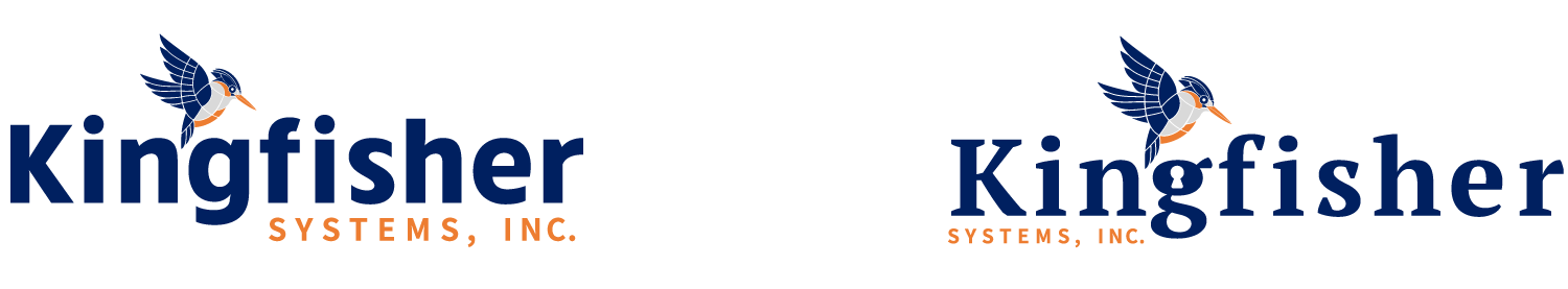
Original Logo

First Logo Treatment
The first step was to work on a treatment of the kingfisher bird. I first attempted to redraw the bird on the original, but quickly abandoned the idea. The bird itself needed to reflect technology in some way. So I went another route.

First two options:
Once the bird was finished I decided to give it two typographic treatments, a Serif that resembled the old logo and a Sans Serif that would modernize the logo.
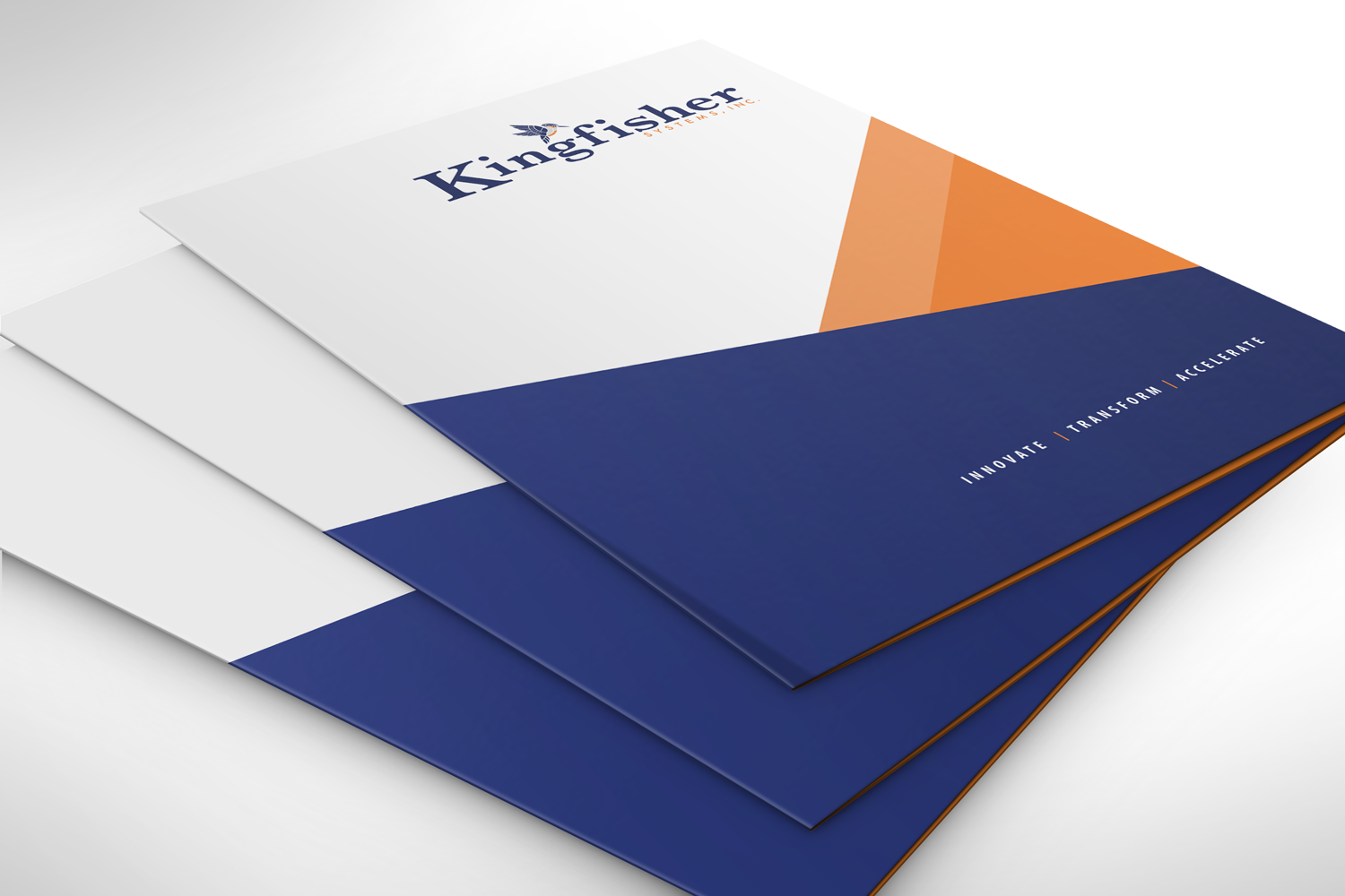
Final Logo:
After a long back and forth I was asked to bring in some of the old features into the new logo. The owner of the company was adamant to keep the “K” in a larger size as did the original. It was a struggle, but I was able to balance the weight of the logo throughout.
Applications