Web Repository | Dashboard | Mobile Web App | UI Design
PLANET PORTAL
By Planet Depos
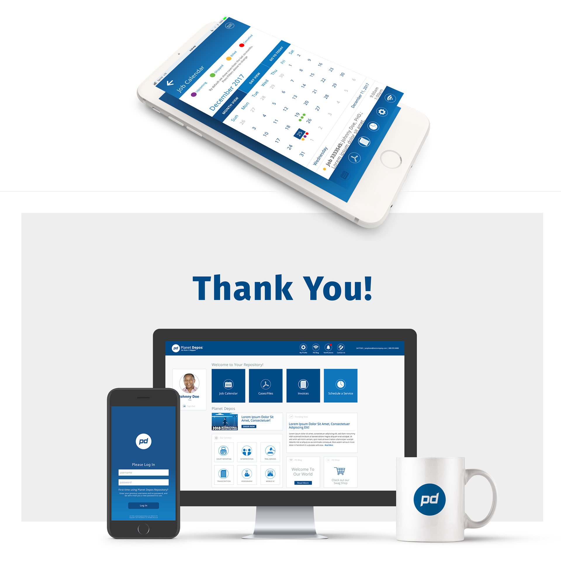
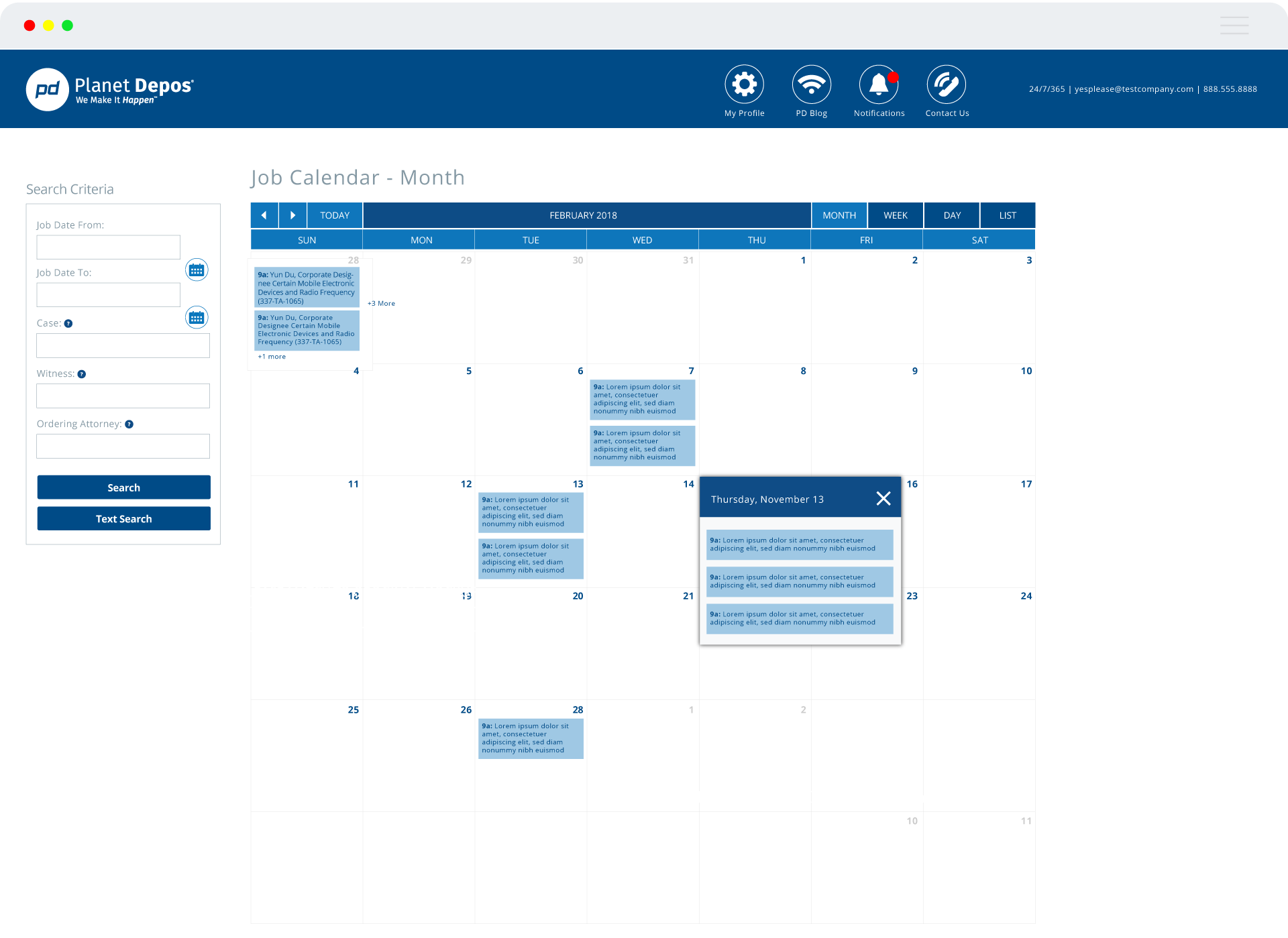
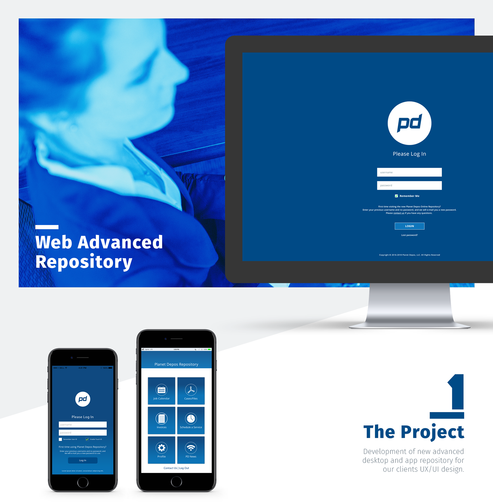
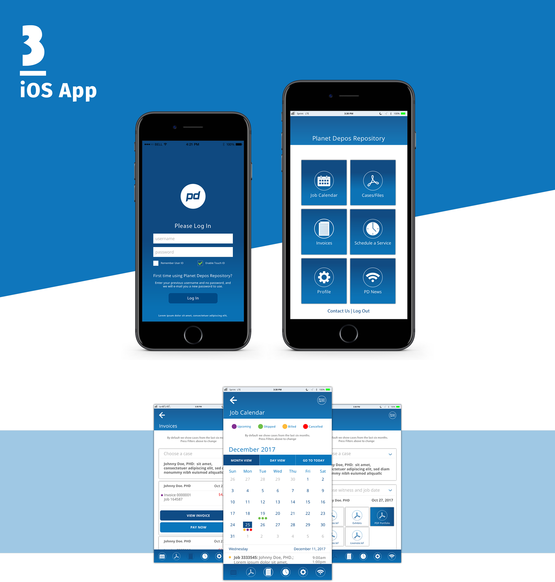
One of the many projects created by myself with the Planet Depos Team in order to better serve our clients with an unique portal with everything from an mobile app for scheduling as well as a repository of jobs and data.
>>OVERVIEW
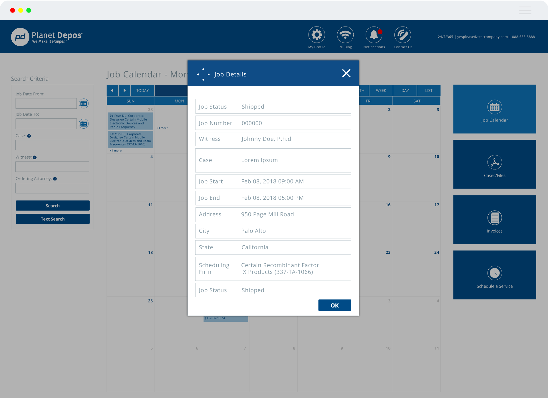
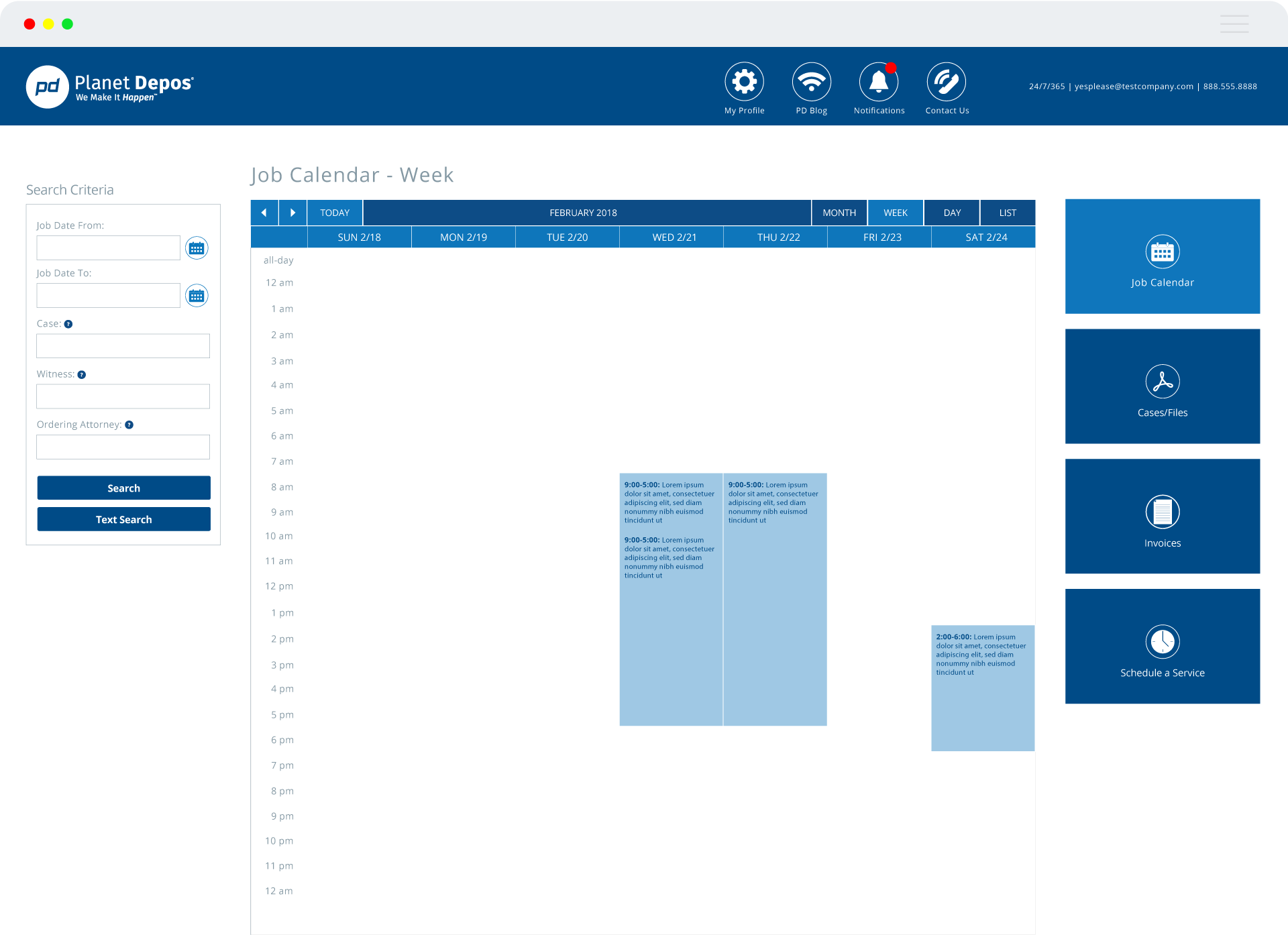
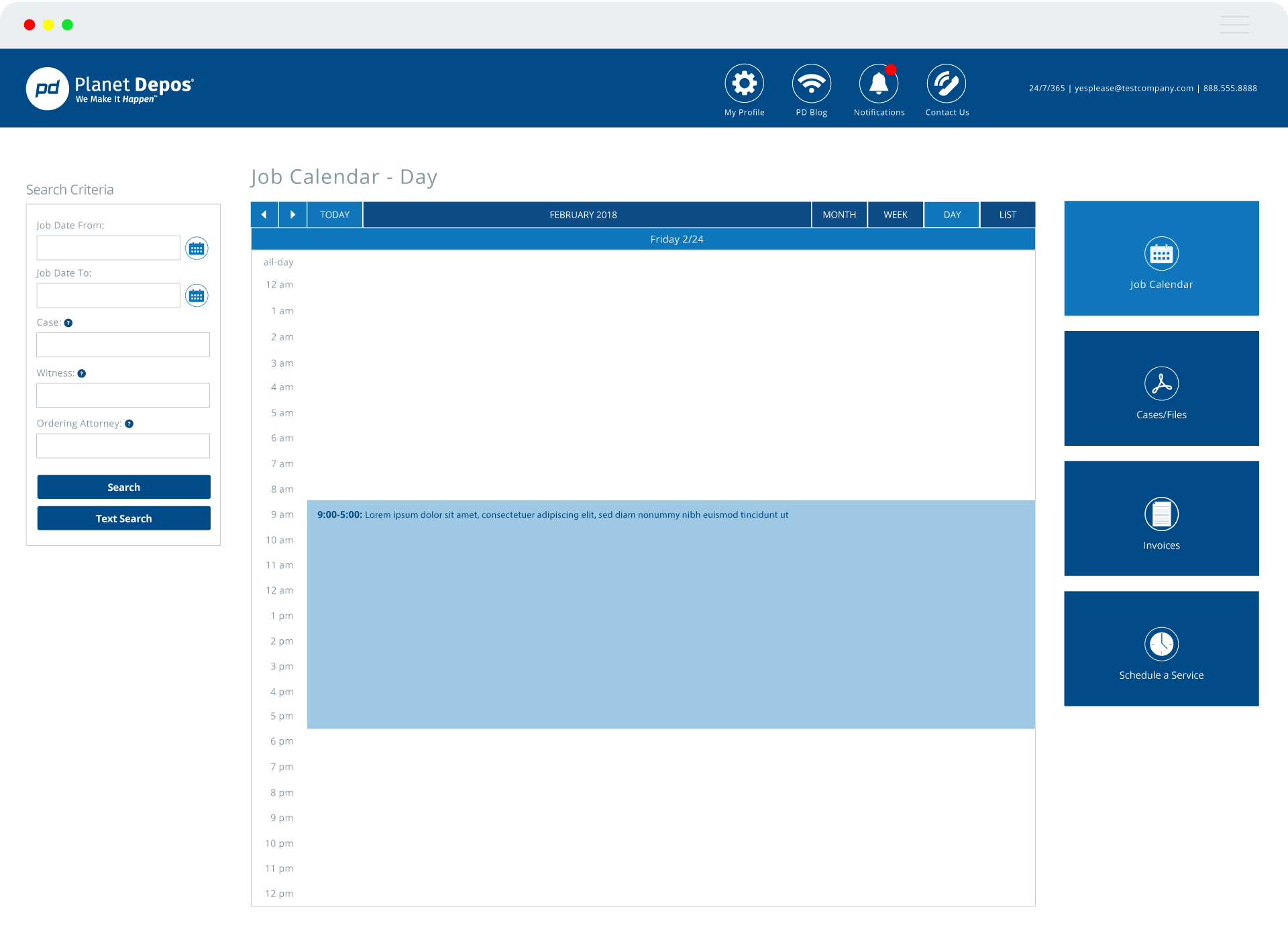
The Planet Portal is a one-stop shop to manage your cases with Planet Depos, from scheduling through delivery. The portal is designed for ease and convenience, with enhanced security to protect your (and your clients’) information.
Project Duration:
12 months
Role:
User Interface Designer / Brand Designer.
I was responsible for leading the third-party development team to make sure all design desicions were consistent throughout the interface.
PROBLEM SOLVING:
I collaborated with the developer team and the in-house industry expert team in defining the best library solution to match the vision of Planet Portal.
>>THE OPPORTUNITY
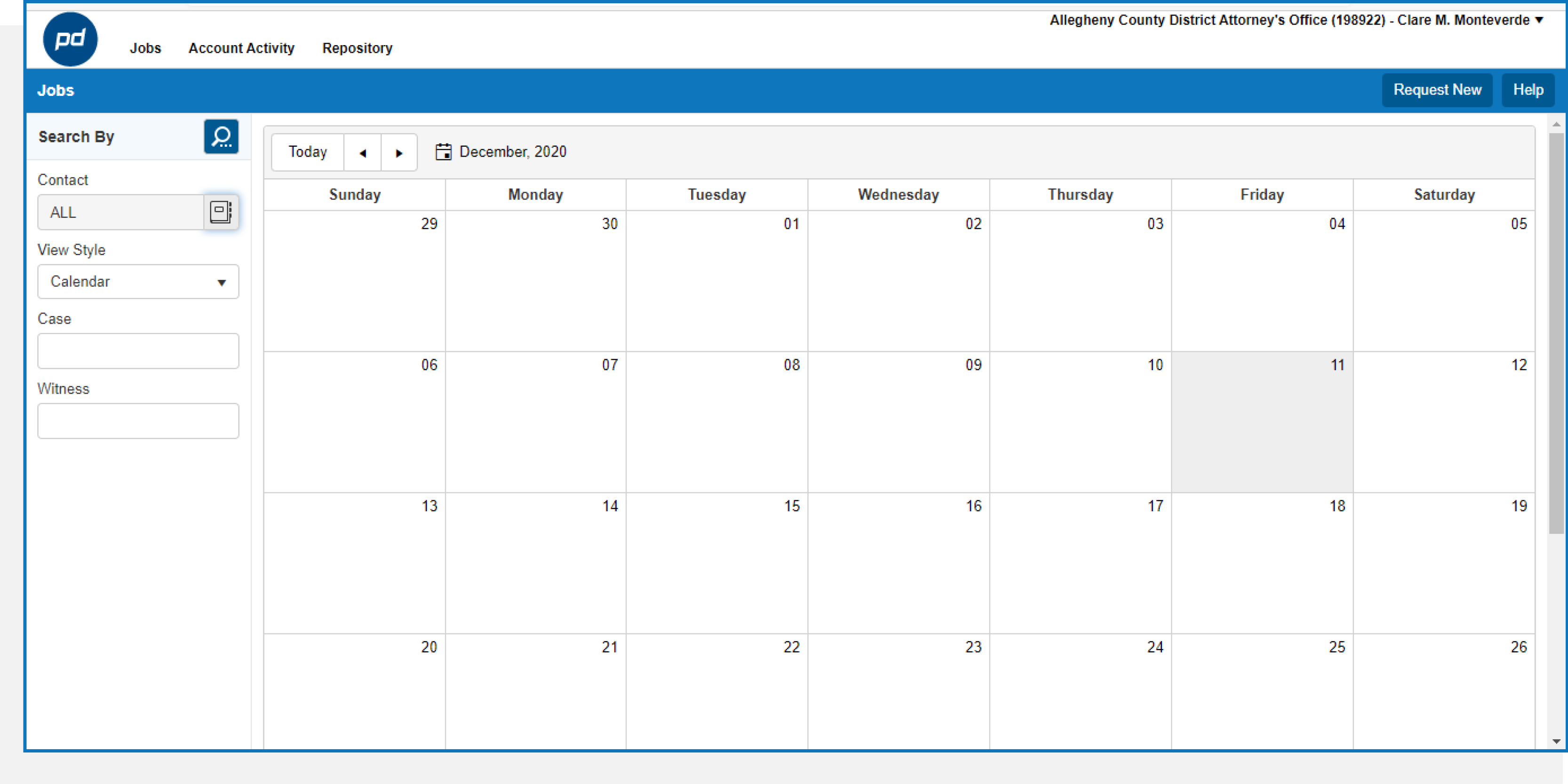
When I got involved with Planet Portal, one of my first objectives was to perform an audit of the User Interface design. The biggest issue concerning the dashboard was brand incosistency. Planet Depos’ brand had already been defined but it was not applied correctly. Planet Portal needed to be redesigned.
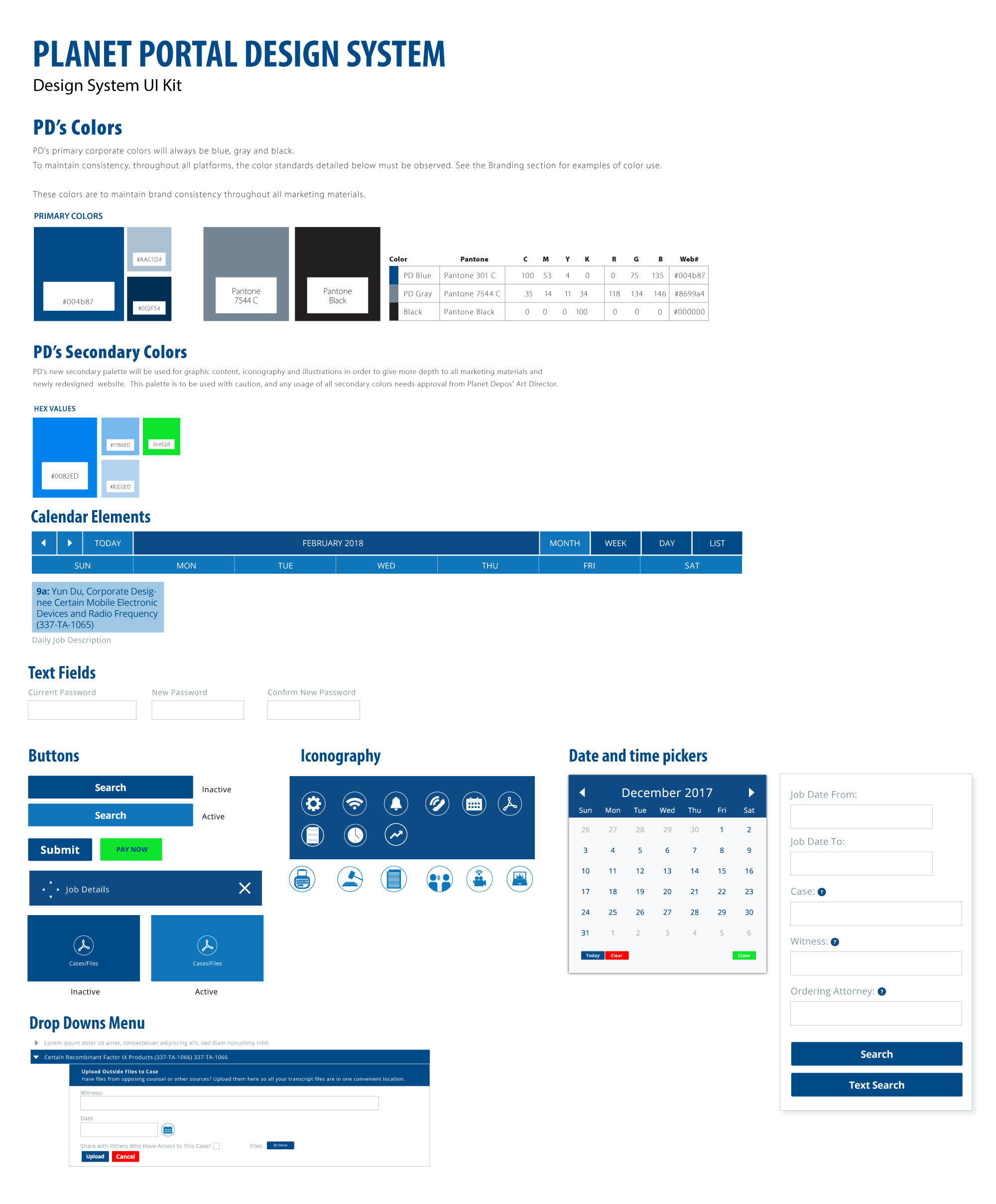
Defining the Design System.
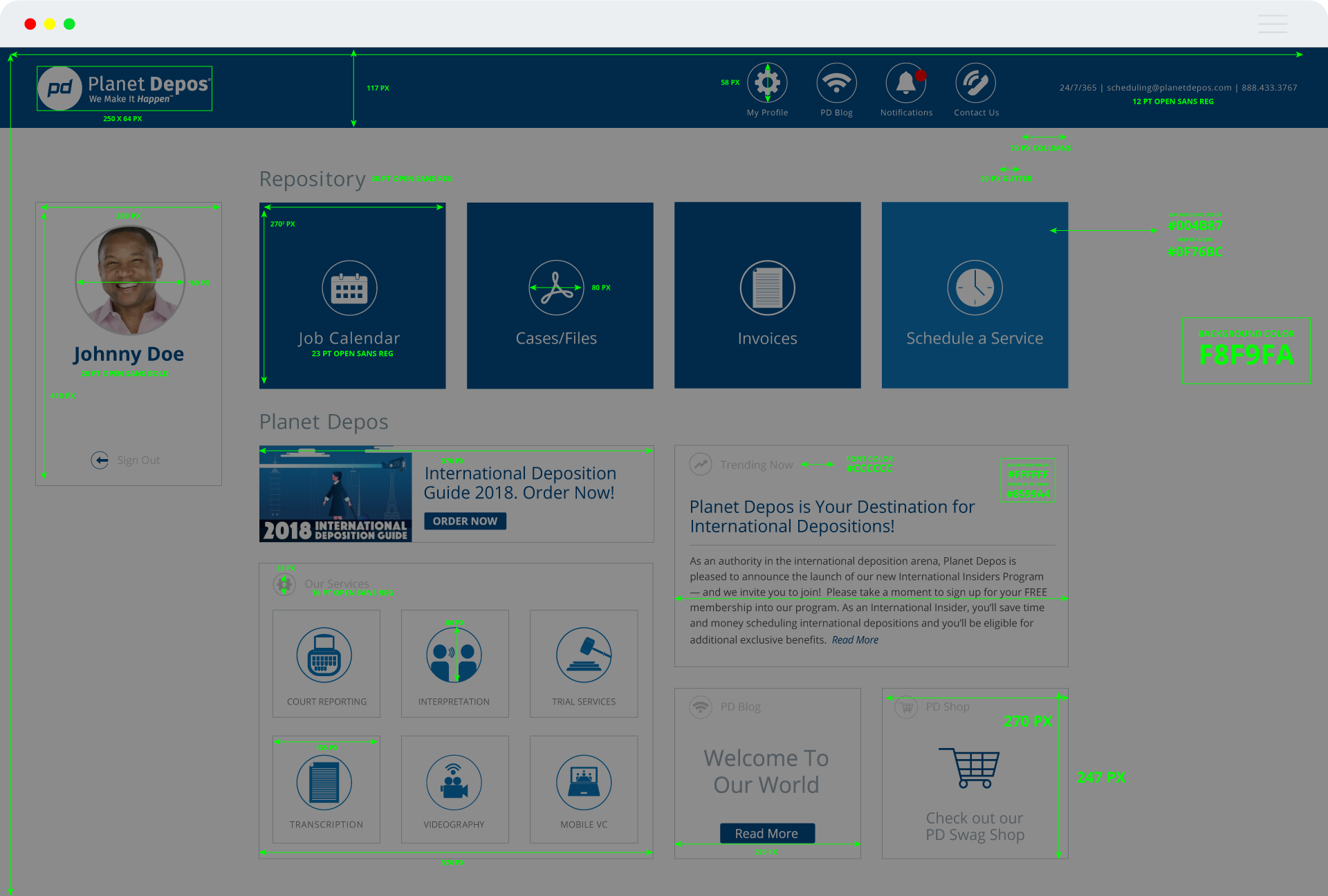
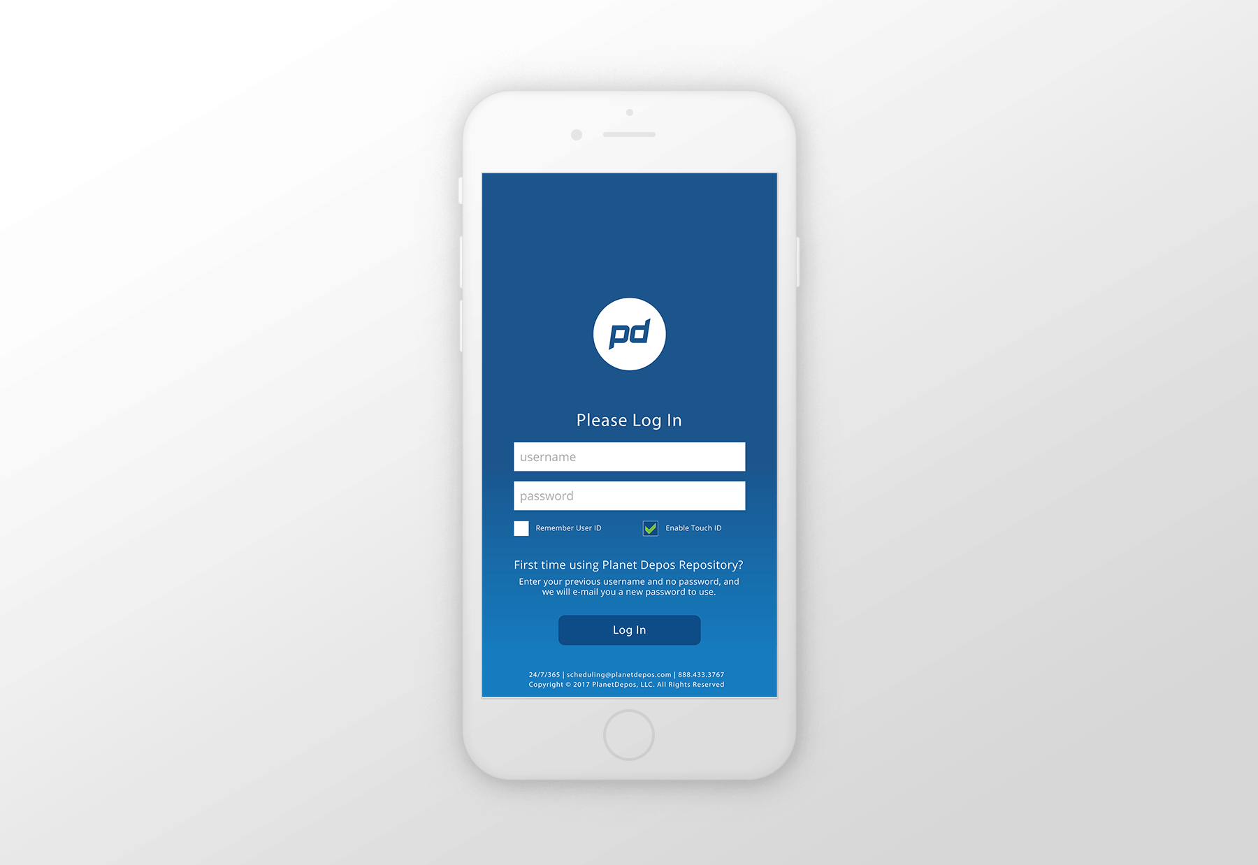
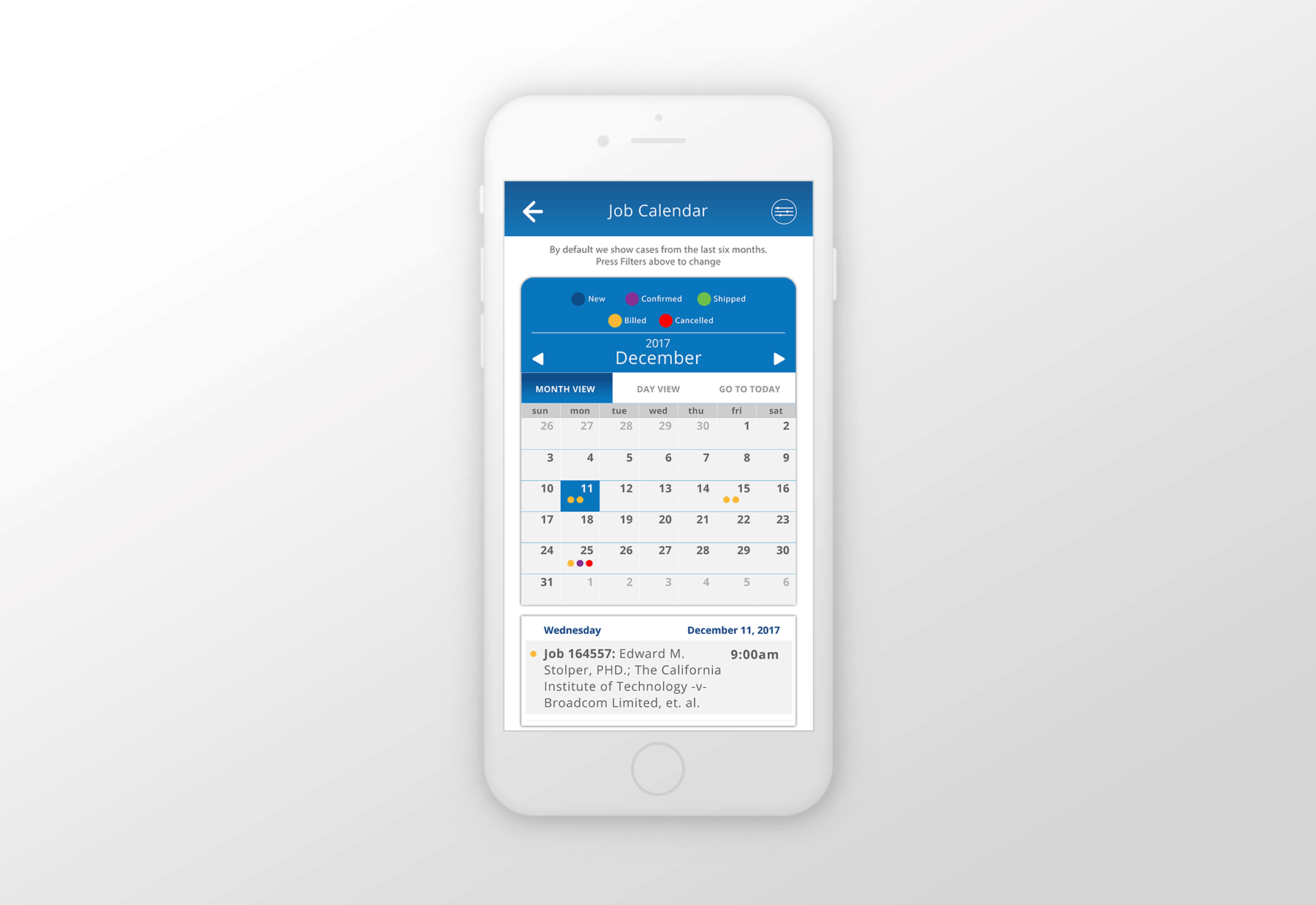
Once the audit of issue was performed, it was time to define our own Design System based on Planet Depos Brand Identity Guide used on our corporate website and also borrowing from iOS Element Design. I wanted to keep simple clean and well organized. I built all the components from scratch.
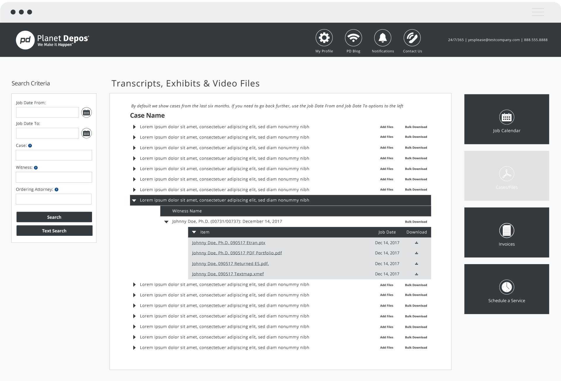
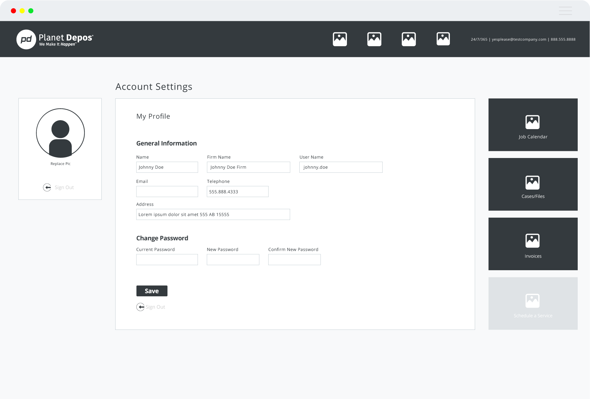
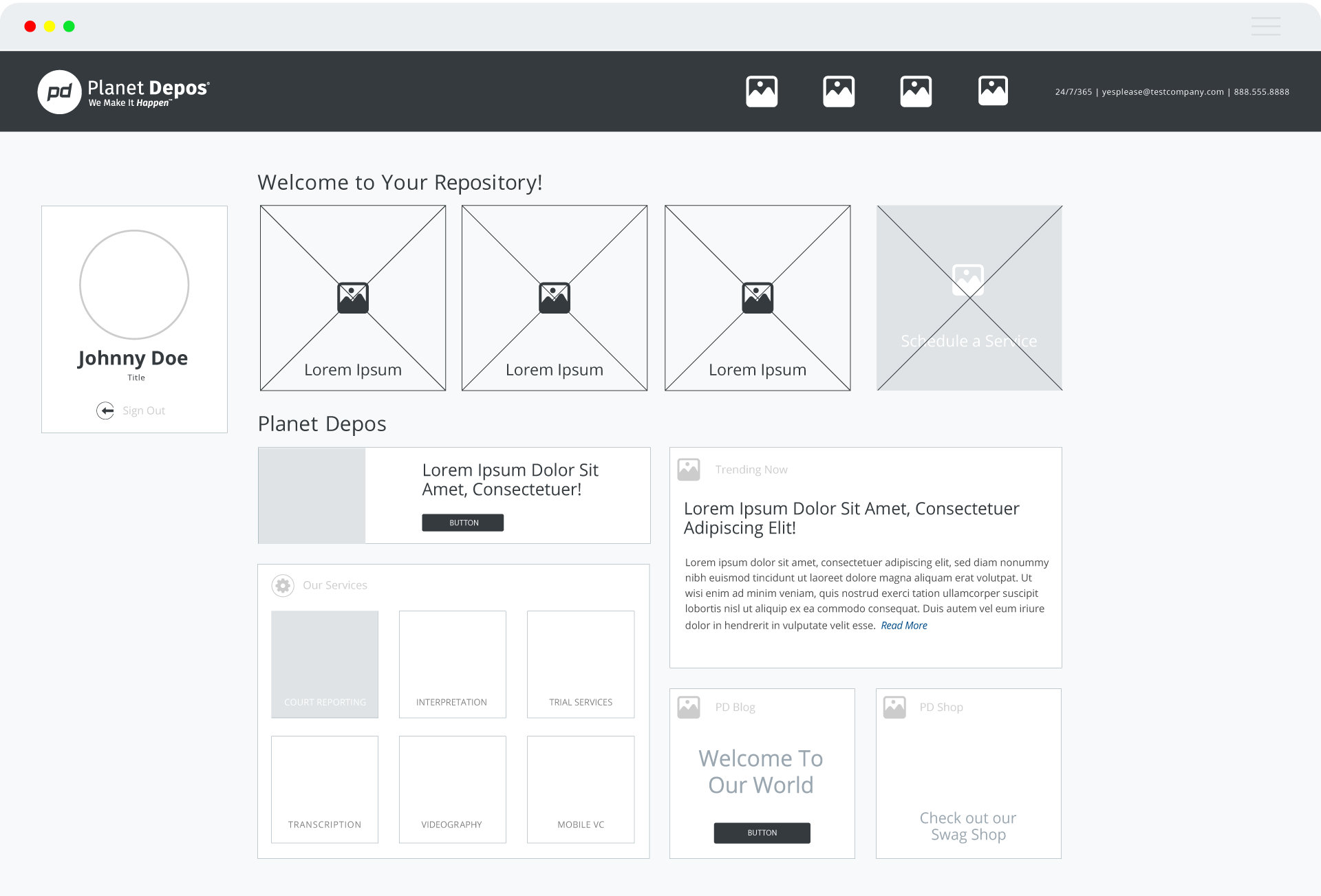
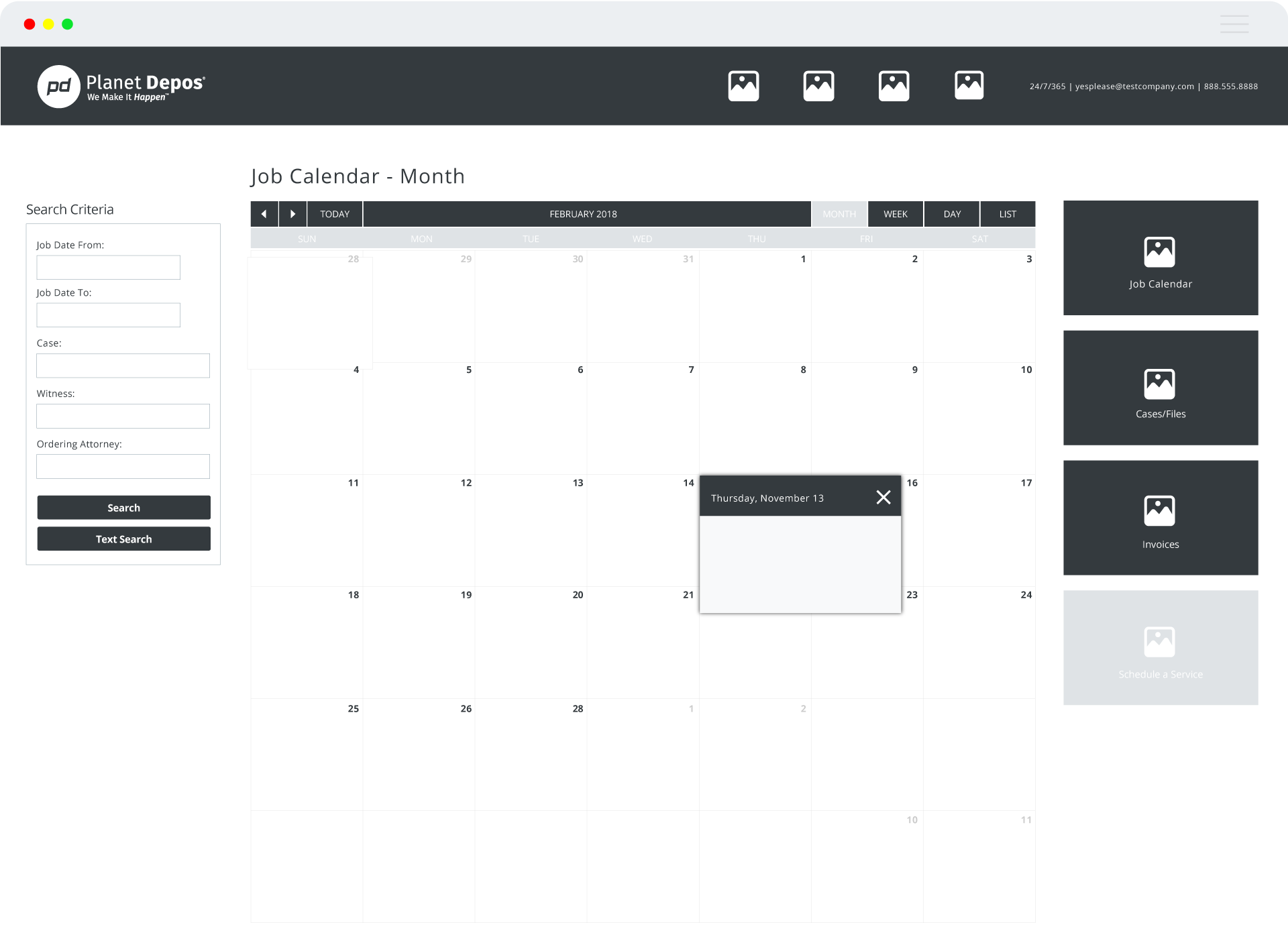
>>MID FIDELITY WIREFRAMES
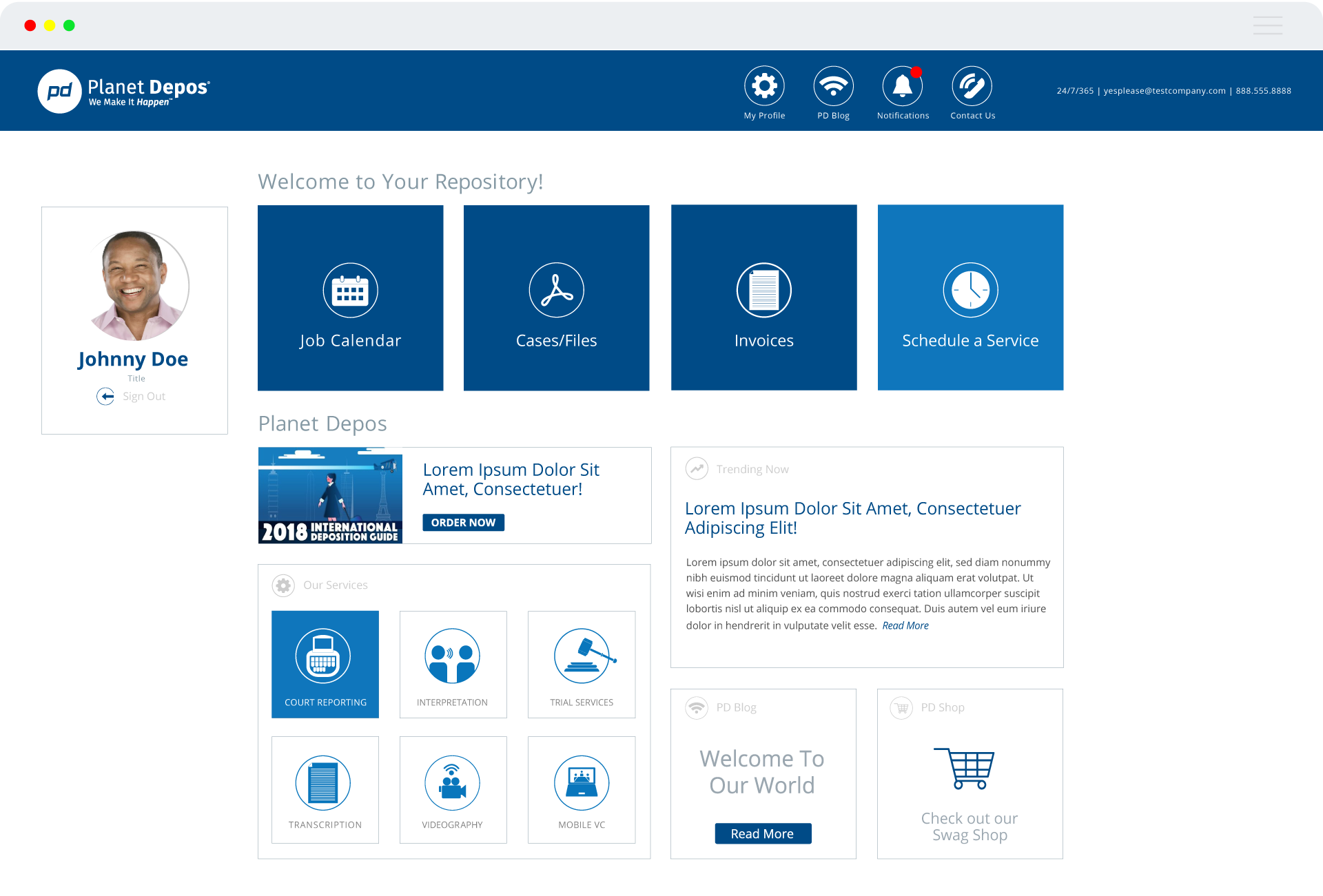
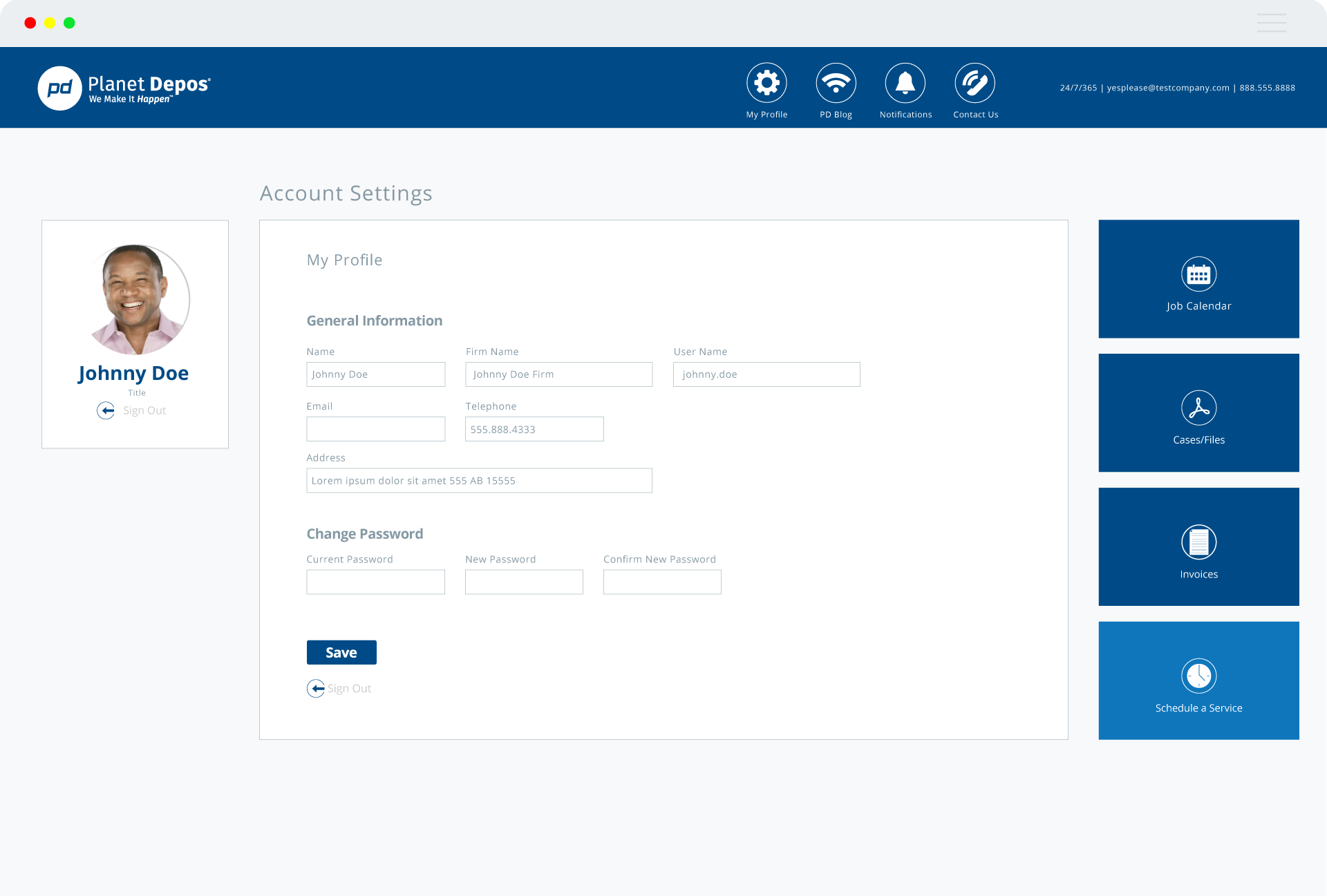
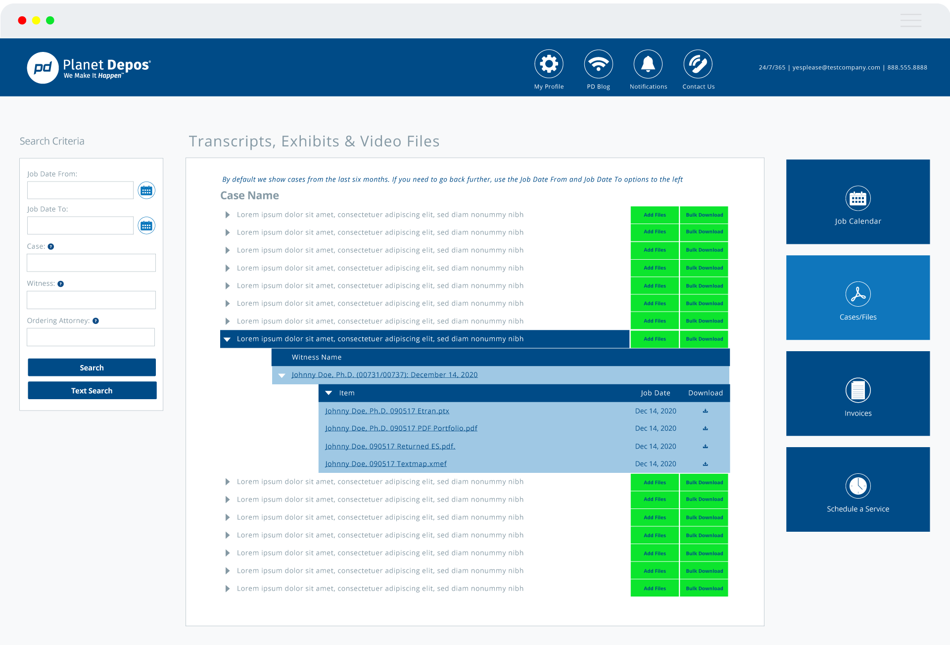
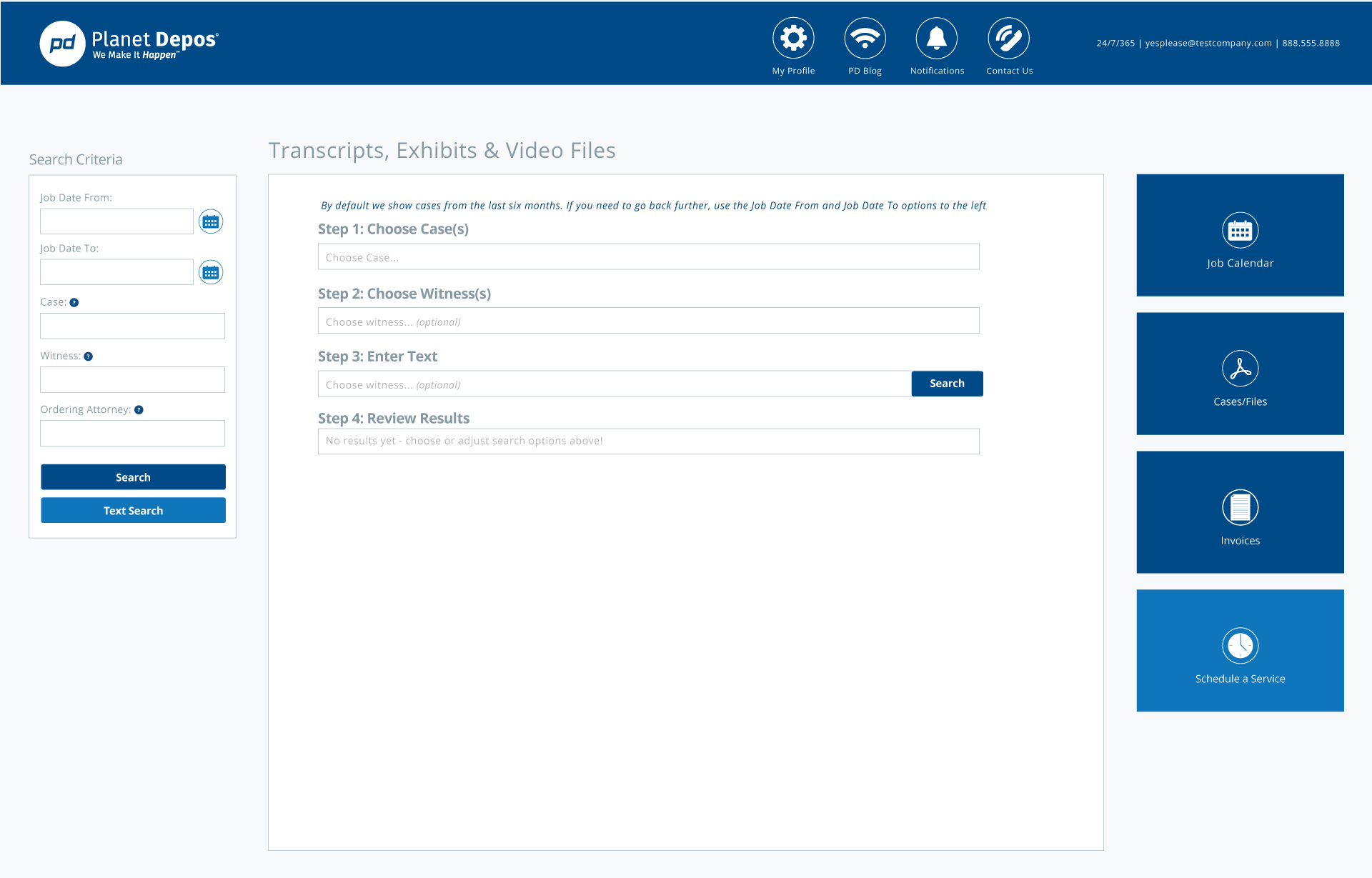
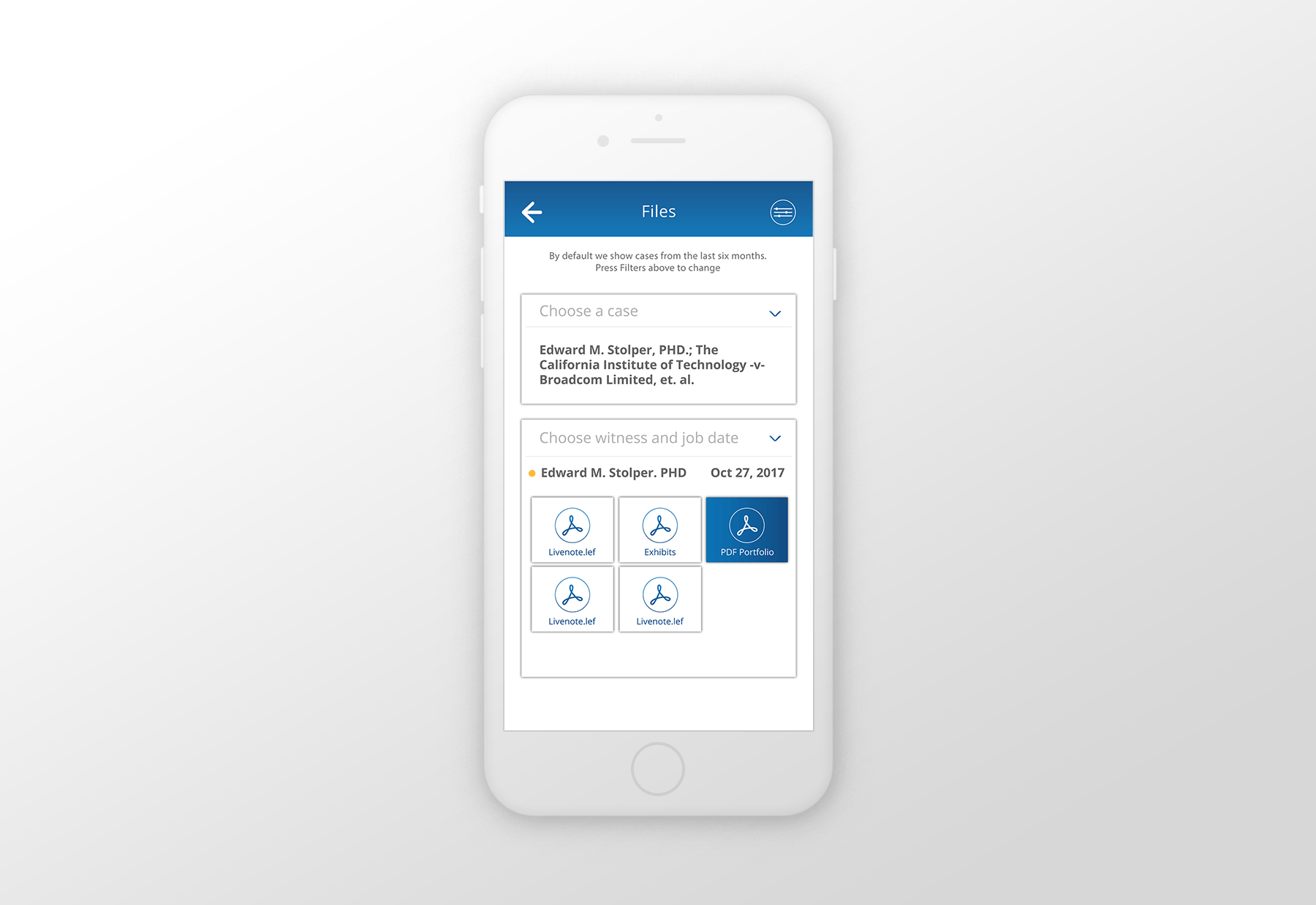
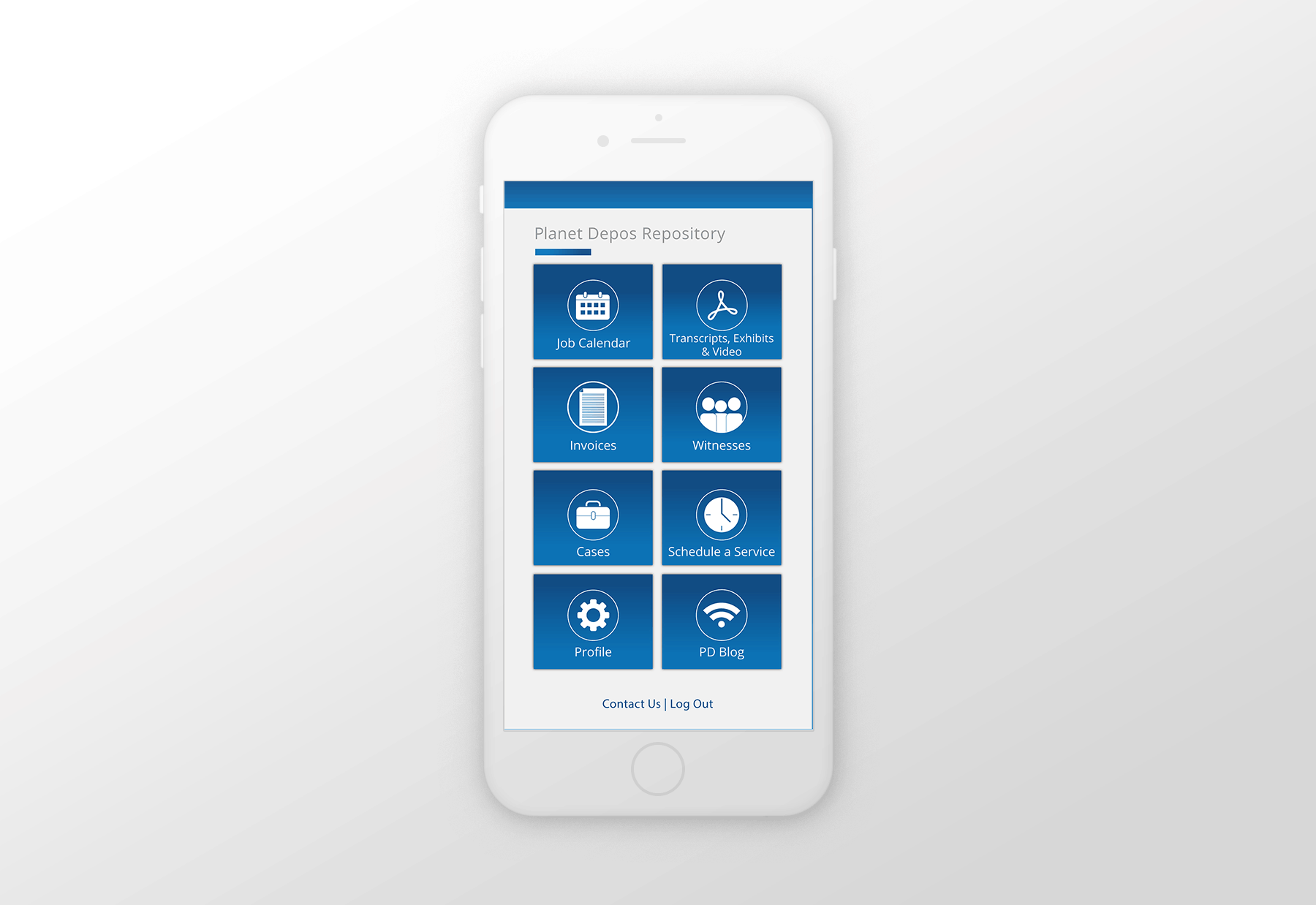
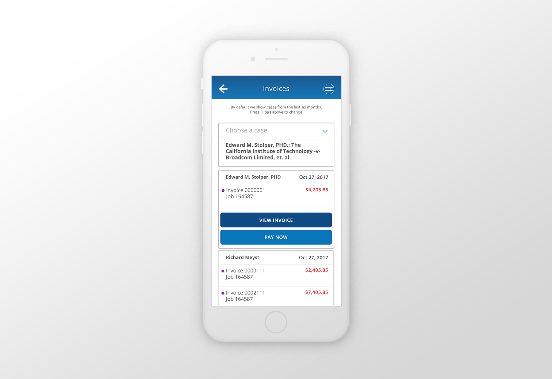
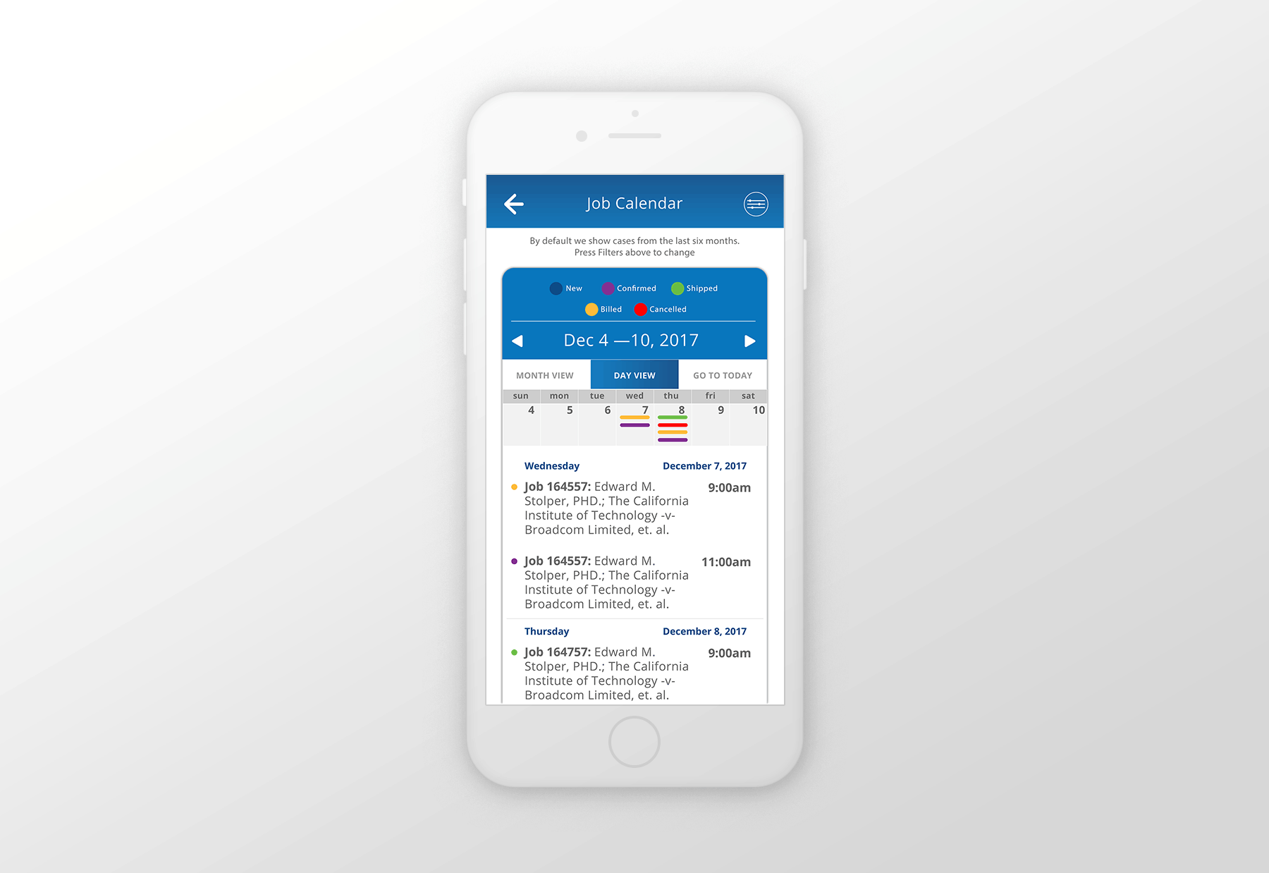
After testing, the original layout of Planet Portal was re-arranged in order to improve the UX design already in place. I followed the teams instructions and feedback in order to create the wireframes.
>>OUTCOMES & LESSONS
Challenges:
This is the first time I dove into UI design trying to come up with a system of my own. I didn’t have the background or certifications in the methodology of UI/UX design, so I struggled doing research on how to approach my solutions and how to communicate them with the developers. Graphic Design is second nature to me so thinking outside the box helped me come up with a solution that ended up working pretty well. I had to create my own deliverables and my own instructions to the developers. See below.
Rewards:
This project was the one that reminded me of my problem solving skills. Jumping in the middle of the project once again and being able to refocus the product and user interface lead me to go back to school once again and dig deeper into this UI/UX design discipline.
