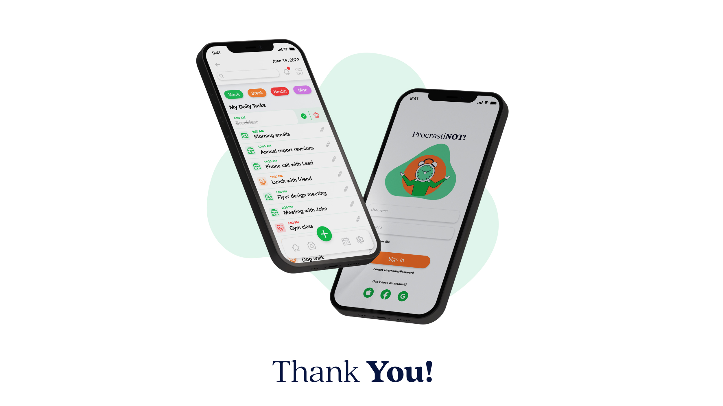
IOS APP | UX Design | UI Design
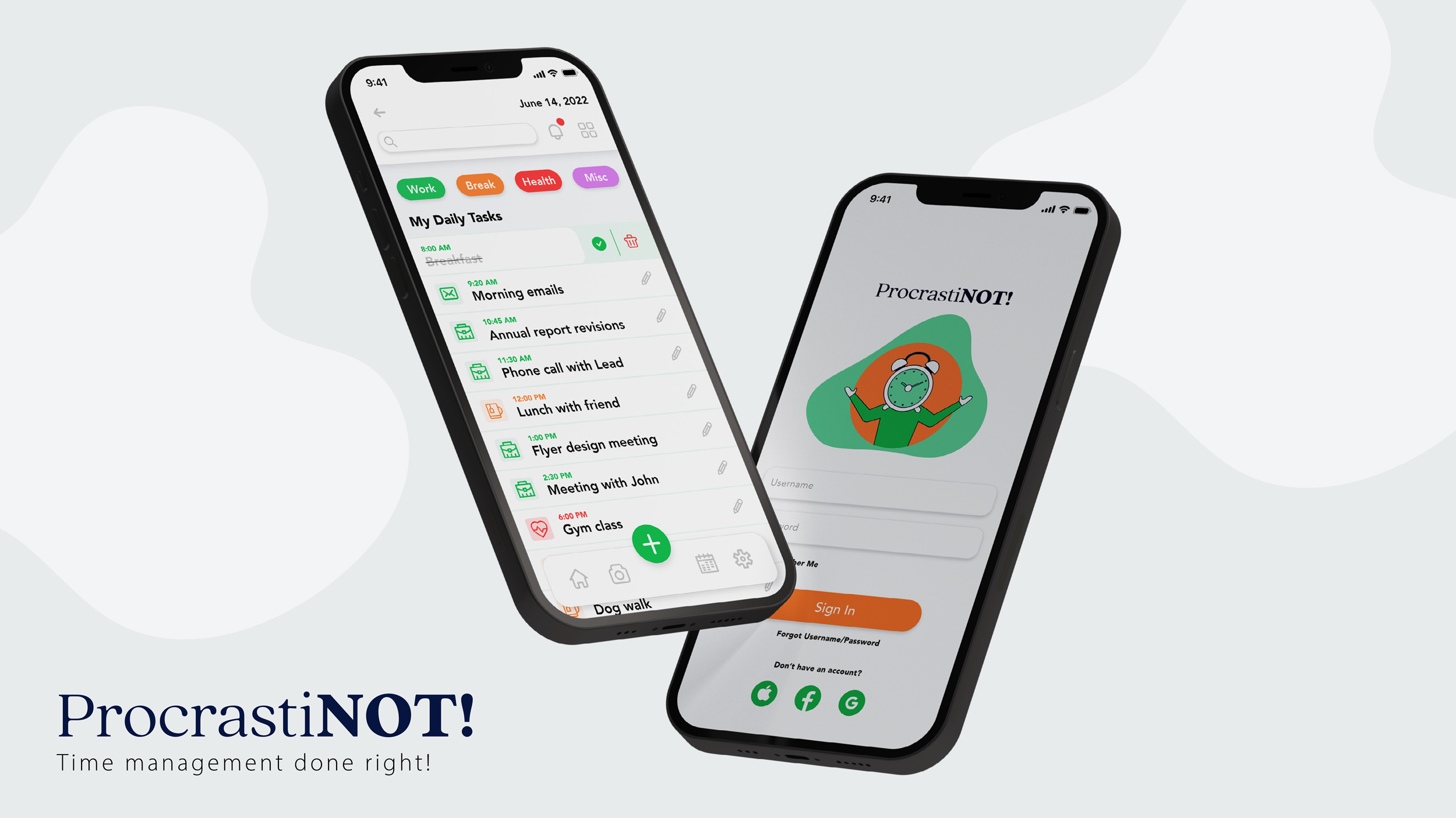
Procrastinot!
Time management done right!
B-link specializes in allowing small businesses to find products of all worldwide brands at discounted prices to provide distributors with the best deals on one site.
>>PROJECT OBJECTIVE
To design the UI for the mobile version of a productivity app and prepare for handover to developers.
To define the UI direction that will work for branding and digital UI. The final UI design should meet the design requirements listed on the original brief provided by the client.
ROLE:
My role during this project was split between UX/UI designer and Brand designer. I focused on developing the brand identity, creating wireframes, and creating user flows.
Project Duration:
3 Weeks – 15 Screens
>>THE OPPORTUNITY
The general public depends on daily planning to get them through their daily tasks, whether at work or home, To-do lists always facilitate task organization. ProcrastiNot is designed for people who need to plan and organize tasks rapidly and consistently.
Proposed Solution
Most of the apps already on the market are too complicated, requiring a lot of time to create simple to-do lists. For the first iteration of the app, ProcrastiNOT will be kept simple with the following Key features:
- Create task lists: Main Function
- Mark tasks as complete: Main Function
- Undo Completed Tasks: User should be able to undo a mistake when pressing on the completed button by mistake.
- Pick Time of tasks and add duration: User should be able to pick time of task during the day and duration of task?
- Labeling: User should be able to create label tasks either with colors or just iconography for task categorizing.
- Notifications: User should be able to receive notifications of tasks to come or completion of tasks.
>>APPROACH
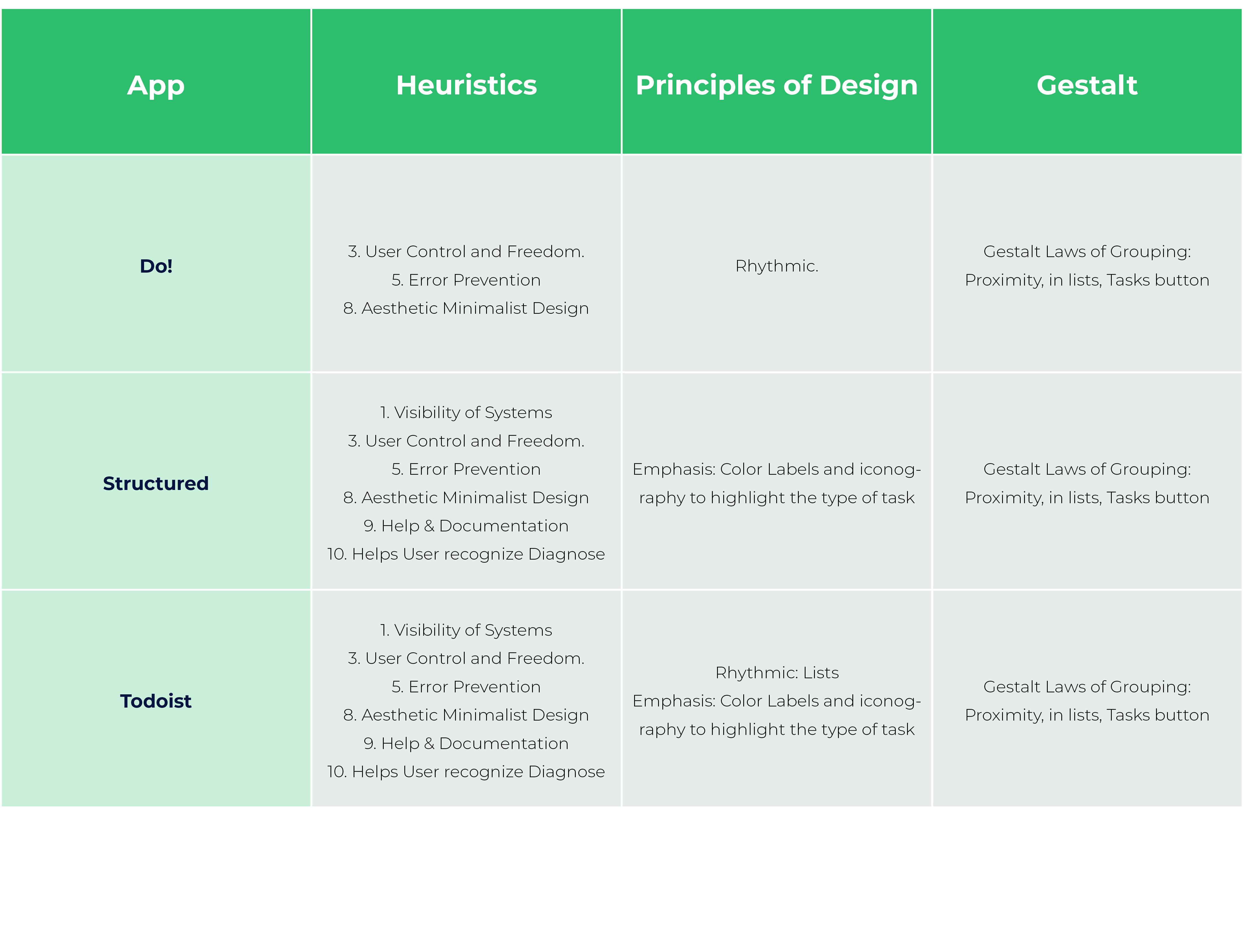
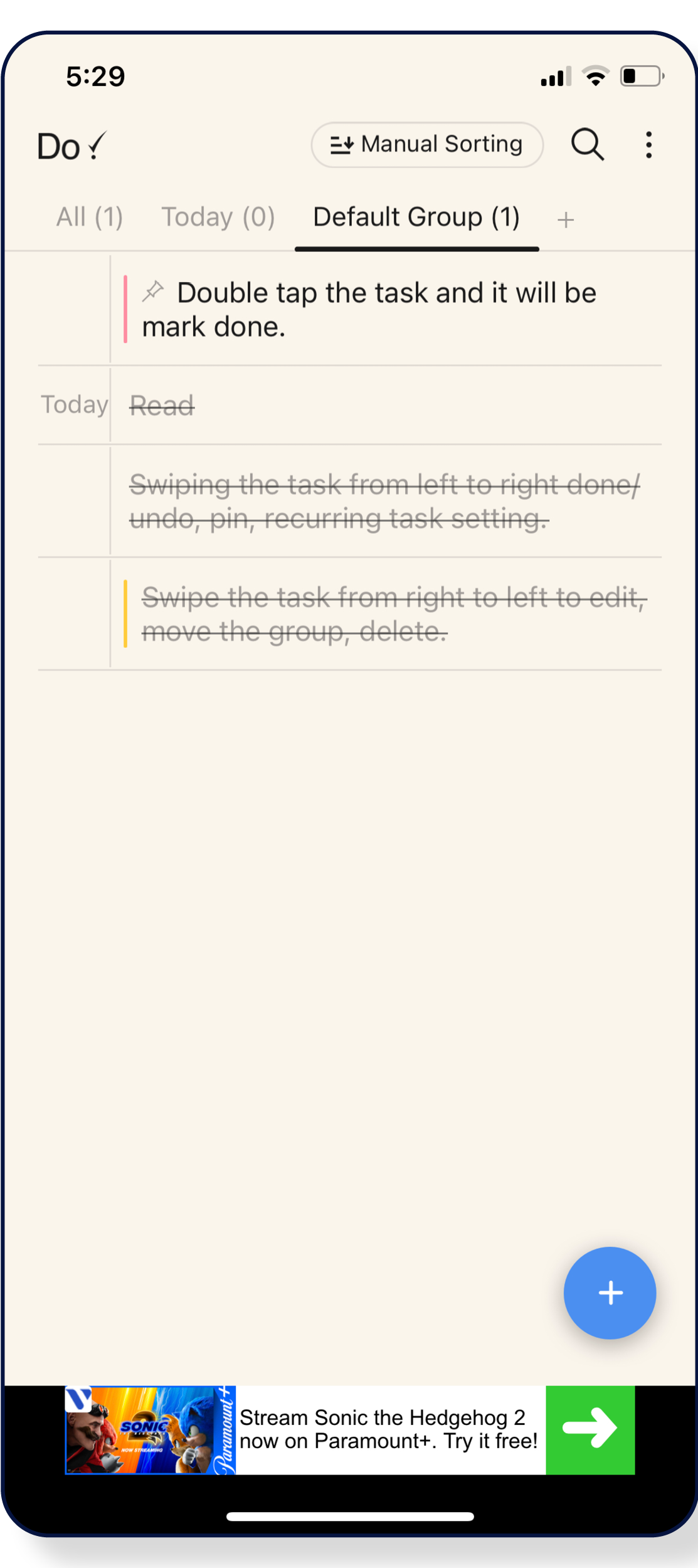
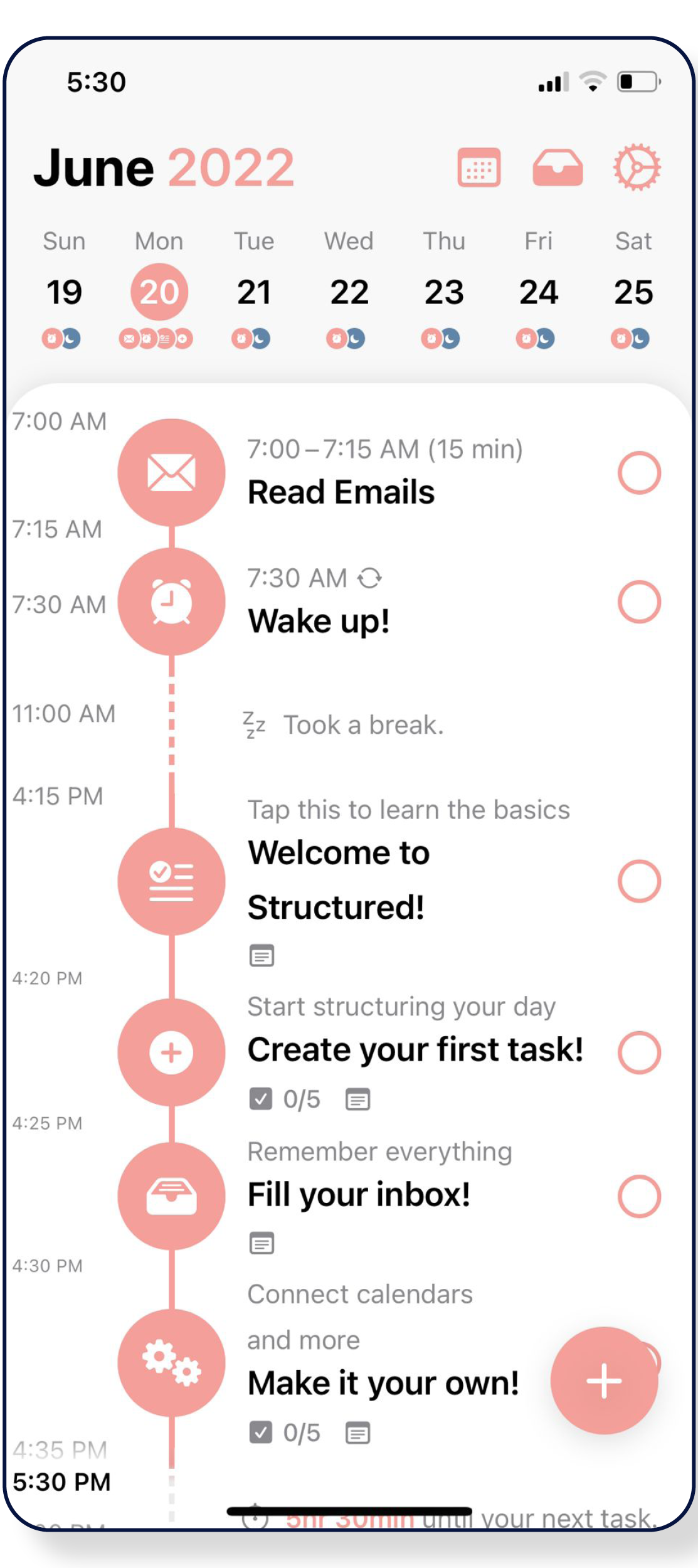
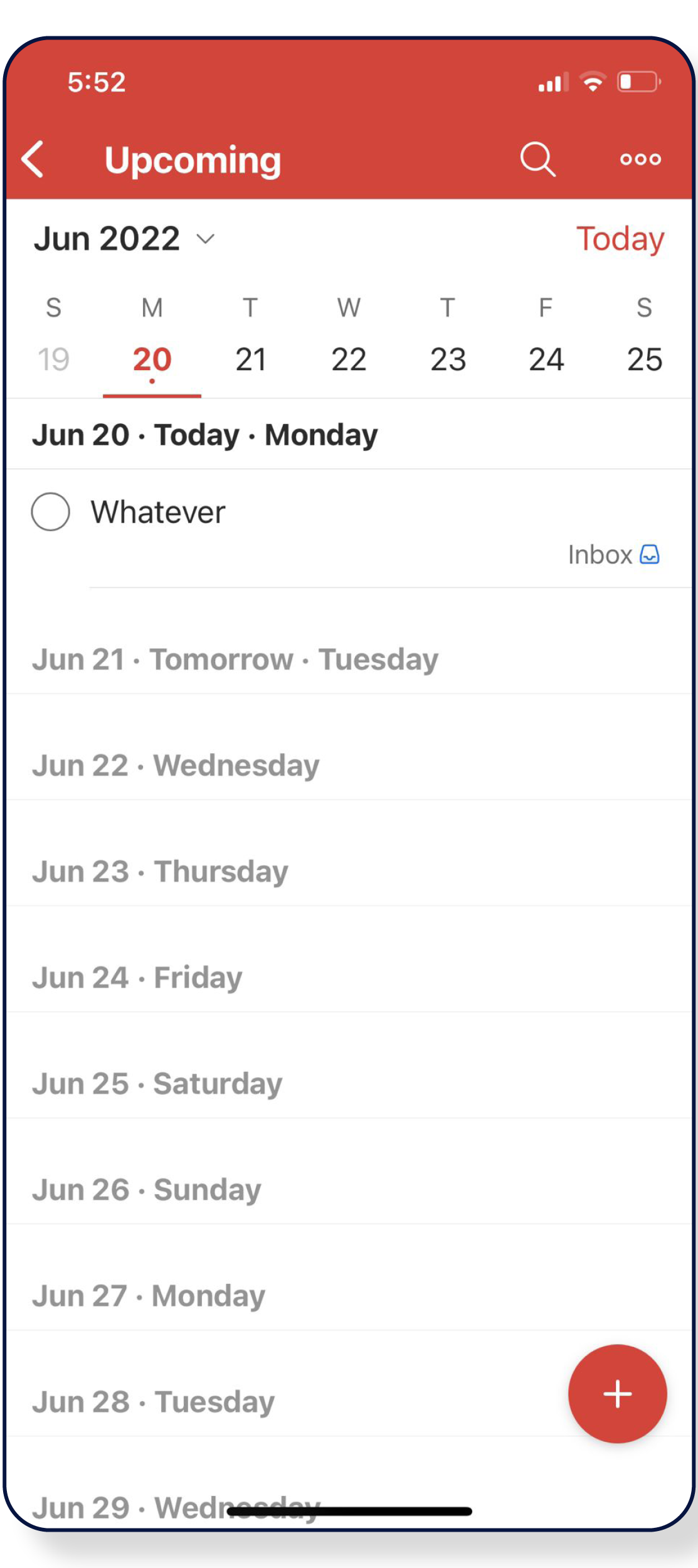
My first step in mapping a solution for this project was to research similar apps, download and test them and do a competitive analysis of each. The competitive analysis showed opportunities to test and look for improvements in the existing task and to-do list apps.
COMPETITIVE ANALYSIS
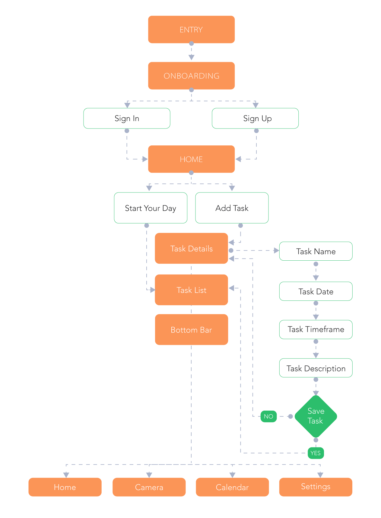
USER FLOW:
APPLIED SKILLS:
UI DESIGN:
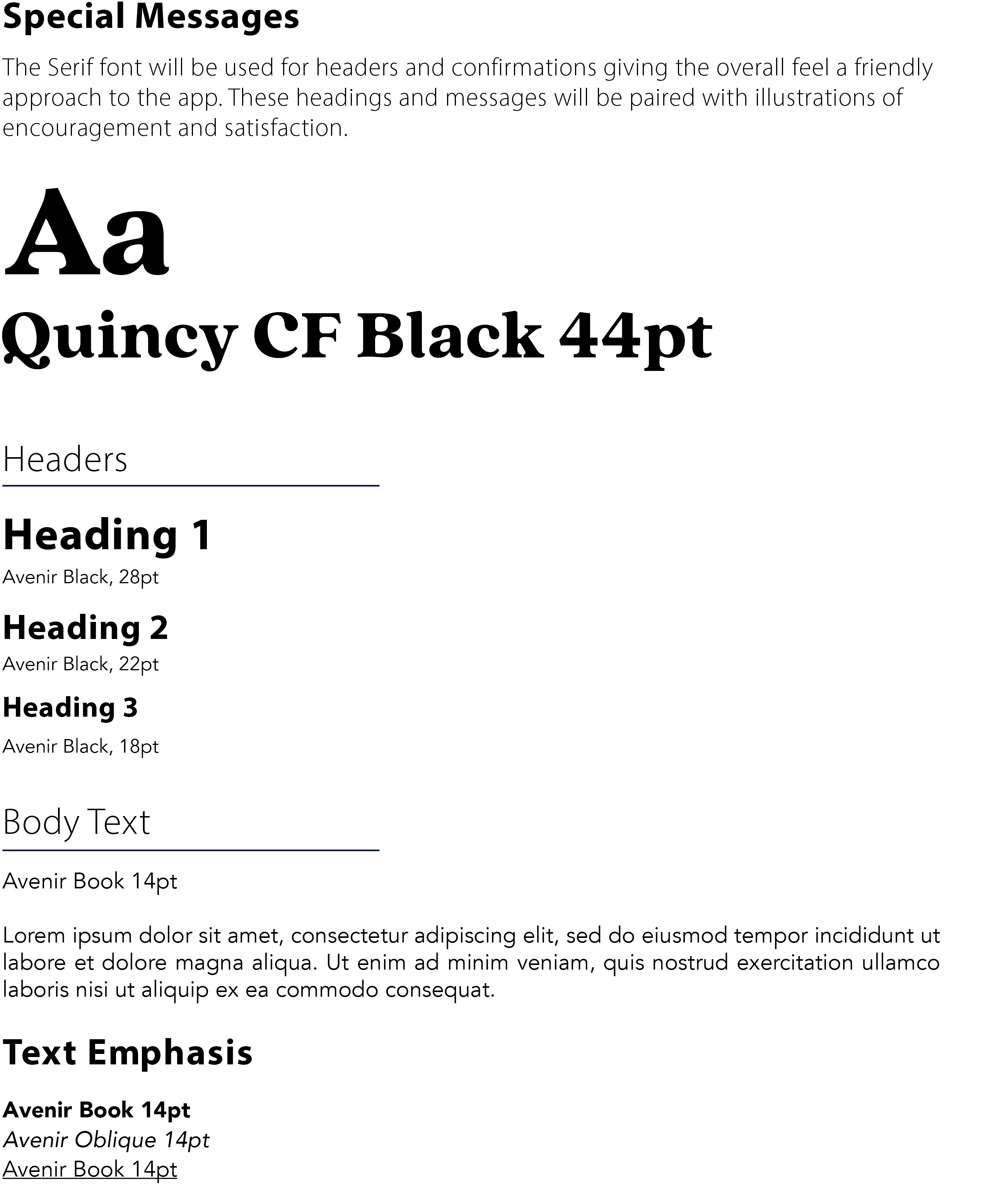
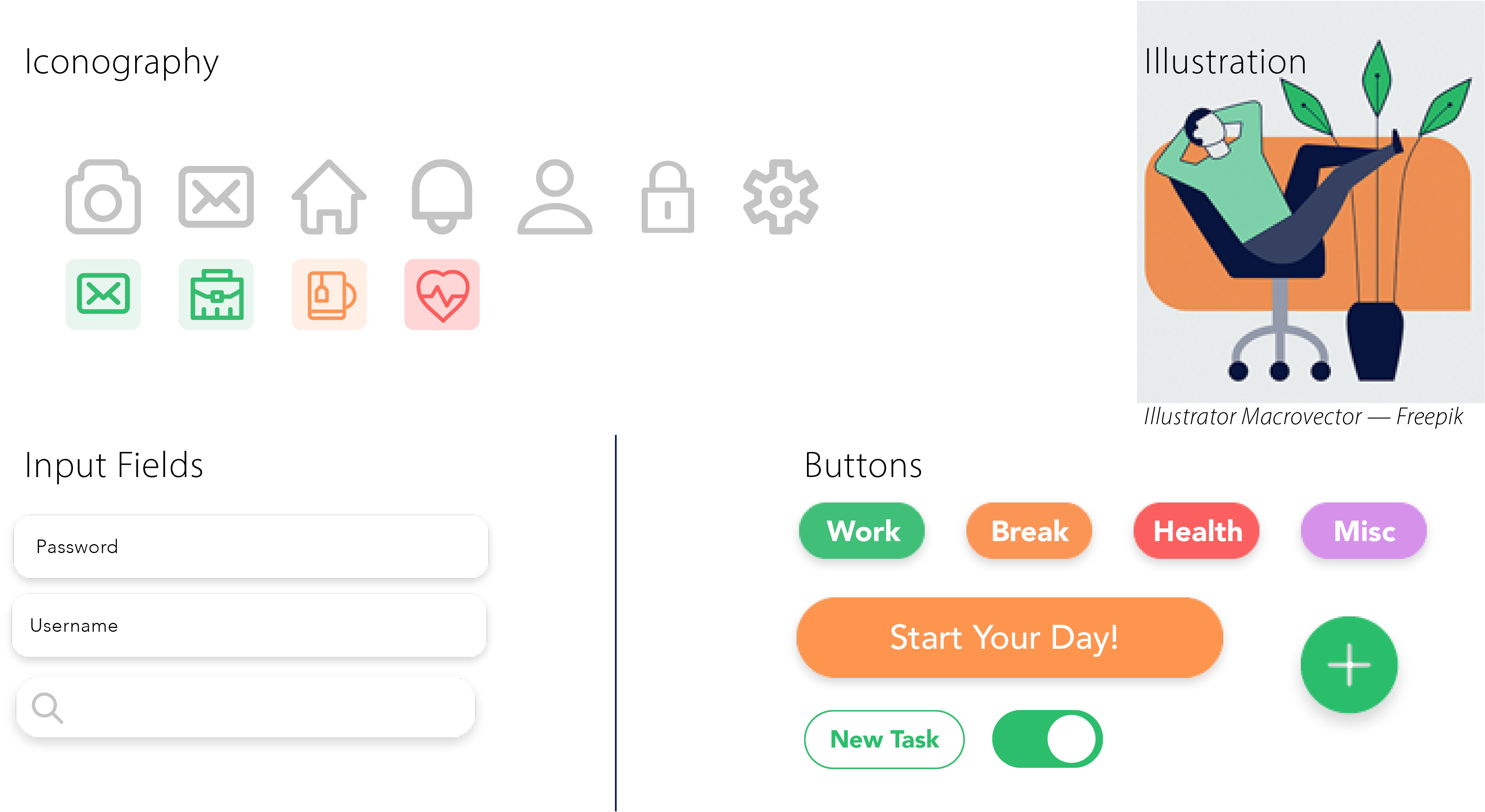
Brand identity design applied consistently on both native guidelines (iOS elements and Material Design) including iconography, typography and color palette.
UX Design:
User flows, rapid sketching paper wire-framing, digital low-fidelity wireframes.
Low-Fidelity Wireframes
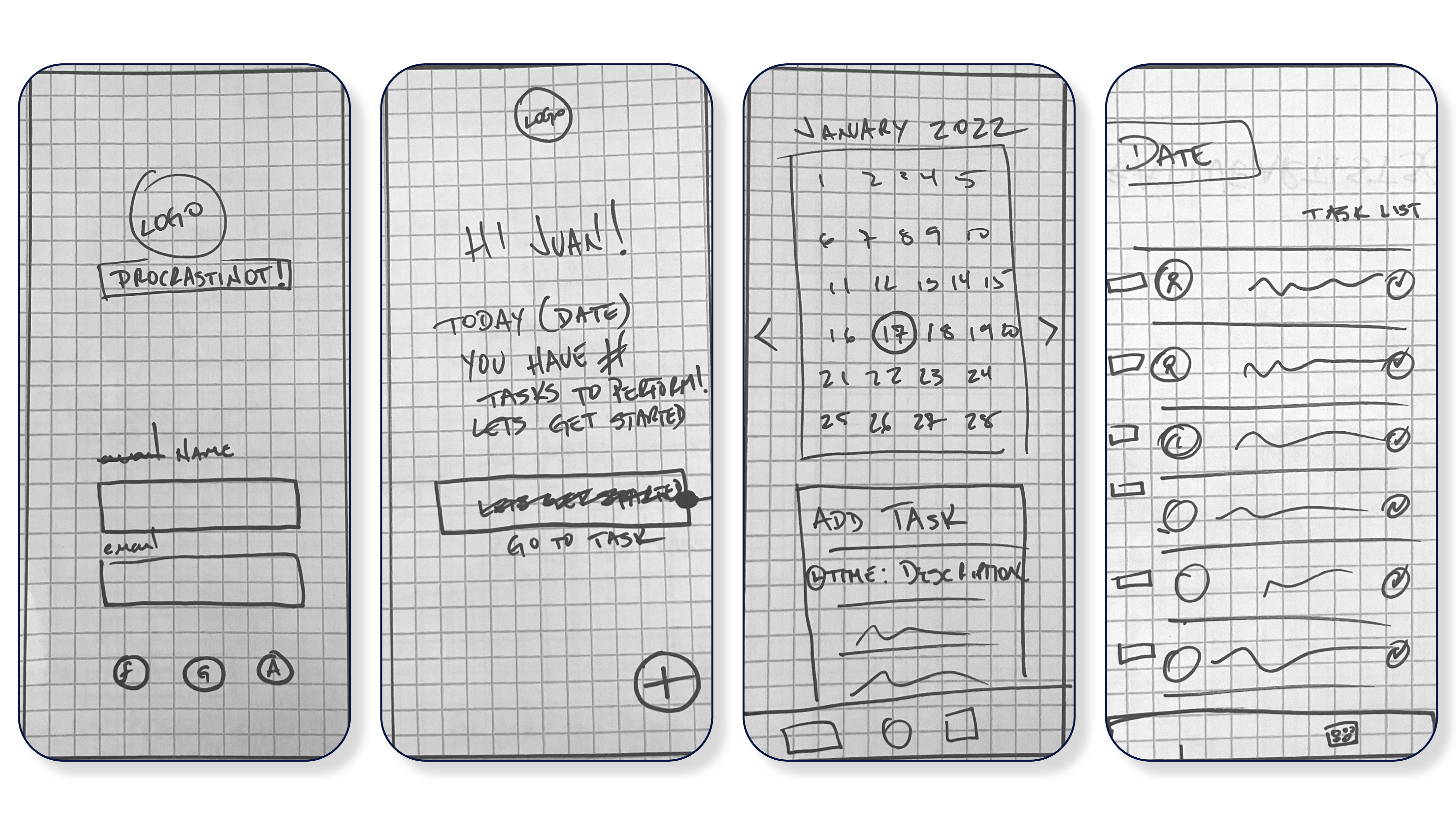
>>WIRE FRAMES
MID FIDELITY
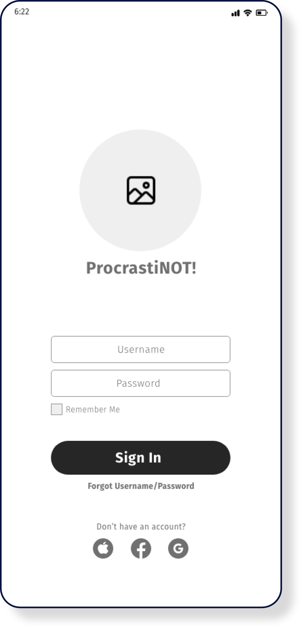
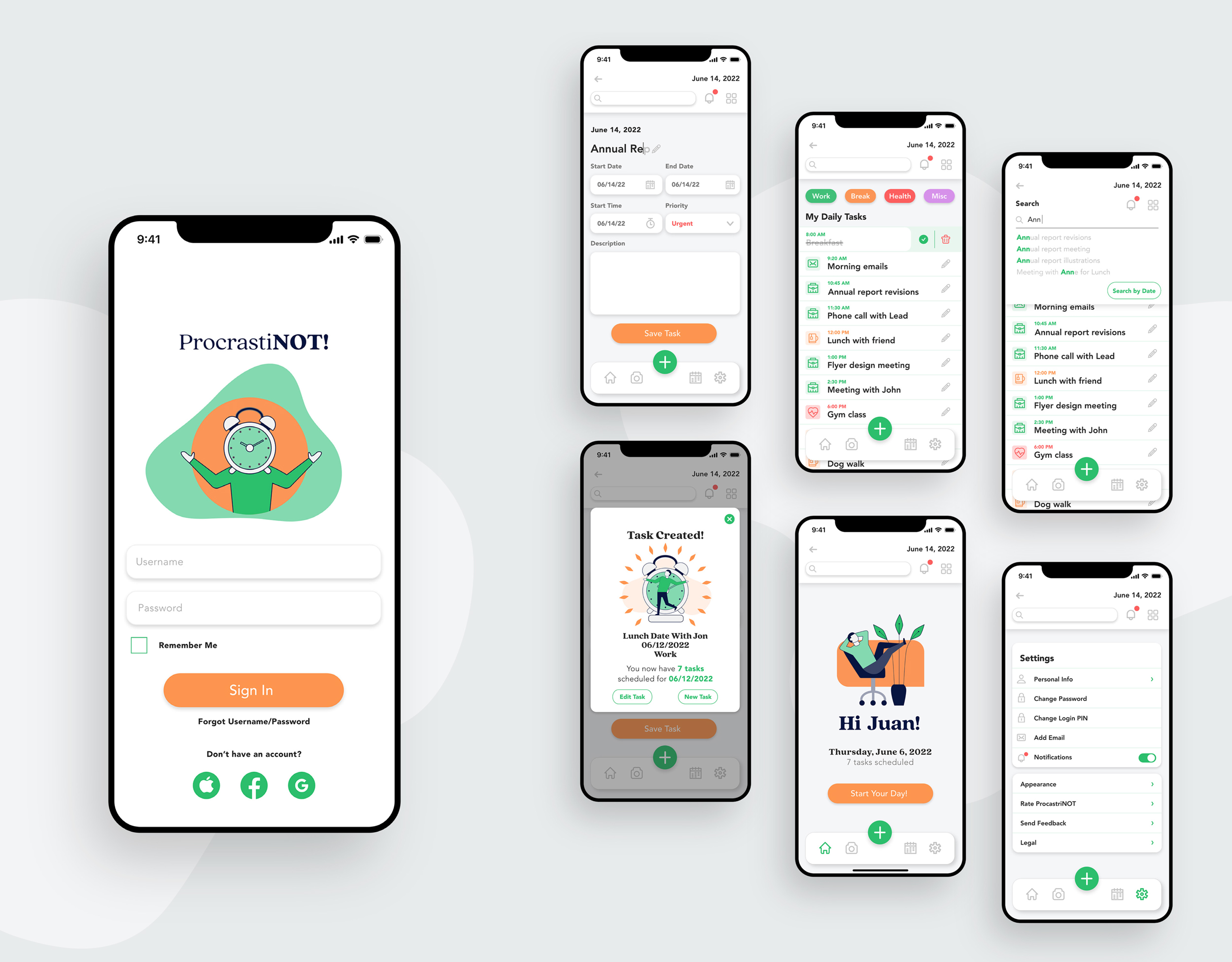
LOGIN SCREEN:
- Large-sized logo and Name of the app ProcrastiNot!, grouped atop the screen .
- Two text fields followed by the prominence of the “Sign In” button instructs the user. And since it is an intuitive task for any user, the simple design allows it to perform quickly and without distractions.
- Added a check box for Remembrance of Use Name/Password
- Forgot Username & Password should be a clickable link in order to not distract with over clutter of buttons.
- Icons for sign up with social media connection.
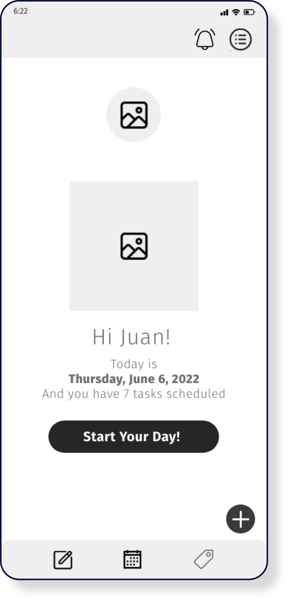
WELCOME SCREEN:
- The welcome screen will reduce the size of the logo and it will remain as part of the welcome message.
- A welcome illustration will give the app identity a bit of friendliness and encouragement.
- Salutation will be Larger than the other text as part of the welcoming “committee.”
- Salutation followed by a message containing the date and the number of tasks.
- The start your day button will take the user directly to the daily list.
- At the very bottom, the Add Task Button will begin to appear throughout
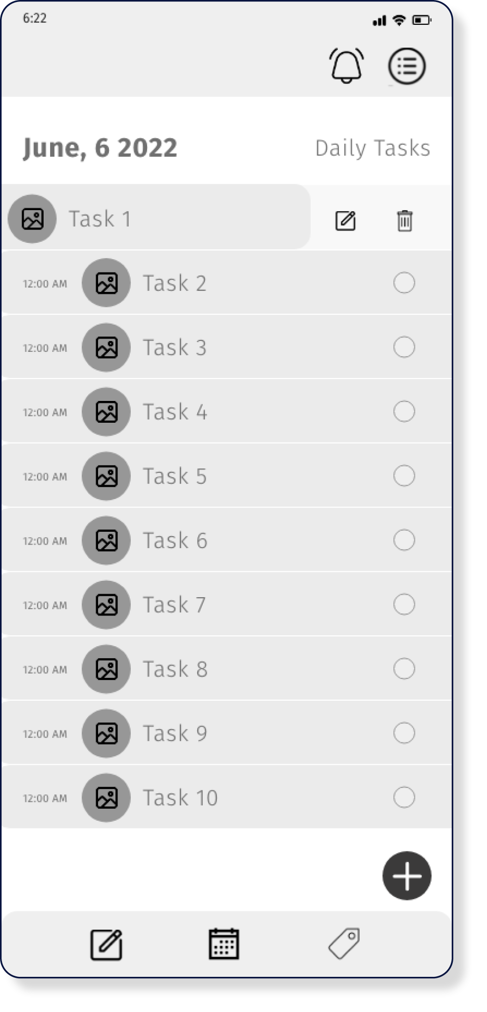
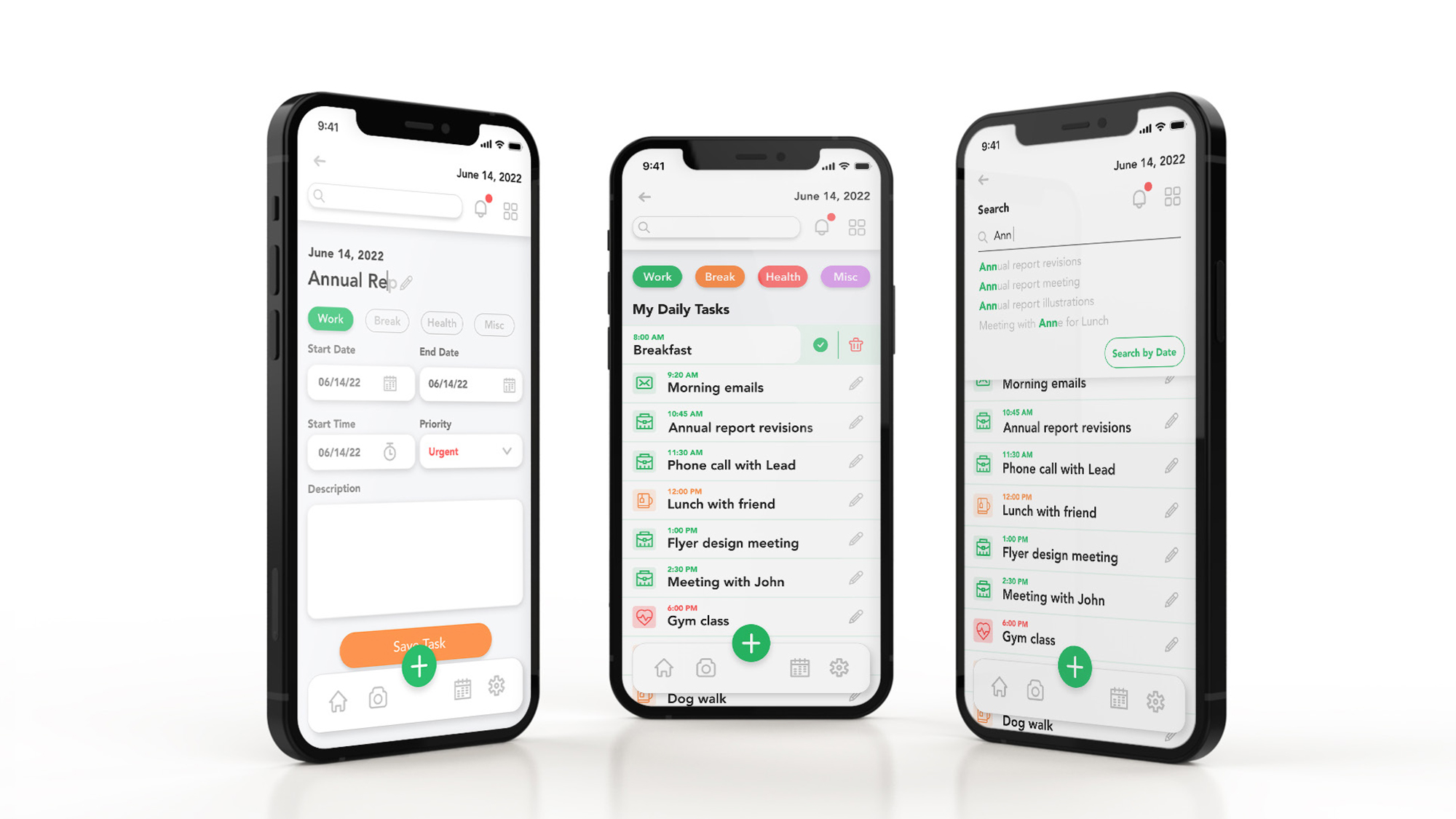
Daily Task List Screen:
- The date will be the main heading reminding the user of that List’s date. Date header will be bolded throughout the app.
- The Tasks are listed from top to bottom according to the time of the day. AM starting at the top.
- The information provided will have a labeled icon for the type of task category, followed by the name in large font size but unbolded to not make it too busy.
- A check-box can be clicked to finish the task performed.
- If the task has been canceled or changed the feature of Swipe List Item can be performed revealing the trash icon or edit icon to perform whichever task is needed.
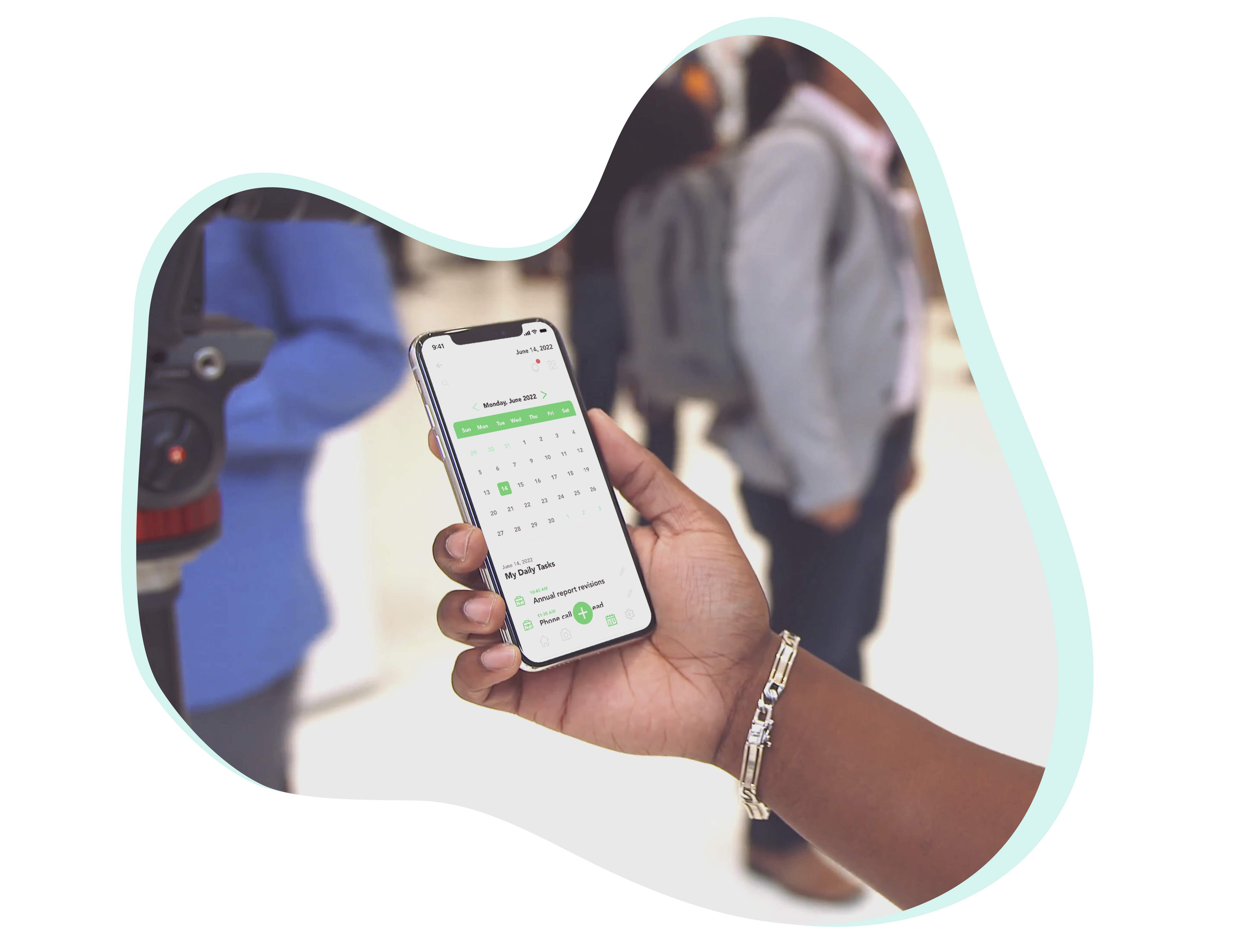
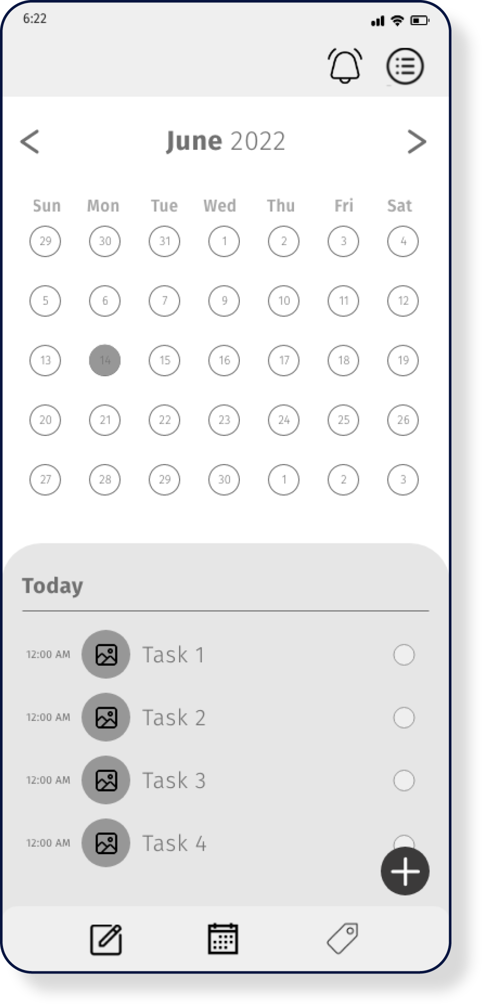
CALENDAR SCREEN:
- The calendar will be the main tool for scheduling a new task. It is placed first on the screen to center the user’s attention on the tool.
- The calendar numbers are clickable. Once the day is clicked, The daily list of tasks will be present underneath as a reminder of the day. This is a swipe-up pull-up tab.
- The create new task button will be at the bottom as a static button.
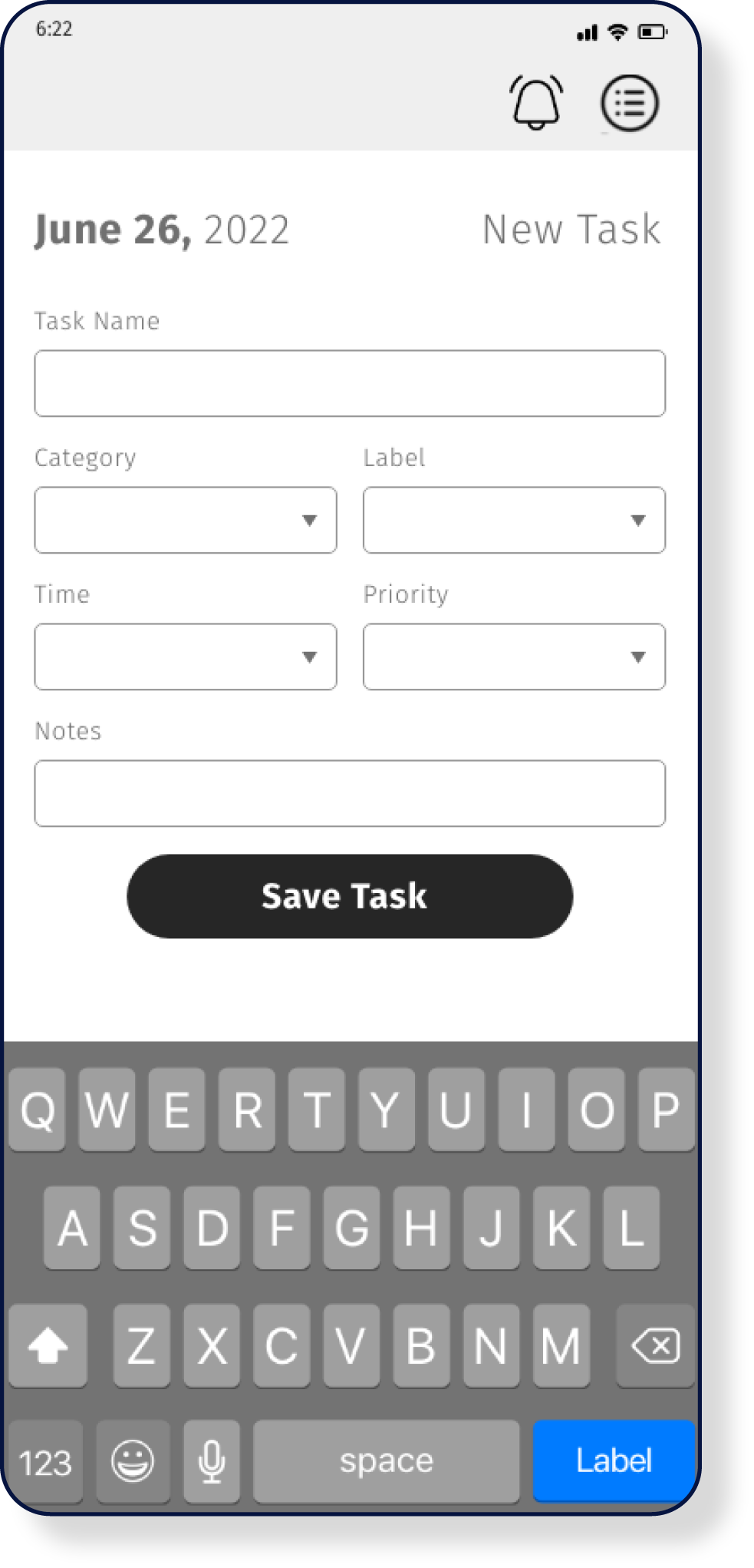
TASK DETAILS SCREEN:
- The Date will be the main heading reminding the user of that List’s date. This will be bolded throughout the app.
- The Tasks name should be a text field to fill.
- Category, Label, Time, and Priority should be a drop-down menu list.
- The time drop-down should bring the time “Rolodex” element.
- Notes should be a multi-line text field.
- Followed by the Save Task button with high contrast color to finalize the task.
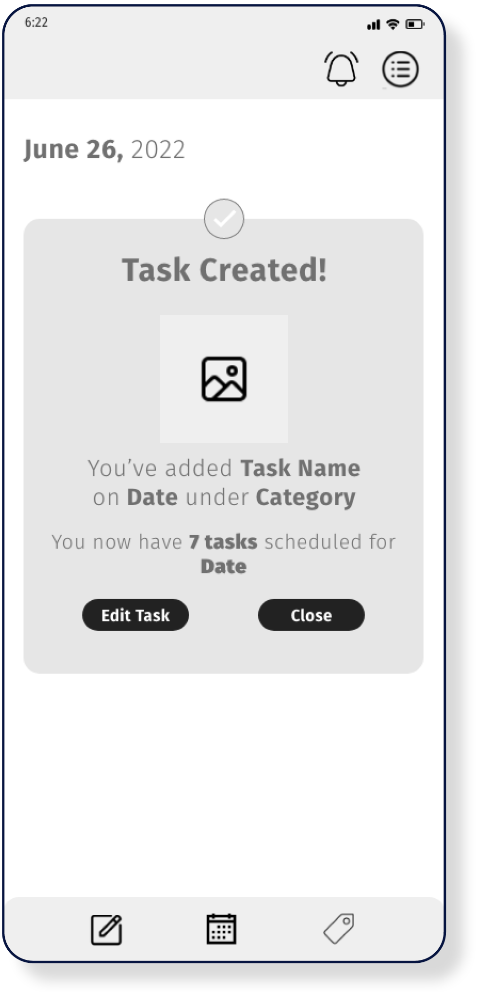
Task Created Screen:
- The Date will be the main heading reminding the user of that List’s date. This will be bolded throughout the app.
- Once the task form has been submitted a Confirmation notification will appear with a Header in bold “Task Created” and an illustration of “Success and Celebration”
- The message beneath will gives the details of the task name, date, and category and the number of tasks for that particular day. The information in each field will be bolded for emphasis.
- The user will have the opportunity to Edit Task if a mistake’s been made or close the task a continue on the task list date.
>>UI DESIGN
DESIGN SYSTEM/STYLE GUIDE
>>CHALLENGES
What did go well?
I was able to finish the first iteration of the app on time and I had to take a step back and simplify the scope of the work to have more control. After working on a few more projects I was able to look back at this project and once again apply and enhance the UI aspect of the project.
What didn’t go well?
ProcrastiNOT was my first case study as I delved into the UX/UI Immersion courses in Career Foundry. Although the concept was clear from the beginning, I ran into multiple obstacles concerning the methodology of this design discipline. User flows, the scope of work, and the original MVP became a bit overwhelming to execute as a one-person team.

