Branding | Graphic Design | Logo Design
UNDERPROD RADIO
Logo Redesign 2021
A quick turnaround redesign of the Underprod Radio logo. I did not know how, who or why the original logo was designed, but we were asked to keep as many of the original features in a modernized version of the logo.
Original Logo
First Logo Treatment
The first suggestion was to retrace and simplify the logo in order to vectorize and keep the original as to not affect the newly established identity. The original logo was not working due to the extra effects and embossings that just made it look pretty outdated. Below see the treatment of the newly retraced logo and its many usages.
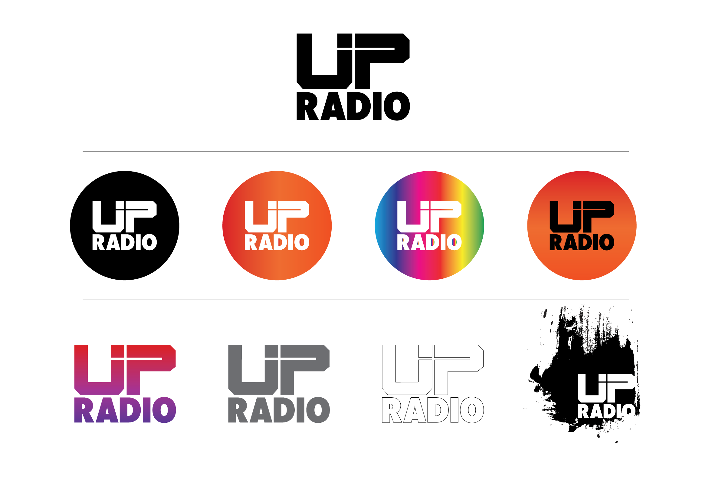
Second Concept
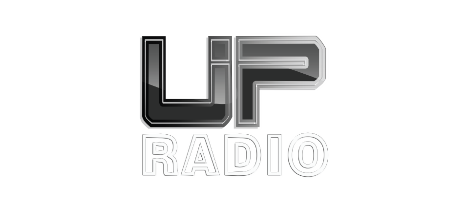
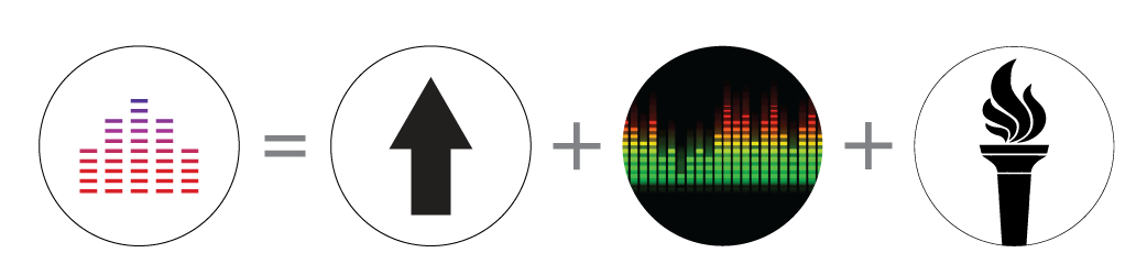
The other solution I presented was to modernize the structure of the original logo and added meaning.
Final result:
Applications
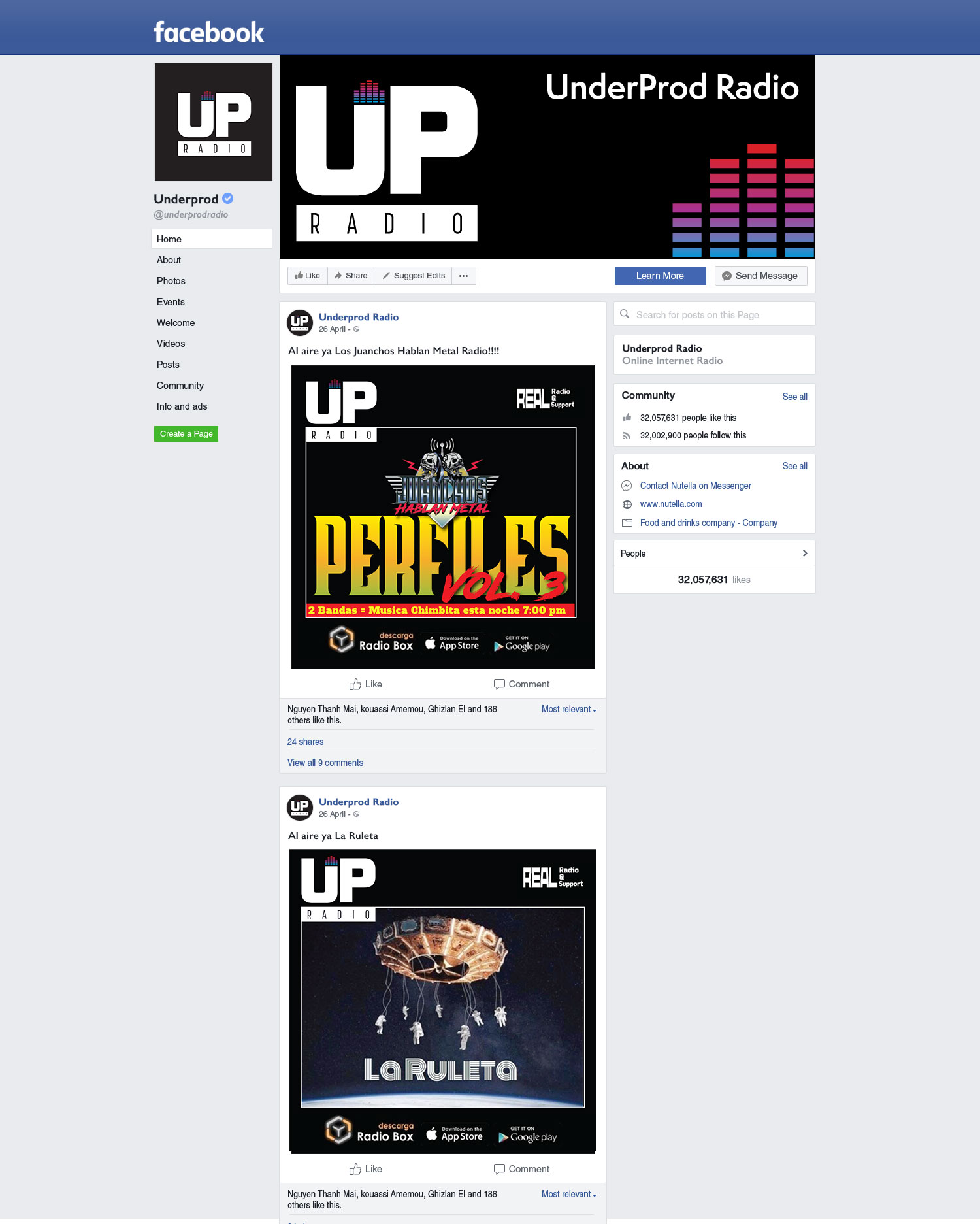
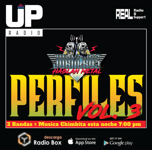
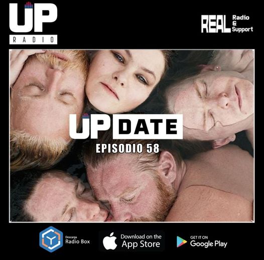
Due to the variety of programming of the radio station it was important to create a frame that would have all the information about Undeprod Radio in each social media post. This was decided in order to let each independent program create any type of art for their radio announcements and postings but with a consistency of branding.
Below are some samples of the type of posting from each radio program.